Hey survivors 👋
I’ve been working on improving the Crafting / Inventory UI in AREAZ, with a big focus on helping new players better understand the two-hand crafting system from the start.
Note: The crafting system itself isn’t changing — this is purely about clarity and usability.
AREAZ crafting is based on what you hold in your hands, not just clicking a recipe — and I want to make that feeling clearer and more intuitive visually.
Right now, I’m testing three different UI layouts:
1️⃣ Original version
– Crafting hands centered at the bottom
– The system longtime players already know
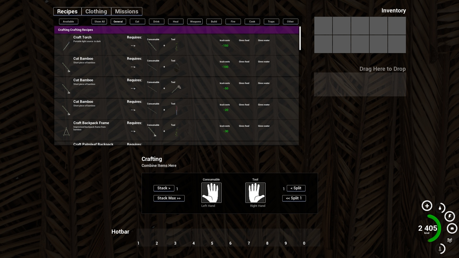
2️⃣ New – Centered & Framed
– Hands stay in the center
– Clear framing and labels
– Crafted to better explain “put items in your hands to craft”
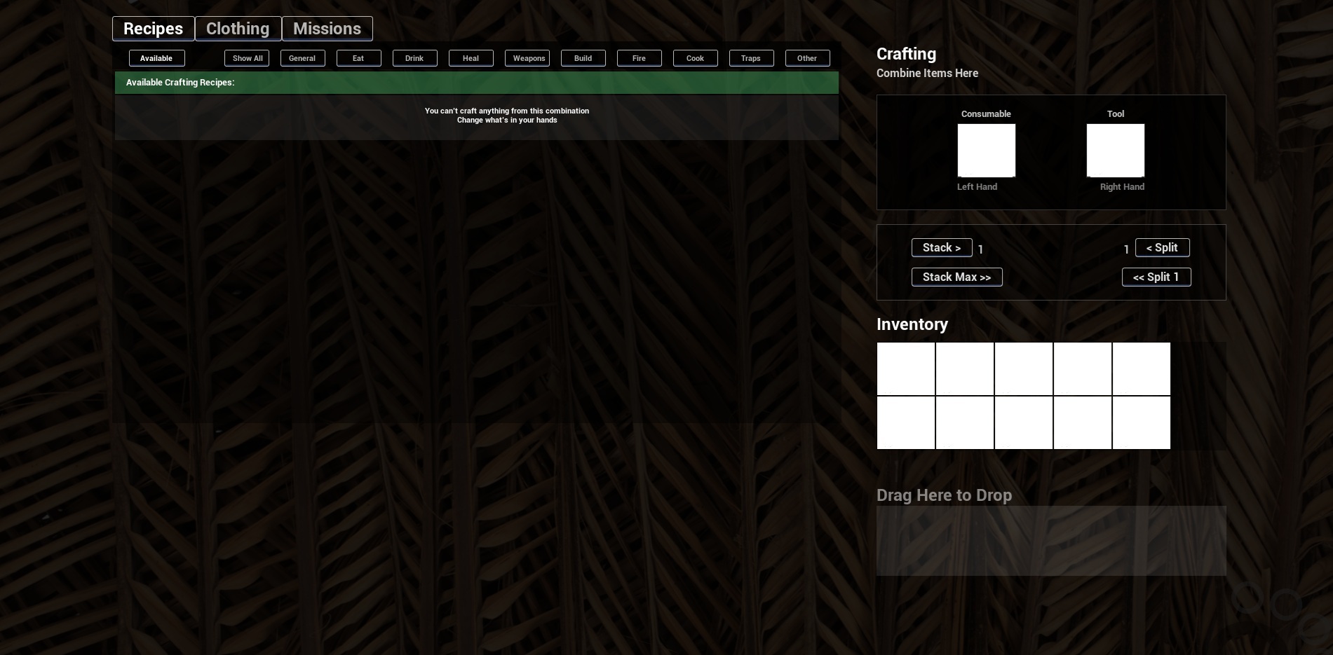
3️⃣ New – Two-Column Layout
– Recipes on the left
– Crafting hands + inventory on the right
– Shorter drag distance
– Designed to guide new players more naturally from inventory → hands → crafting
I’ll share screenshots of all three versions below.
👉 Which layout do you prefer?
👉 Which one do you think would help new players understand the two-hand crafting system faster?
👉 Anything confusing or missing?
Your feedback directly influences how AREAZ evolves — thank you for being part of it ❤️
1️⃣ Original version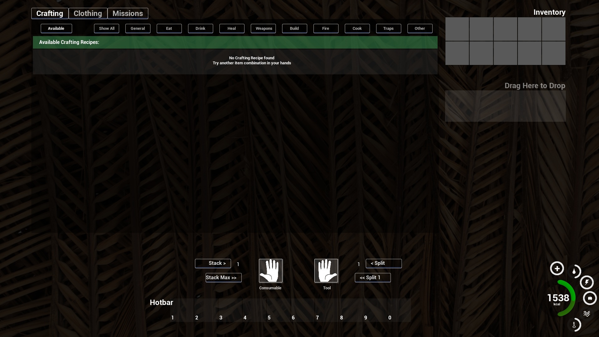
2️⃣ New – Centered & Framed
3️⃣ New – Two-Column Layout
To get more news on new map, provide reports and feedback please join our discord:
Thank you for your long lasting support.
Juraj Bachar
Game Creator