
Where did this art direction come from?
When we started working on PODER, we realized something pretty quickly. Most games about politics either turn it into a heroic story with "right" answers, or into satire where everything hides behind jokes and made-up scenarios. Either way, the same thing gets lost - the sense that any of it is real. And that's exactly what mattered to us. We wanted to build a political strategy game that shows power from inside the machine, not from the hero's chair. One that helps you see why a decision that works for some people is always a problem for others.
That's where the core idea behind PODER's identity came from: this isn't a world you look at. It's a system you work inside. So the main visual metaphor is politics as an operating system. Not figuratively - literally.
You're not out on the streets. You're not in the middle of the action. You're sitting in an office, behind a computer. In front of you — an interface, work windows, notifications, charts. Desktop folders are your city's departments: security, utilities, healthcare, social affairs. Notifications are events and problems that need your attention. Work windows are where you make decisions and run the system. And behind the monitor, a brick wall — a quiet reminder that the city is built gradually, one step at a time, through your actions.
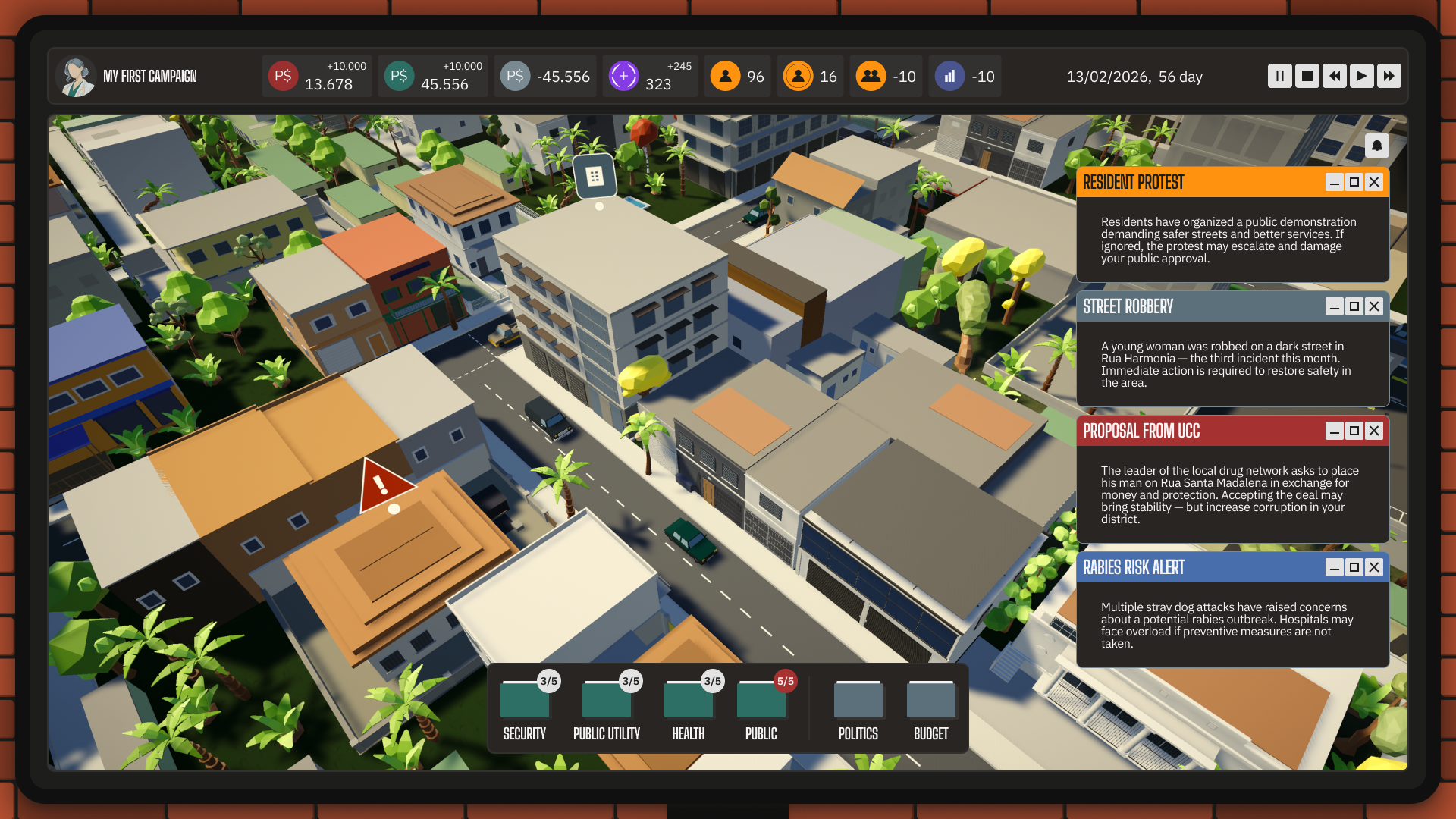
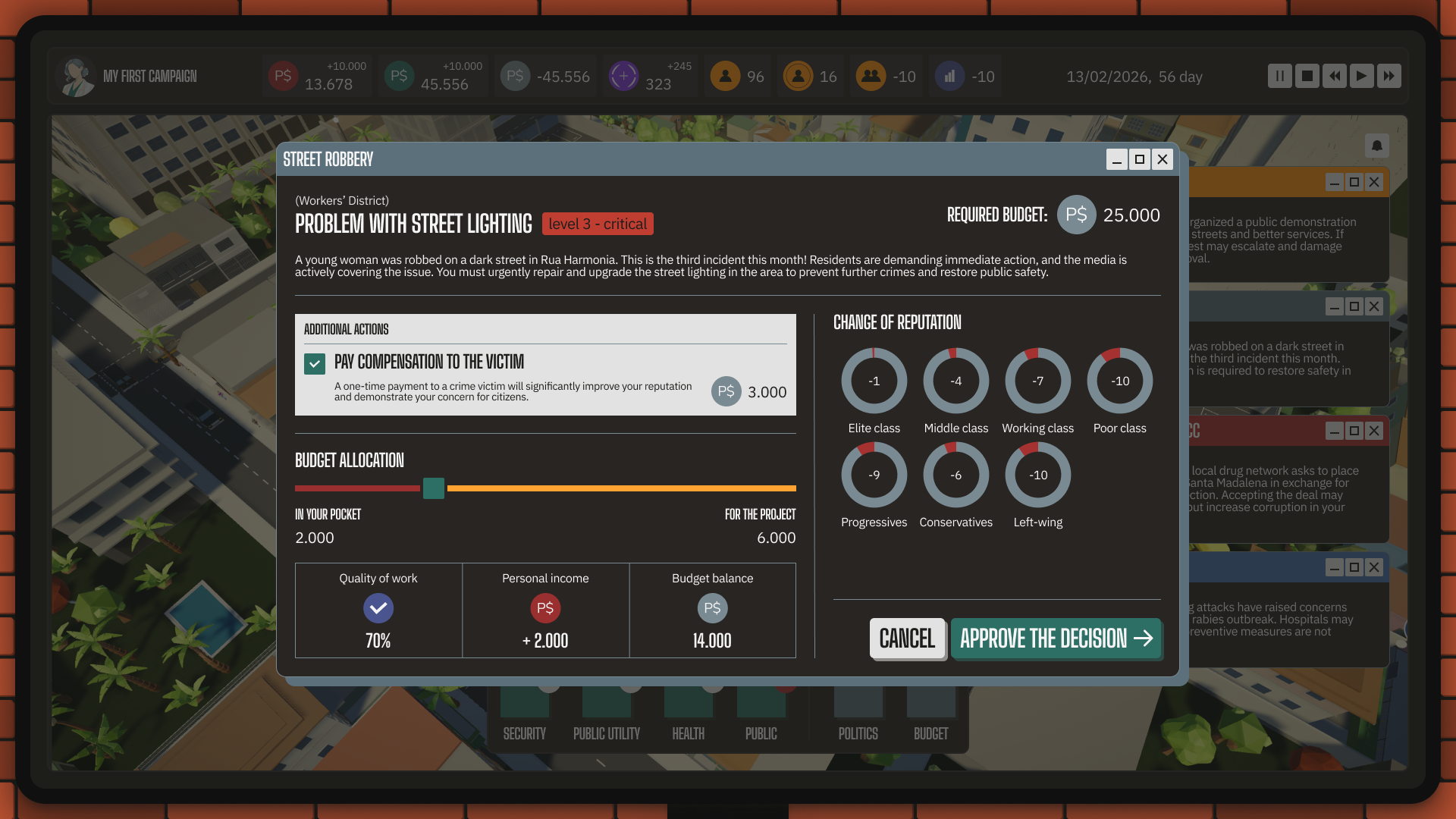
But it didn't take long to realize that "the system" alone isn't enough, because behind every number there are people. That's how the second visual metaphor was born — the pulse as the rhythm of decisions and city life.
The city doesn't just exist - it lives and reacts. When things are stable, the rhythm is steady. When a crisis hits, it speeds up - noise creeps in, micro-animations, tension.
This tension between system and life, the contrasts running through everything - that became the foundation of the entire identity.
Color palette and shapes
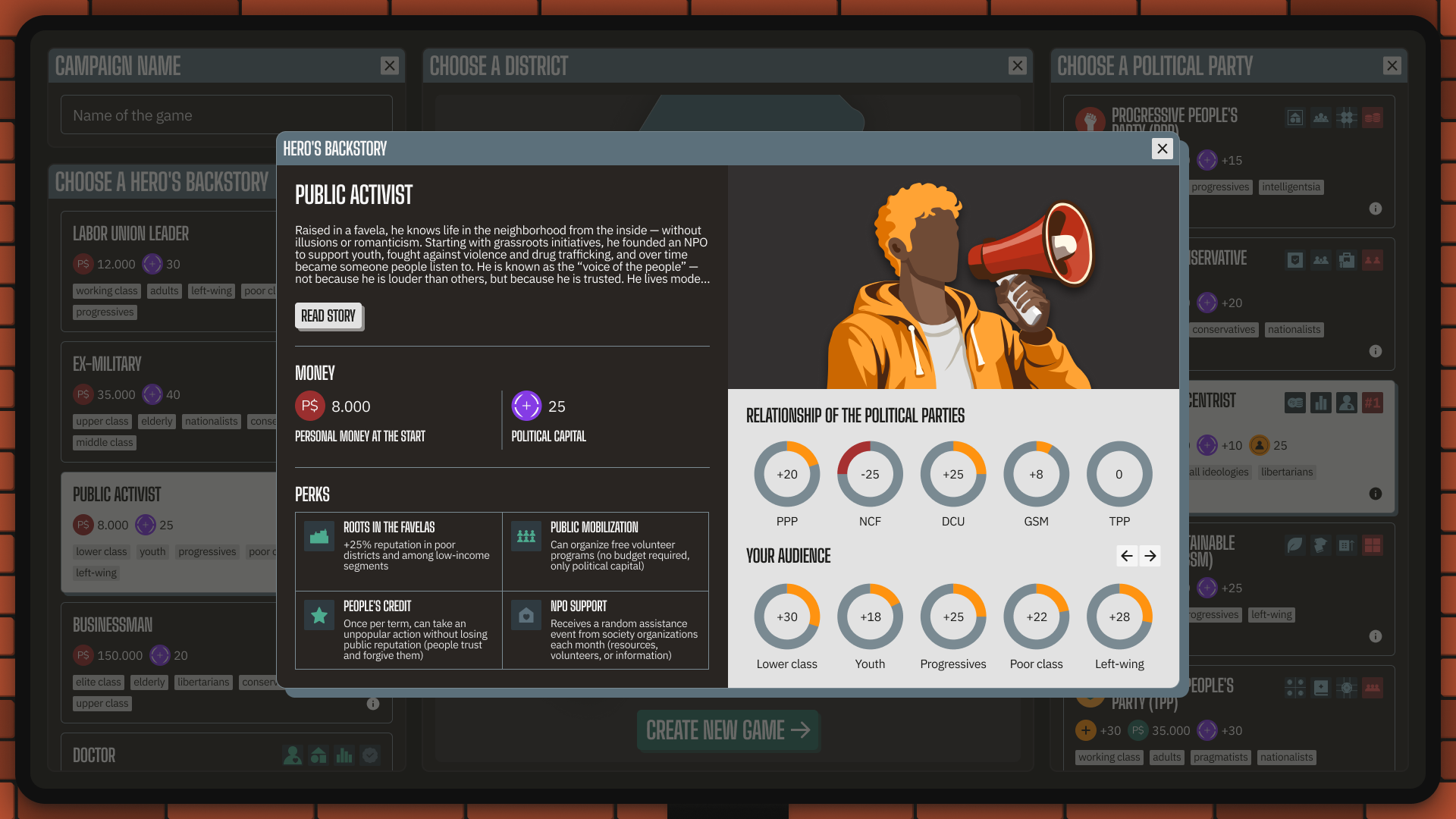
We don't just have a nice-looking palette. We have a color system:
Black, dark brown, white, and light gray - the OS framework: cold, heavy, inert, high-contrast.
Orange - the people. Approval, public mood, citizen support, reputation.
Green - governance and decision-making.
Red - risk, corruption, crises. It hits you — it's not background noise.
Gray - data. The connective tissue between people and the system.
Here's the thing: none of these colors mean what you'd normally expect. Orange isn't "joy" - it's approval. Green isn't "success" - it's a decision. Red isn't "action" — it's risk. The colors aren't about emotions. They're about the state of the system.
Same goes for shapes. Most of the interface uses slightly rounded corners - because the system allows for flexibility and compromise. But in moments of risk and pressure, sharp edges appear, and the shape starts to cut.
Characters and illustration style
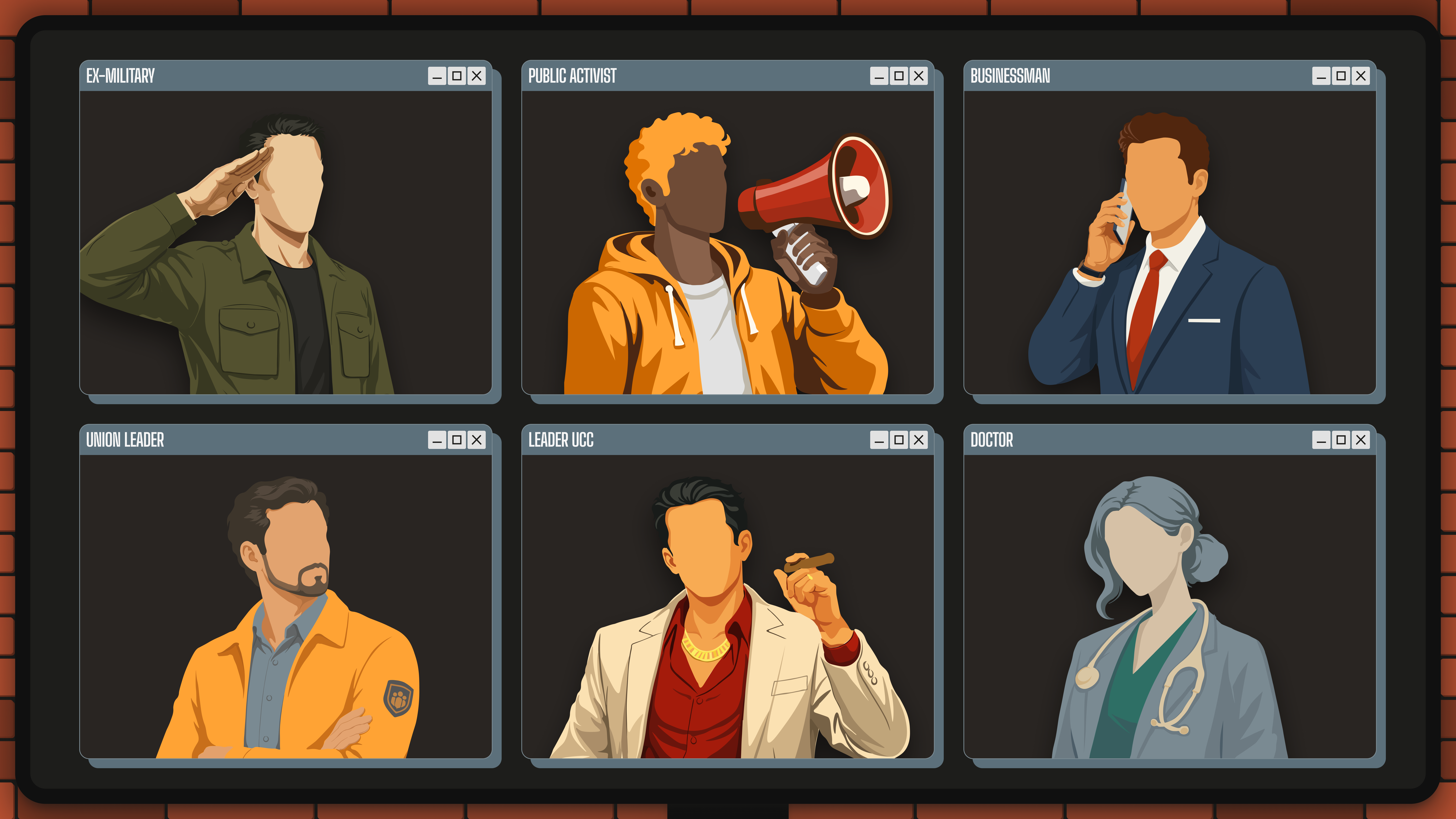
The characters follow the same logic. They're minimal, not heroized, faceless. Each character's color reflects their role and nature within the system. You're not supposed to read them as individuals - you read them as roles, and build your own associations. A union leader, a military officer, an activist, a businessman, a doctor, a party leader, or a crime boss - none of them is the main character. They're all different.
Once we figured all this out, we came up with a simple rule for ourselves: the system is bigger than any one person. Not because that's how it should be, but because that's how it feels from the inside. So PODER's identity isn't about style - it's about the feeling of how power actually works. And this is just a small part of what we're building into the game.