
Howdy and welcome to our second Love & Fool’s Gold devlog!
This time, I want to start by addressing how the current demo (i.e. Chapter 1 of the game) fits in with our plans for the rest of the game.
A ‘demo’ can mean a number of things in different contexts, but in our case, it’s as much a ‘demo’ as it is an early stage prototype, or a proof-of-concept. So yes, there will be things changing in the game, and many of these changes have been (and will continue to be) informed by your generous feedback and suggestions! I will talk more about these specific areas in future devlogs, but the main areas you should expect to see changes are in UX/UI, music, technical features, and general polish to audio/VO/narrative (and some subtle fine-tuning of art here and there). There are going to be some minor rewrites to parts of the first chapter (particularly to boost the sense of player agency) as we’re still in the process of finishing up the final scripts, and we want the narrative to be as tight as possible.
I love a good diagram, so I think now’s a good time to show a very rudimentary flowchart to illustrate how the game’s narrative is structured, as has been featured in some of our early videos on social media:
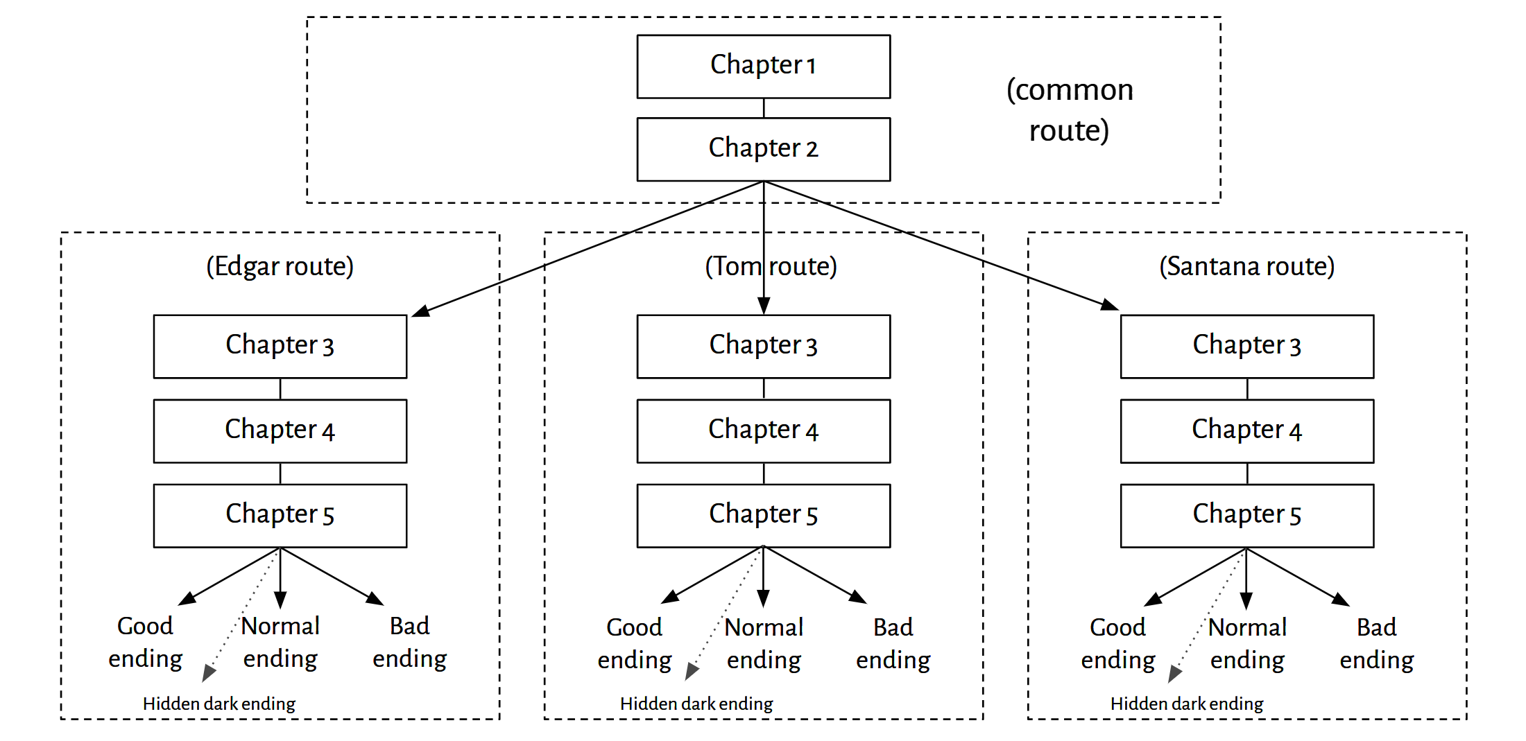
[Note that this is absolutely subject to change as we continue to finalise the later chapter structures (e.g., it’s more likely that the bulk of Ch3 will actually be a common route before the Partner-specific branching occurs).]
There will also be a few additional ‘Bad endings’ not represented on this diagram where the MC (or… perhaps some other characters…) can die prematurely, but I’m not going to tell you where those are.
The idea of structuring the game with this kind of branching is because there IS a set of events that take place throughout the game - so, in a way, it follows quite a linear OVERALL narrative - but the MC’s choices do determine where the story (and its characters) end up. That’s why you won’t see a ton of significant branching occurring within Ch1 (the demo) - the main branching occurs when you make the decision of which character you want to partner up with. And, as each of the Holy Trinity is involved in the core plot in a different way, the story unfolds to expose a different side of this story, depending on who you choose. We took inspiration from games like Mystic Messenger for this aspect of Love & Fool’s Gold’s narrative design.
With that said, even if it LOOKS like there isn’t much branching happening in Ch1, and hence you might assume some choices don’t carry much weight, we’ve also got another mechanism working behind the scenes that determines what route you end up on - Relationship Points! So you gotta be careful what you do and say, because these things might come back to bite you on certain characters’ pathways…
Anyway, this idea that the story unfolds differently depending on who you choose as a partner is another reason why we cannot, sadly, make characters like Randy romanceable. I hate to be the bearer of bad news, but if Randy were an option, we wouldn’t have much of a story to tell. WITH THAT SAID, you can bet that we have a ton of ideas for future content involving Randy, and sure, that means a Randy dating sim DLC too. Whatever. Fine.

The game’s branching structure also means that it’s absolutely designed to be replayed! Just like Mystic Messenger, a single-character route playthrough won’t be sufficient to get all the details in the events that take place in the game. You will need to play through three times (one with each of the main character routes) to uncover everything. (That’s another reason why we won’t force you to romance any of the Holy Trinity to get their route’s good ending - we won’t ask you to be unfaithful to your One True Love by pursuing another romantically in a different playthrough, if you don’t want to do that.)
One thing we’ve been spending some time on the past few weeks since our last devlog is giving our UX/UI a bit of loving! The version of the demo currently up on Steam was made by an even smaller team than we have now - just three core members, only one of which was full time - so we had to be scrappy with what we could put into the game given our limited time and resources (we had no funding at this point). This is my feeble excuse for the very bland UI currently sitting in the demo, and by “very bland” I mean it’s literally a plain black box set to 90% opacity. (Also, I can be rude about the UI because it was me who did it.) I’ll be the first to admit that UI art isn’t one of my strengths, and my main priority was simply to put something in the game that looked different from the default UI that Ren’Py offered, because there’s personally nothing I hate more than UX/UI that looks straight out of the box. I should also add that we’ve since migrated development from Ren’Py to Unity, with the help of the NaniNovel plugin.
So, yes, you can DEFINITELY expect the game’s UI to have a facelift for the full version! We want to incorporate more Western themes and motifs into the game’s look, but also use the UI art as an opportunity to distinguish between characters. So we’ve been exploring different dialogue box variations, as well as different looks for the in-story choices, and how (and what) we can communicate to the player through the use of colour, without breaking away from the game’s style guide/core visual essence.
On the topic of in-story choices, I want to spend a moment talking about my approach - because whilst UI isn’t one of my strengths, I do have a soft-spot for UX.
Ren’Py is a fantastic game engine - it’s easy to use, possible to customize, and generously free. But its default UI screams Ren’Py, and for me, as a player, that means instantly breaking immersion.
 [Source: ‘The Question’, Ren’Py tutorial project]
So whilst I didn’t have the artistic chops to do a complete rehaul of the UI art beyond changing the png assets to a clean black box with reduced opacity, I DID want to ensure that the positioning of choices was switched up a little so it wouldn’t have that same centre-aligned, uniform-width, vertically-stacked layout as the default Ren’Py choice menu. Additionally, as I mentioned in my last devlog, it’s also an ongoing intention of mine to break Love & Fool’s Gold out of the standard ‘visual novel’ mold as best I can, as I don’t want to alienate players who wouldn’t typically consider playing a VN.
I started the process by looking at narrative games with designs I admire; seeing how these games present in-story options to the player, and what approach would work best for Love & Fool’s Gold. I realised I particularly love where the UI is actually integrated within the scene - the choices are positioned around characters, or objects, which makes you feel even more involved in the choice and the story.
 [Source: The Quarry, Until Dawn, Detroit: Become Human, As Dusk Falls]
Having made this decision, I headed back into Visual Studio Code and played around with Ren’Py’s backend scripts to see what I could do. Wrangling Ren’Py’s back-end into customising the UI layout proved a bit of a challenge, so I wasn’t able to go as far as I wanted with limited time - i.e. to have a totally unique positioning of the UI options for every single instance. However, I came up with a compromise that allowed me to set up a few different choice layouts, and then inside the story scripts, I could use parameters to specify which layout to use for each choice menu presented to the player. This also meant I could switch between horizontally-stacked and vertically-stacked choices, depending on what was happening on the screen behind the choices.
Here’s a few examples of how that looks:
 [A/N: my favourite parameter has got to be “bitleft”. What can I say; I’m a wordsmith]
As for the horizontally-stacked choices, I had three displays to choose from: ‘narrow’, ‘wide’, or ‘widest’. Here’s widest:

This meant that in the game, I could pick the best fit for each unique scene layout (or create a new parameter with more specific positioning):
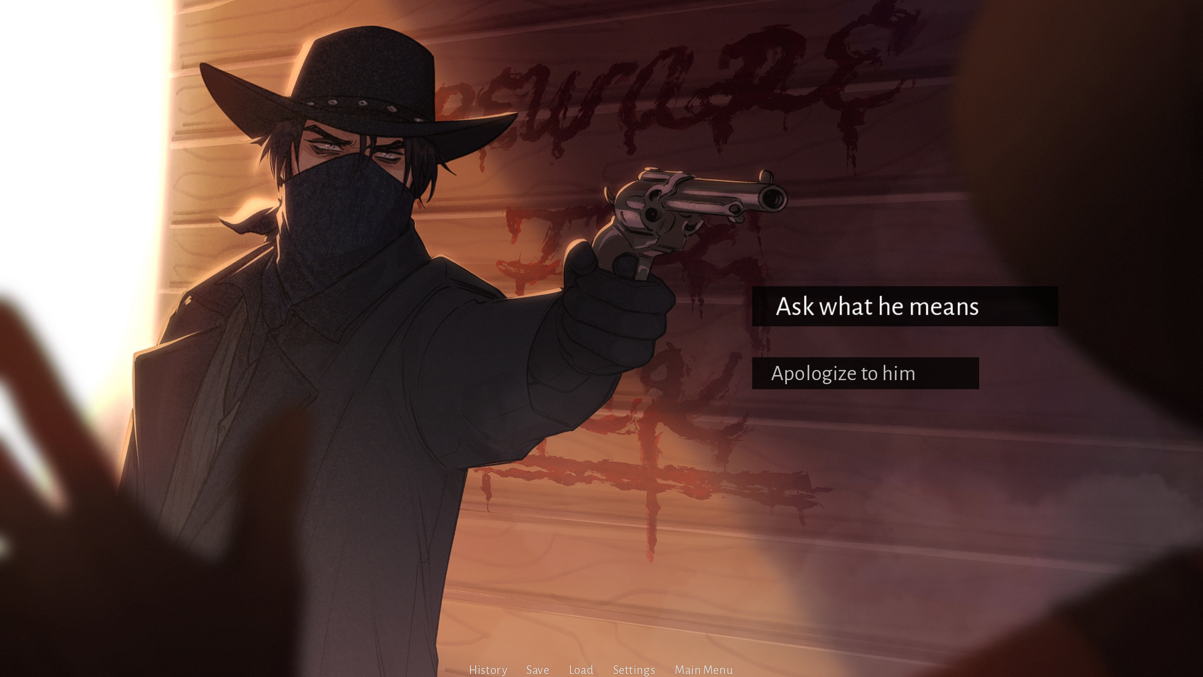
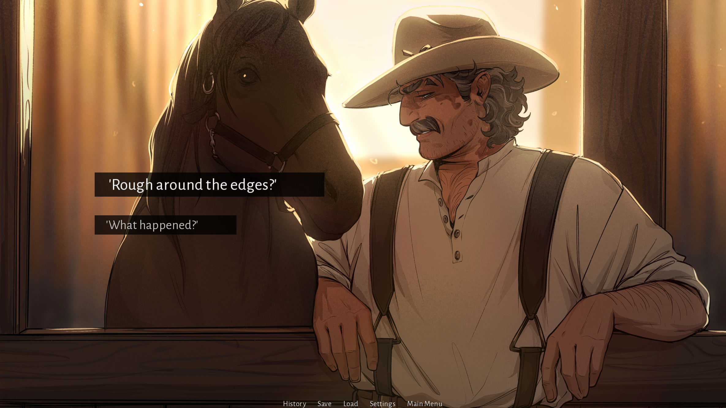 [A/N: deciding whether to eat Randy’s Famous Buffalo Stew calls for the dramatic ‘wide’ UI positioning…]
It was still a bit of a way off the initial UI mockup I started with (shown below), and not QUITE integrated into the environment or characters - but one of the things I learnt is that if you want to get a demo out in time, you have to be prepared to make some compromises! And I’m looking forward to nailing the UX for the game’s full release.

See you next month for Devlog #3!
Beware The Elk,
- Anna (Alu)
Read Devlog #1!