Hello,
Time for an update.
We just polished the capsule art and I want to share with you the process we went through.
Old capsule:
This was the old capsule art.
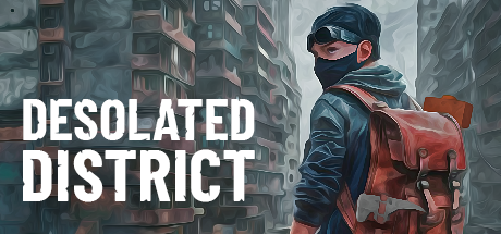
The point of the capsule art foundation was to show the environment(because it's a big selling point for us) and the main character with the crafting tool.
Polish
Here are a few polish iterations we did:
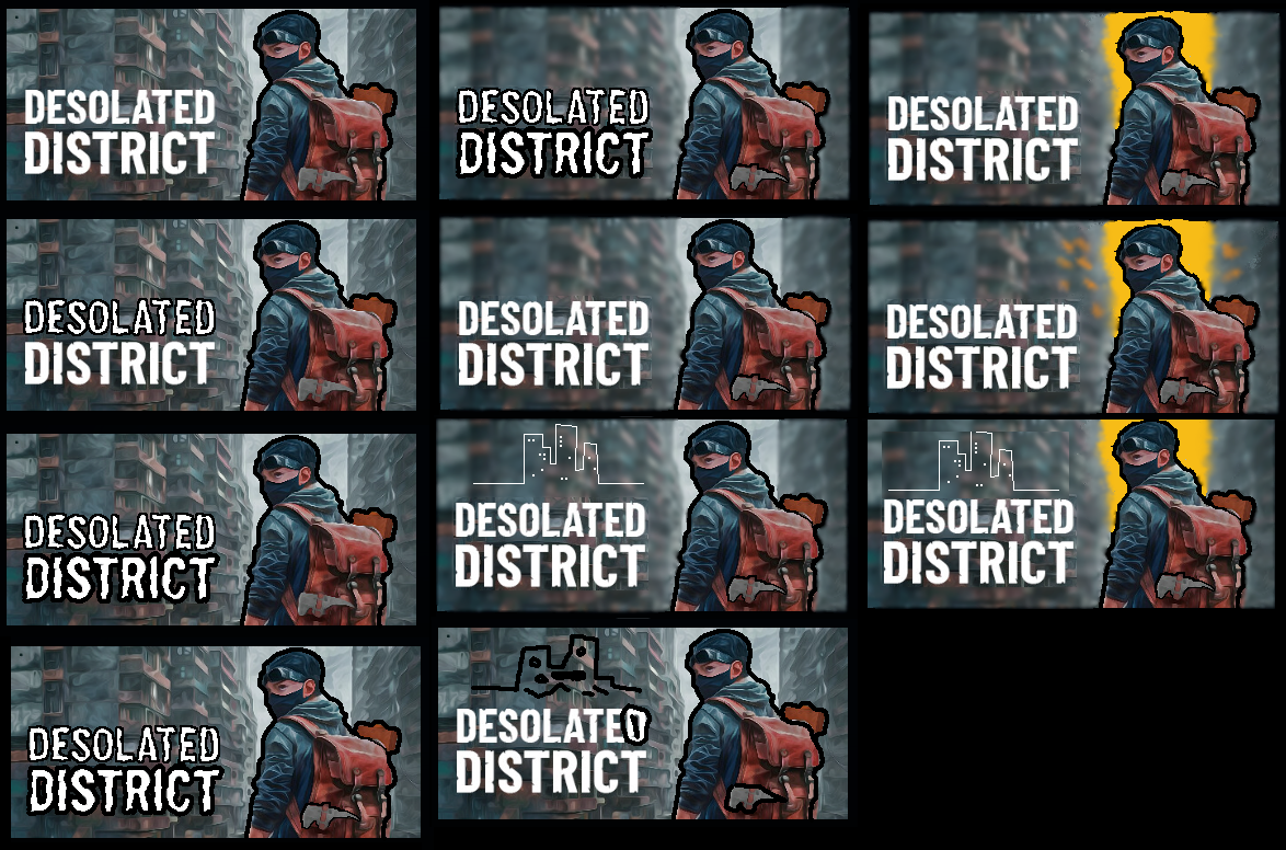
And here is the list of improvements and reasons for them:
- blurred background = so that the character and title text don't blend in with the background too much and stand out more
- Orange/yellow sky color = so that the background character is more heighted and for the capsule to stand out a bit more in the sea of capsules, it is well known that bright colors in capsules help a lot
- City logo = so that the game is more recognizable in a matter of branding
- character black fade outline = so that the character gets even more highlighted including his crafting tools, this is after all a crafting game
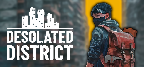
Here is the final result:
Hope you enjoyed the read.