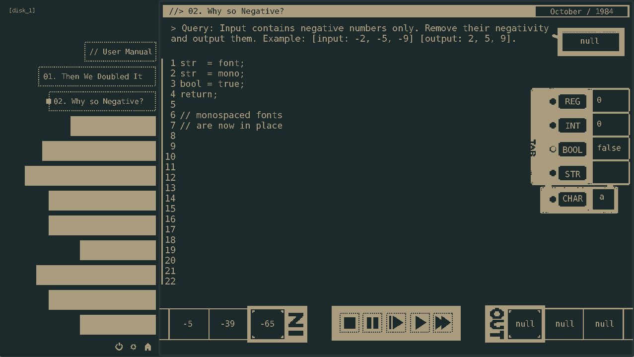
Previous fonts used for the game, were non-monospaced and it didn't quite fit the aesthetics of retro-computing as well as making the block caret look weird on some characters. They are now changed to monospaced fonts, so now Comet 64 looks sharper than before.