
Hello, today we will present the current state of the Artistic Direction. As a reminder, the artistic direction applies to both visuals & sounds but we will focus on the visual part in this devblog.
First of all, the artistic direction of Palallel is restrained by one thing : our skills ! Sometimes, game dev teams lack expertise in some domains. In our case, we don't have a lot of experience in asset creation.
This skill issue guided us in our search for an artistic direction. We wanted to create a visually entertaining and simple game while keeping it kind of unique and refined.
What a game requires in terms of production is a balance between time spent and the final quality. Our artistic direction needed to be :
- Easily replicated,
- Doable with our expertise,
- That fits our game (object variety, feedback needs, coherence of all elements)
In the beginning, we started by looking for something simple, without details that don't constraint us. The first visual leads are based on simple, filled, geometrical forms.
In the meantime, some Game Design problematics added some new needs like Naming/recognizing a particular object to facilitate the communication between players and their organization.
The solution we are reviewed currently is the colors. We make sure that each object has a part with is own color. This allows players to name an object by its color.
Being in charge of the graphical part, I've made some tests to simulate a "retro neon" theme but it didn't fit very well. It was either too simple, too dull, too bright ... However, we liked the "wireframe"/"object borders" aspects.
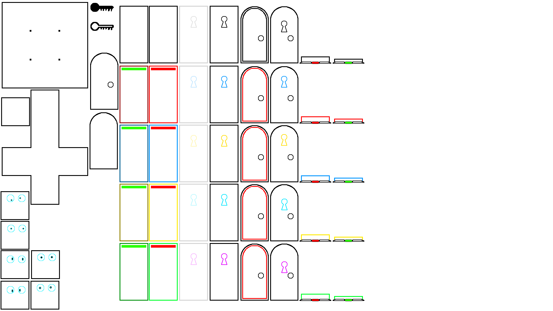
Here are some plates of the first attempts :
At the start, we tried a white background and black lines.
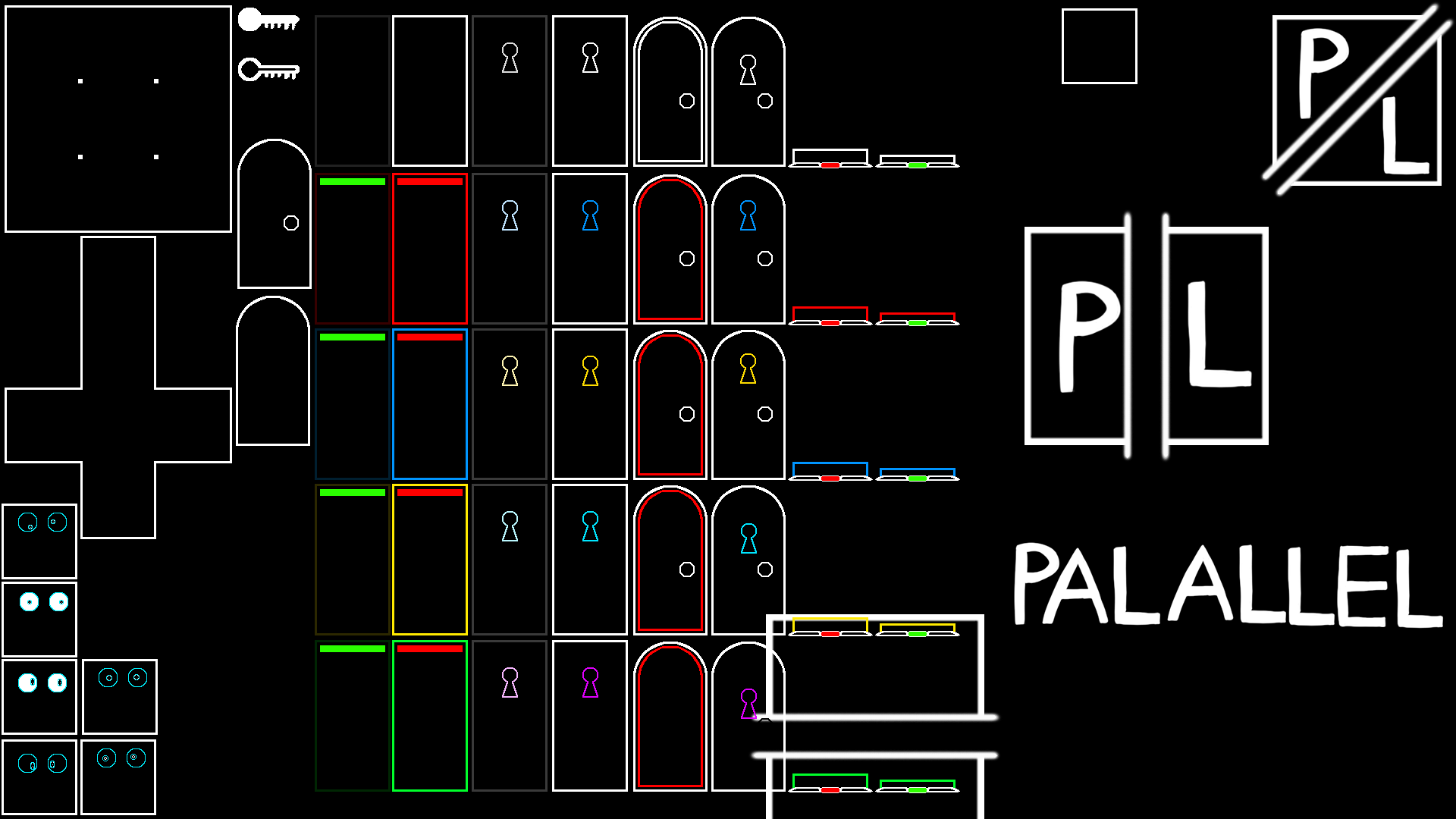
Then, we switched to a black background and the first tries with the title and logo appeared. These changed quite a bit.
This one was a new test with filled shapes. I liked it personally but something "fun" was missing. It was rigid and a bit cold despite the colors.
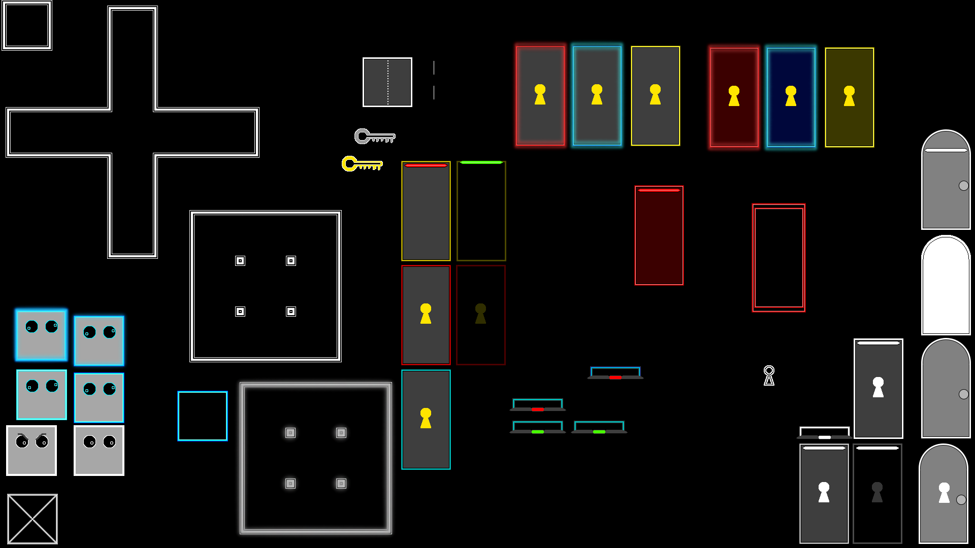
On this plate, only one thing really changes. It's the closest to the one we have currently.
Among the solutions we considered, we mentioned one that allocates a letter or a shape to each object or even adds a name to each object. Bit it didn't really the artistic direction we wanted to have.
Our original thought was to create a "doodle" or "shaking drawings" theme. This aspect of handmade drawing was put aside, but an alternative brings us back to this "awkward" drawing.
For those who are interested in the way we found the current lead :
We were in a talk about the attempts above. After a while, we tried to change the colors of the background : red, blue, yellow... We then tried the green. Which worked pretty well and gave a "school board" aspect. We liked it even though we found it a bit randomly by messing with the bucket tool. Then, I've made some tries with brushes to create a chalk effect. The result was convincing enough : it was our next lead.
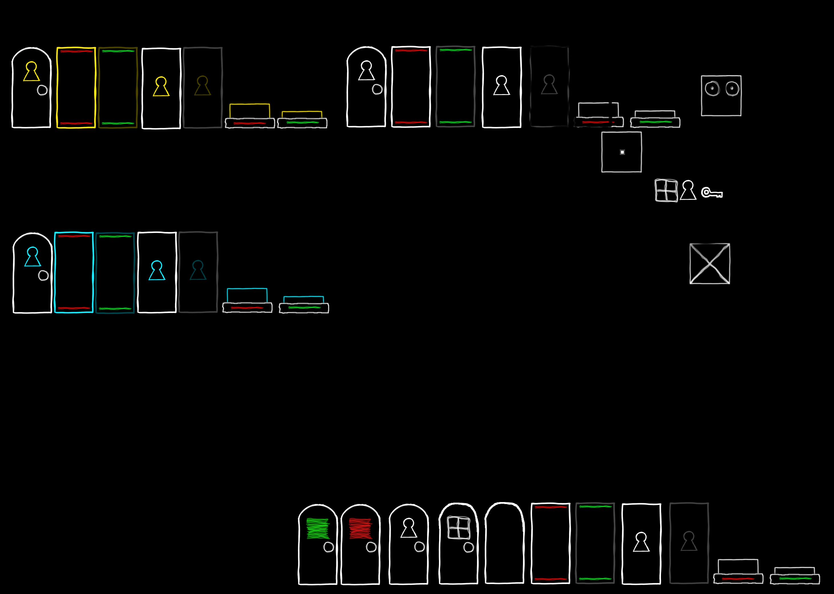
After a bit of polish, the first concept art appeared :
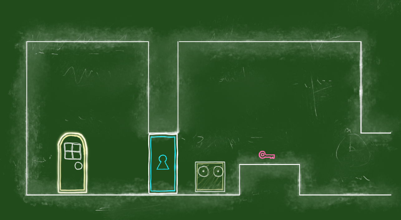
In the end, we chose this school board aspect. It allowed us to : make simple shapes for sprites and create an identity bound to the chalk/board and school theme. This direction also gives the impression that puzzles are handmade with chalk on a board as if a child was playing.
Finally, this theme gives us some justification about the game's ambiance or for a potential story. This cartoon aspect is easily exploitable and it was one of our goals at the start : create a fun game even with the artistic direction.
We were happy with this concept art and so were the people we showed to. It was a good start !
That's how we found the first visual artistic direction.
It's the end of this devblog about our attempts before the current artistic direction. I hope you liked it and found it interesting despite the lack of technical content.
See you soon for the next devblog !
Thomas