
We’re alive! It’s been five (!) months since our last post but we have been working, I swear.
Well, we’ve been mostly working, I did have three weeks off to get married and go on my honeymoon, and Dan and Sarah have moved house into the English countryside, literally in the middle of the woods. This, along with the shorter and colder days, has certainly lent a more Summerford vibe to our surroundings!
Also on a side note the dev blogs are a bit messy on Steam. Steam refuses to let us delete duplicates or rename anything right now, but hopefully that will be fixed soon. Rest assured, this is definitely dev blog #8.
Lighting and Atmosphere Overhaul
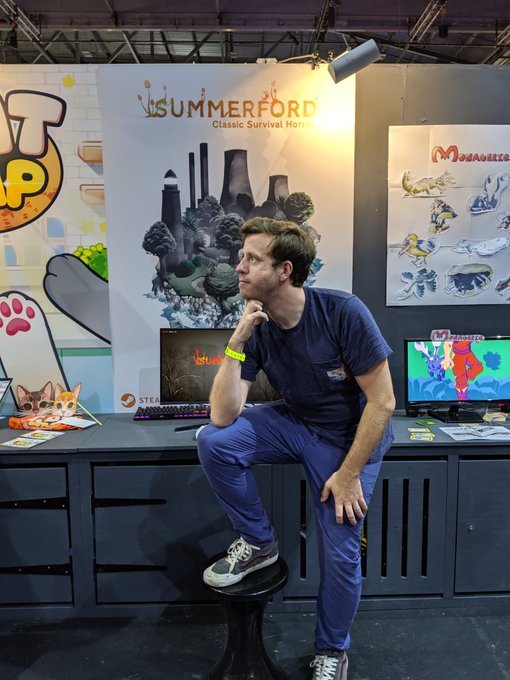
Rather than jump into exactly what we’re working on now, I thought a quick catch up on our last blog would make more sense. We’ve spent a long time polishing the early areas of the game, partly for our own sanity, but mostly for our trip to EGX in October. Here’s a picture of me looking cool that Dan took on the third day:
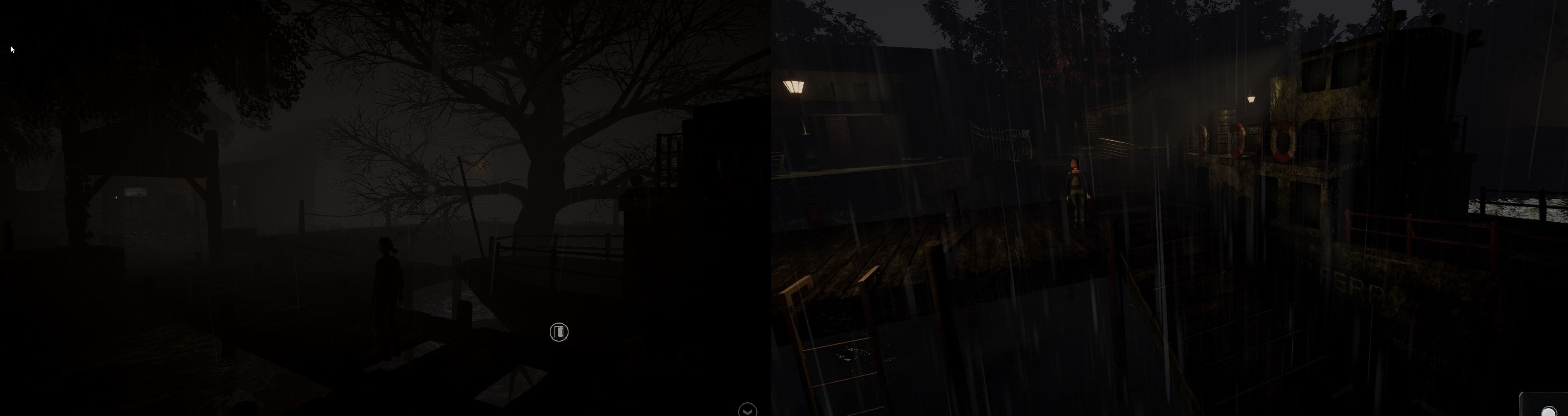
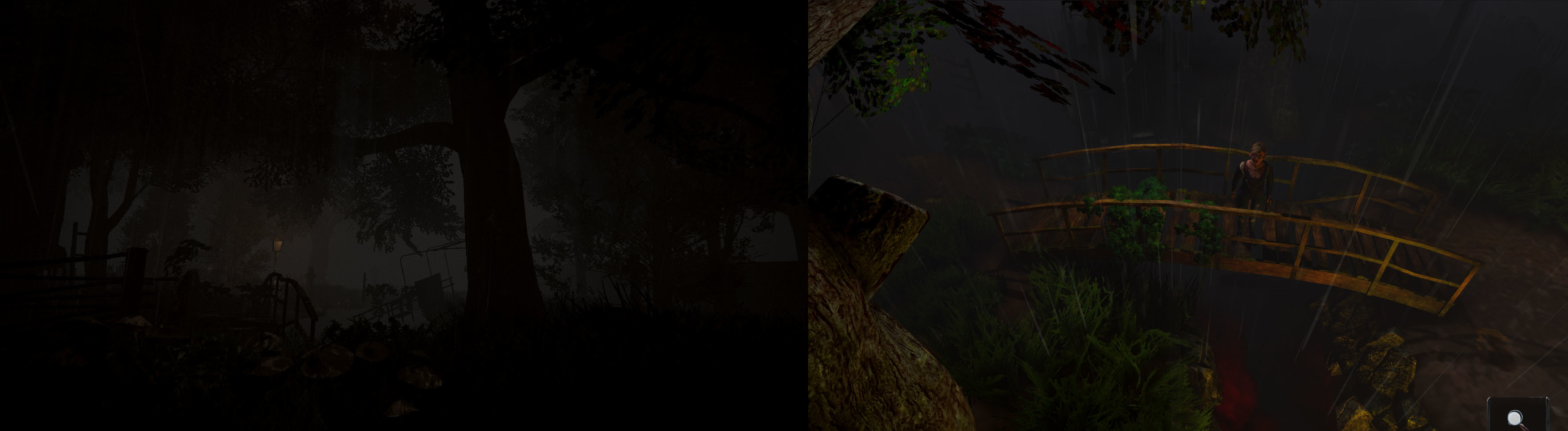
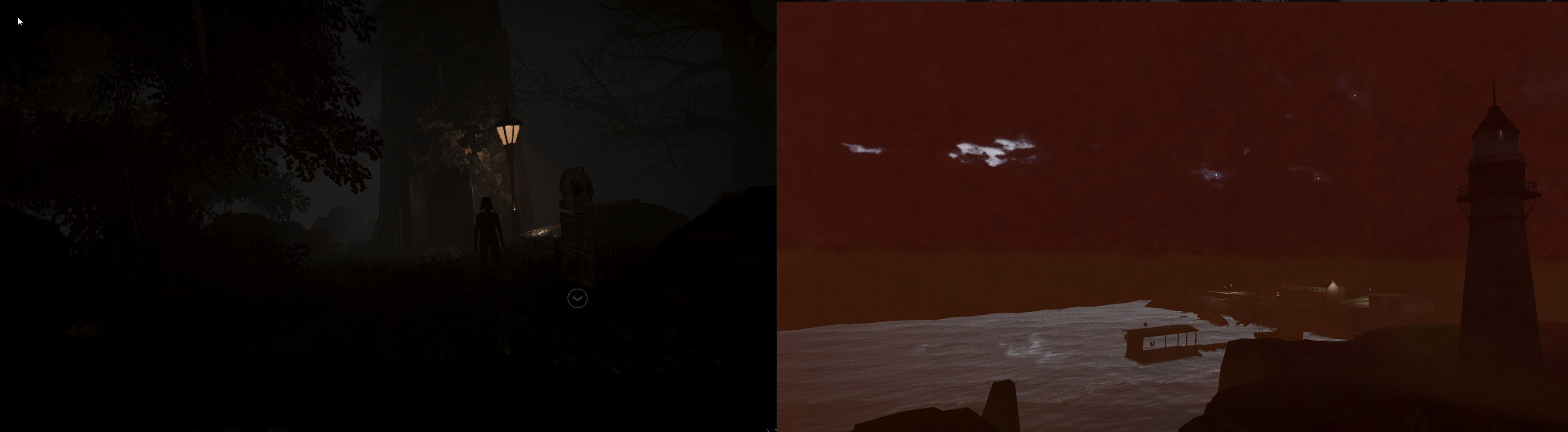
The biggest change is really a complete visual overhaul in those areas in terms of cameras, lighting and atmosphere. As far as outside areas are concerned at least, I’m really pleased by how everything is coming together. The game now has a more consistent, muted colour palette, and we’ve managed to get things like fog where we want them. We’ve now got a more oppressive atmosphere that feels a little more "unique".
UI Overhaul
One of things about making a game inspired by older titles like the original Silent Hill, Resident Evil and Alone in the Dark is that you have to decide where you want to adhere to retro design philosophies and where it’s best to modernise in order to make a game that's more playable in 2020.
One of those decisions was made during EGX this year, as we watched people play the game: we don’t really want people having to ‘search’ for things they can interact with. In most older survival horror games you’d be running around pressing X on everything to find out if you could pick it up, or get clues, or open doors.
This really isn’t that enjoyable for most players, and hunting for missing objects is never great for the pacing of a horror title. We’ve taken some cues from more modern adventure games like the Telltale series, and the Resident Evil 2 Remake, to come up with a UI system that highlights interactable objects. It looks like this:
In order to achieve a good balance of accessibility and not clutter up the UI, we fade icons out as the player moves away from them. Different items can be faded at different ranges, so we can keep critical items on the screen for a little longer, while more obvious things like doors won't show up until you're closer to them. The goal is to make this whole system optional, too, so if you do want to play without any hints, it'll be possible!
That's it for this week - we're currently working on one of the the main Summerford village areas, but I'll talk more about those next time.
Thanks for reading!