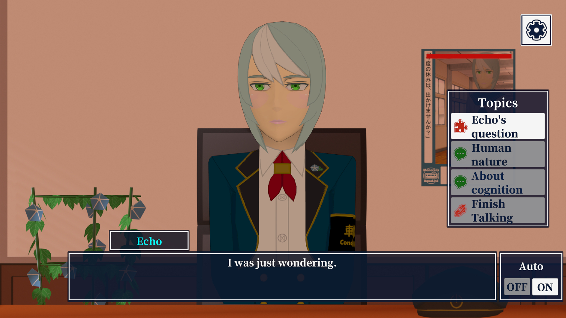
The previous layout was designed with reference to the old-fashioned ADV.
These have a simple UI and the text is easy to read, so I personally like the design.
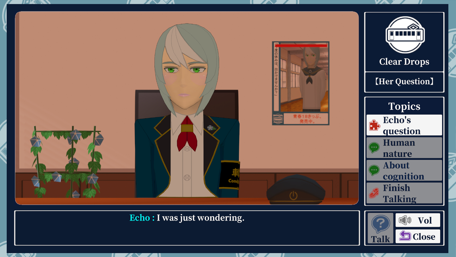
However, there were two problems with the screenshots displayed in the store.
1: When displayed compactly, the character screen is quite small and visibility is poor.
2: Since there is no change in the frame and UI, the image tends to look monotonous.
For these reasons, I have changed the layout to the following: