
Opening Remarks
Hello, everyone,
Welcome to RSP’s Steam developer update.
We have taken over this account, and yes, be prepared, the next few updates may include team-building activities, so please be aware and prepare mentally for this. If there are players still concerned — we understand. After all, restoring trust takes time. We are ready to put in real efforts to rebuild certain things.
In any case, as per usual process, I will share behind-the-scenes details of RSP's development with you. These updates might cover a range of topics, including gameplay, mechanics, weapons, equipment, and more.
You’ll also have the chance to get an early look at upcoming content, so stay tuned!
Starting from this update, we’ll have the developers themselves introduce their work, avoiding any PR manager’s gloss.
Of course, a big part of sharing all this information with you involves hearing your thoughts — so please let us know in the comments below, and we’ll take notes!
Now, the mic goes to Нариман, who will present his development progress report on "Redshift Point."
**
Rocky Start: Fixing Past Mistakes
**
Firstly, we encountered serious integration issues when taking over this level, as it was inherited from former developers who have since been dismissed. The map had severe performance and design flaws; while it may look decent to the untrained eye, it was virtually unusable. To make things worse, I heard they even handed over this map to our leadership and presented it as part of a holiday display, tarnishing our reputation with such an unprofessional piece.
In the end, we managed to resolve these issues. The head of the technical art team will showcase this part in his development report, so I won’t go into detail here.
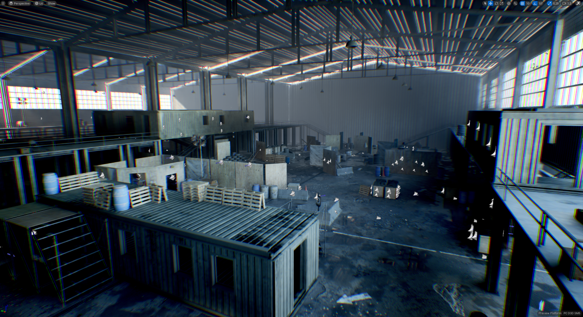
Even after optimization, the map’s design remained poor, and to make things worse, it lacked any connection to the storyline, making it unrelated to the world and the game. Overall, it was better to rebuild the level from scratch.
Thus, we salvaged some barely usable models from this level. Then, we wrote up a new level design document from scratch, discussing what we wanted to achieve in this level. After completing this, we created the level layout, detailing gameplay elements such as player objectives, key areas, and so on. We then began constructing the level layout to understand object placement and overall visuals while testing lighting setups.
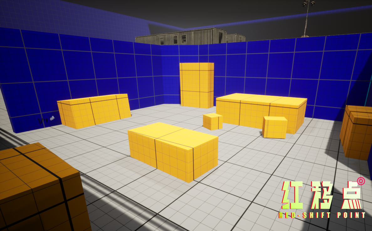
Based on feedback from this layout phase, we collaborated with the narrative design and art departments to align on the concept art and stylistic requirements for the level. The narrative team told me they’re preparing a prologue mission called "Ruthless" from the "New America" faction storyline to serve as the demo level, focusing on themes of bandit suppression.
As an environment artist, my main focus was on the visual style. Starting from September 16, the art department gradually submitted concept art, personally reviewed by Comrade Raier. The documents brought a surprising twist. Our department initially expected some kind of Chinese post-apocalyptic, anti-war theme or even a Soviet retro-futuristic sci-fi style, but it was nothing like that. It’s the first time a shooter game has reminded me of "Disco Elysium," setting it apart from our "Stalker" or "Metro" series.
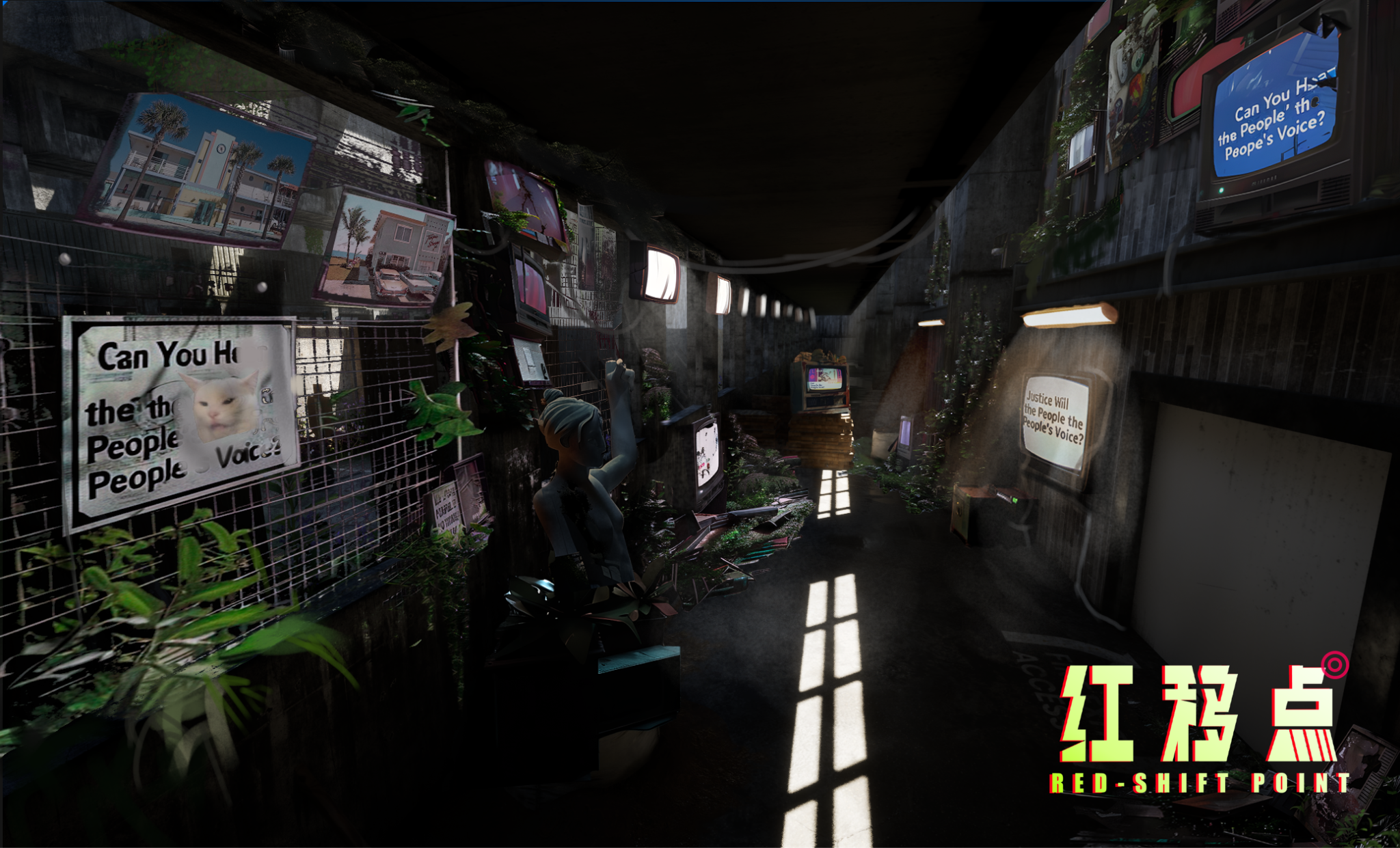
I may be praising him too much, but I’m thrilled that the style of the Redshift series is finally cohesive; I’ve waited so long. This transcends previous approaches, avoiding Soviet-style indoctrination or inexplicable preachiness, instead employing contemporary materialism and futuristic historical perspectives to tell the story. It merges philosophical themes of the era, technology, and society into an epic sci-fi narrative.
As an environment artist, creating such an unprecedented style that differs from other FPS games on the market is exciting. After understanding the layout, we moved to the environment art phase, where we began placing assets, adhering to the conceptual style.
**
Demo Environment Design: "Welcome to the Wilderness of the Real"
**
Here, I’ll showcase how I step-by-step recreated Raier’s and the art team’s designs:
In "Prologue: Ruthless," we encounter the "Rangers," a faction within the Nomad group. The producer explained that in the story, the Nomads differ from "Fallout" wastelanders or "Stalker" dwellers. In "Redshift," the intent is to depict a post-modern control mechanism: The American Free Zone Nomads organize through covert information manipulation, not violence or simple cult-like brainwashing seen in "Far Cry." They don’t resemble the soulless raiders of "Fallout"; instead, they see themselves as "defenders" or "fighters for comrades." They submit to an imagined community, believing they are heroes rather than killers. Through self-validation, brainwashing, double standards, emphasizing victimhood, performative protests, exaggerating their circumstances, glorifying their group, and demonizing "enemies," they justify their actions.
So, in environmental storytelling, we should avoid the barbaric aesthetic of American wastelands or the dreary style of Russian post-apocalyptic worlds, instead filling it with chaotic, flashy consumer goods, meaningless electronic waste, information overload, and pop culture memes.
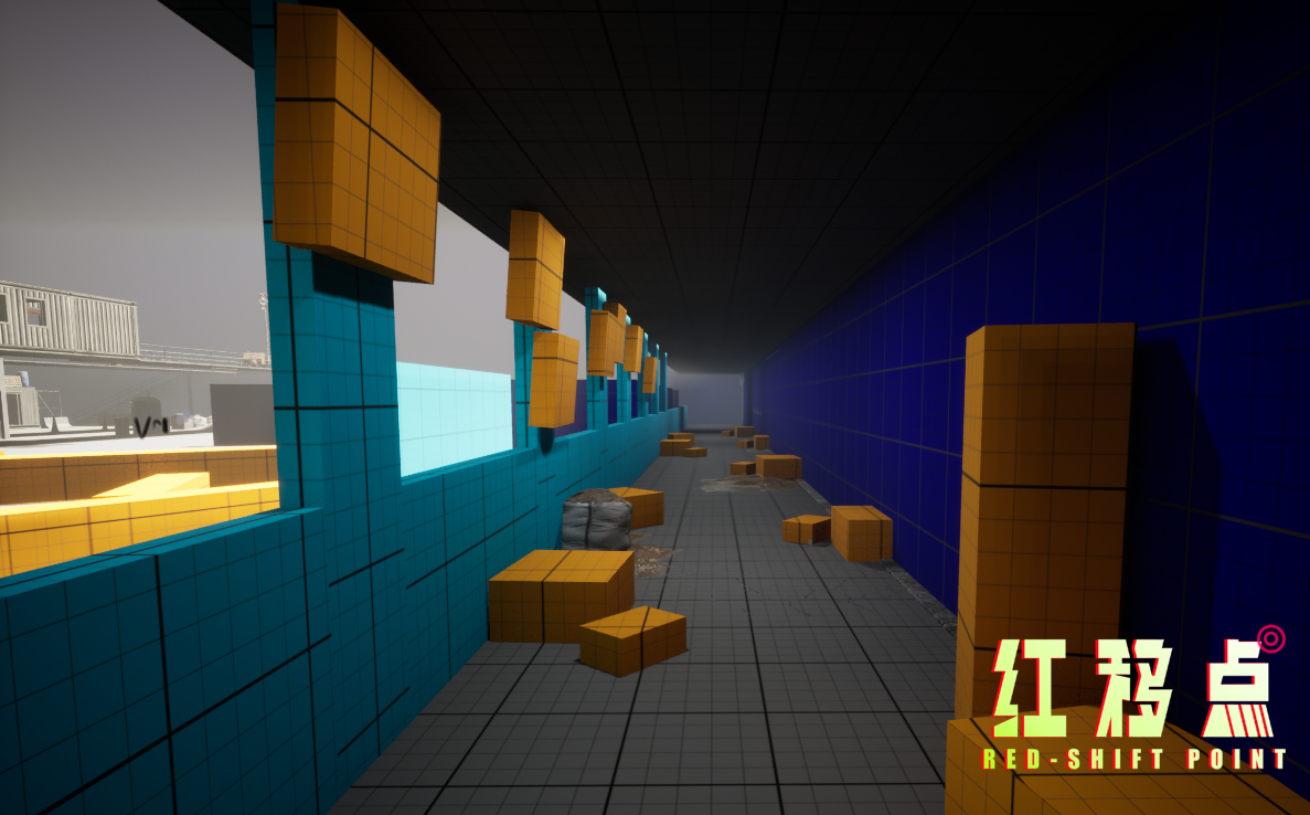
In environmental storytelling, we first set the level on the American West Coast, incorporating futuristic and brutalist architectural styles, symbolizing the Rangers’ attempts to reshape America. However, a few steps further, the player quickly notices signs of past violence: broken infrastructure, surveillance cameras, scattered digital devices, overused corporate products, and fanatical yet superficial propaganda.
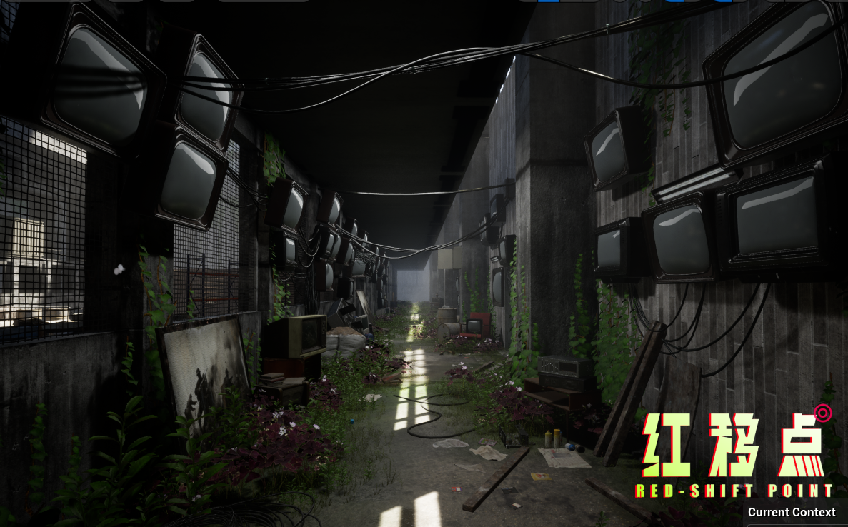
Per Raier’s design document, I’ll paste his original text here because there are some Chinese slang terms I don’t fully understand:
The entrance hallway is lined with rusted fences, and the sign at the entrance is covered with "Freedom Ranger" propaganda stickers. These stickers and banners contain symbols of pop culture from 20 years ago (2024), including anime characters, meme videos, and outdated internet memes. The entrance is filled with screens endlessly playing recruitment ads for the Rangers, edited with AI filters and quirky effects to glorify the old American prosperity. The audio is accompanied by "Big Stone Crushes Jimi" and personalized sound effects.
The Rangers consider themselves saviors, fighting against evil, yet their lifestyle is deeply infiltrated by real malicious forces. They loudly decry injustice while profiting, ensuring they can afford the latest online trends from the Trade Union.
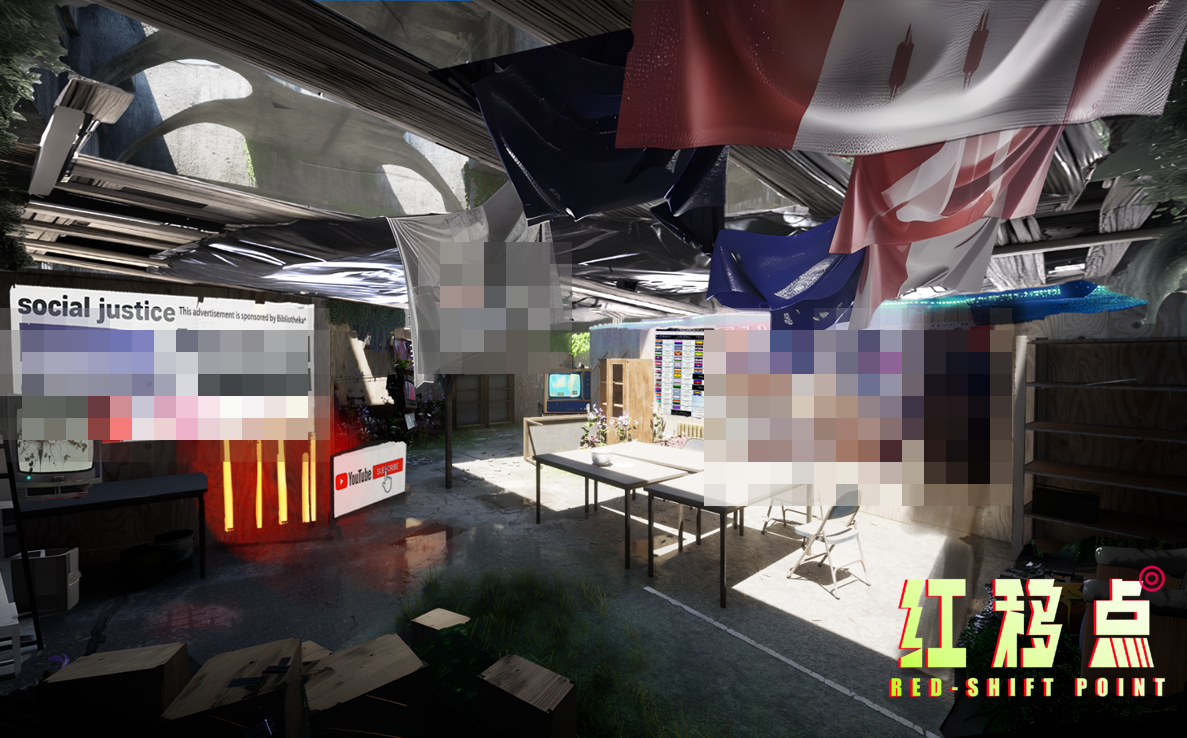
In their settlement, what was once a CQB training area of a peacekeeping force has been turned into multiple living quarters. These spaces are decorated with 2024 pop culture items, such as anime posters, game merchandise, and tasteless meme wallpapers, crammed with digital devices and corporate products. Even the shelter roof bears colorful Trade Union company ads. These decorations represent not just nostalgia but how they manipulate trends to foster a false sense of "community."
The canteen walls have interactive screens showing real-time social media feeds, like meme sharing, video challenges, or trending topics. The screen also displays likes and comments from members, emulating real social platform interaction, creating a sense of integration and community culture through a continuous stream of content.
We need to design corresponding screen textures for this part, so the screens in the current scene cannot yet display content.
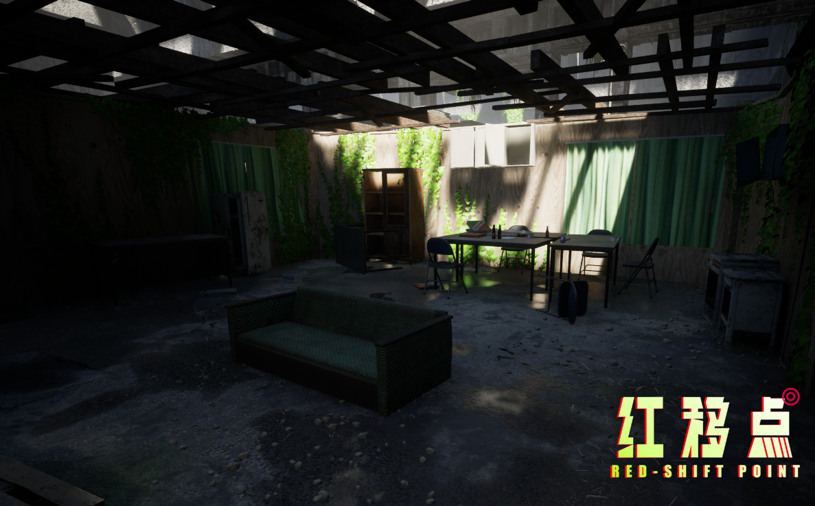
The armory is decorated like an esports streaming room, with walls filled with "personalized" graffiti-style weapons and gear, more of a showy display than a serious military storage room. Here, the fake sense of freedom and "personalized" displays among members hides their actual military purpose.
Additionally, for authenticity, every piece of trash, grass patch, and puddle needs a logical placement, maintaining the narrative of the events.