
How the Content in Shop Crush Is Made
Shop Crush is a story-driven game, which means a lot of development time goes into refining the visuals, audio, and writing so everything supports a single, consistent vision.
That vision, however, wasn't there from the beginning.
The game has gone through several major iterations. Originally, it leaned much more into sarcasm and irony. It had a cartoony art style, and I believed the depth of the trading mechanics would carry the experience.
In those early versions, the real stars of the game were the groceries themselves and the different ways customers tried to get them.
But playtesting showed something unexpected.
Players weren't connecting with the products - they were connecting with the people. The most memorable part of the game wasn't the trading system itself, but the relationships between the shopkeeper and the customers. That changed how I approached almost every aspect of the project.
The story changed as well. While it originally relied heavily on jokes and irony, players consistently interpreted events much more literally than I expected. Instead of laughing at the world, they became invested in it. So rather than fighting that reaction, I redesigned the game around it.
Characters
The first major redesign focused on the characters.
I've shared some of these redesigns before, but what I find most interesting is the process behind them.
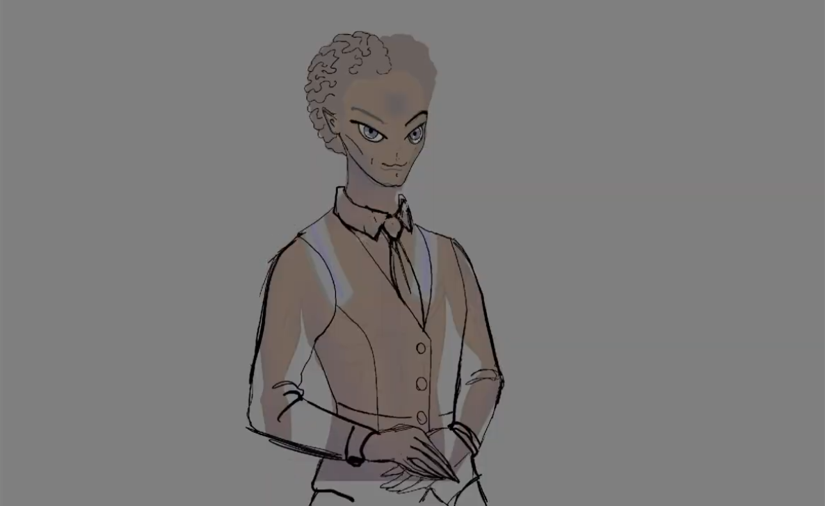
Every character was broken down to understand what role they actually played in the player's mind. We rethought their appearance, expressions, clothing, and posture to better reflect how players perceived them during gameplay.
Since Shop Crush currently has only ten characters, we had the opportunity to make each of them feel distinct. Manipulative customers became more fashionable and expressive, while formal characters, like Mayor Alex, received a more reserved and professional appearance.
Their alien counterparts also received significant improvements. Looking back at the earlier versions, they simply didn't feel convincing enough. Today, I'm much happier with how they fit into the game's world.
Overall, we moved away from plastic, cartoon-like designs toward characters who feel more believable, expressive, and alive. I'm incredibly grateful to our artist for making that transformation possible.
How do you feel about the new characters? I'm curious.
Literal Illusions
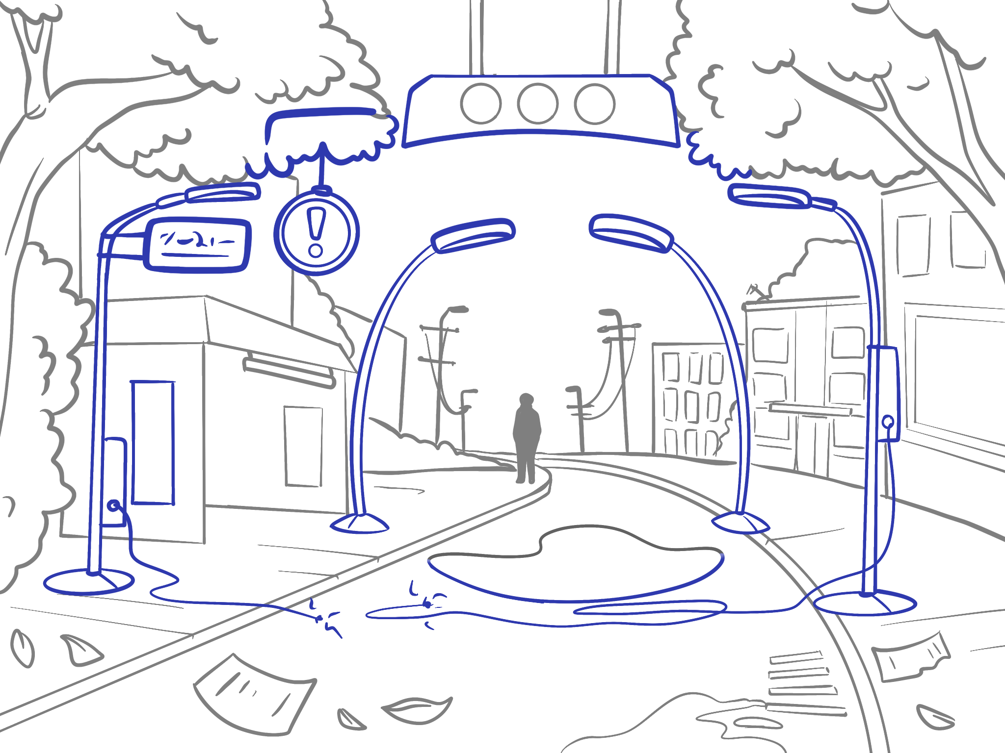
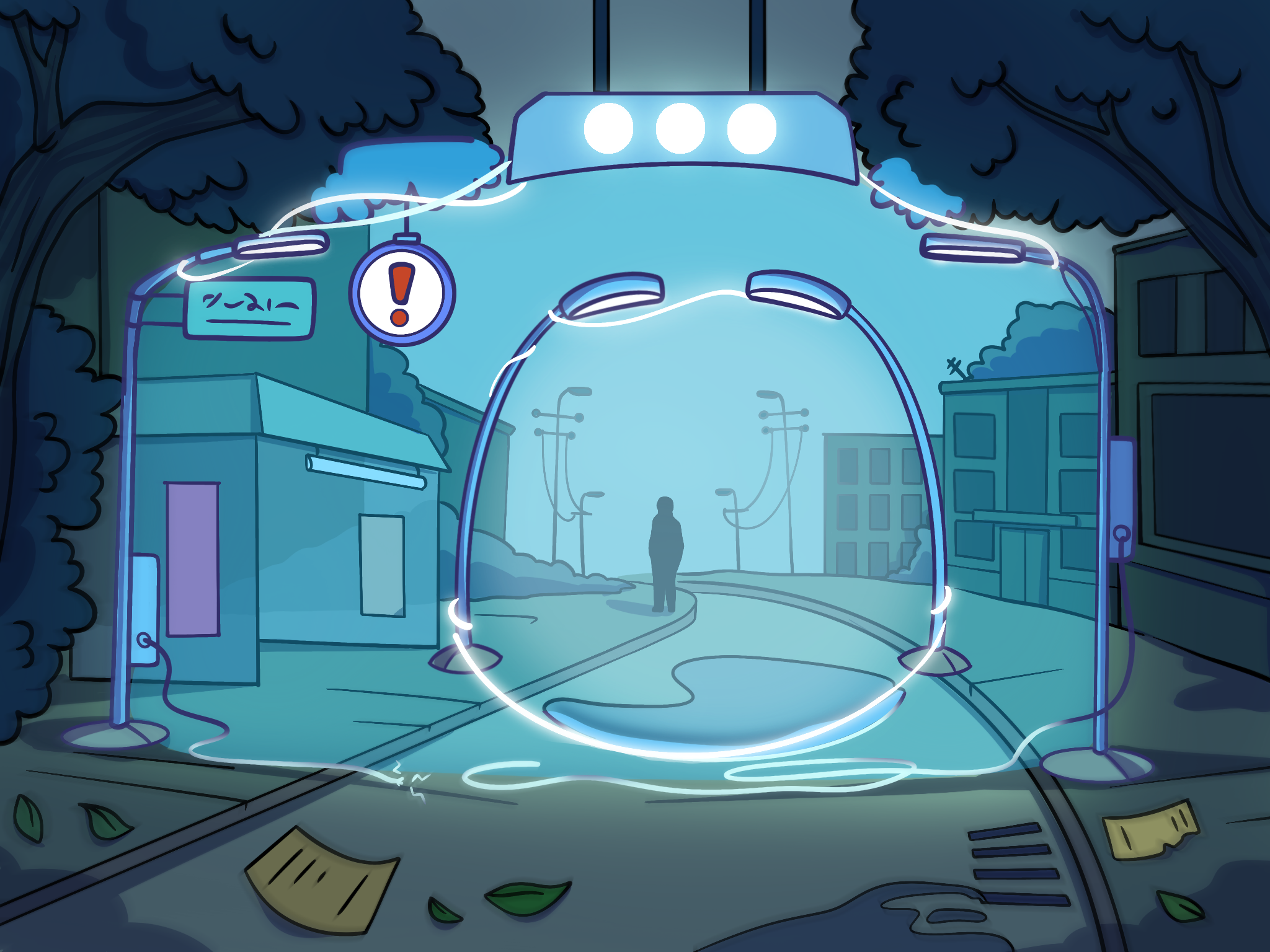
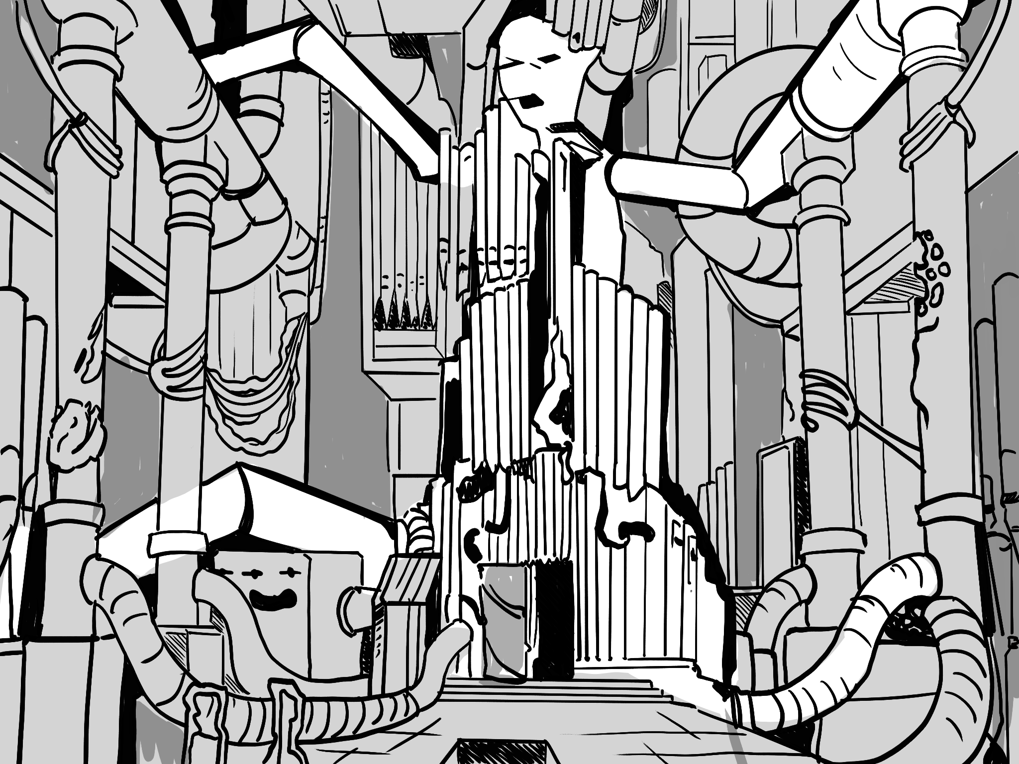
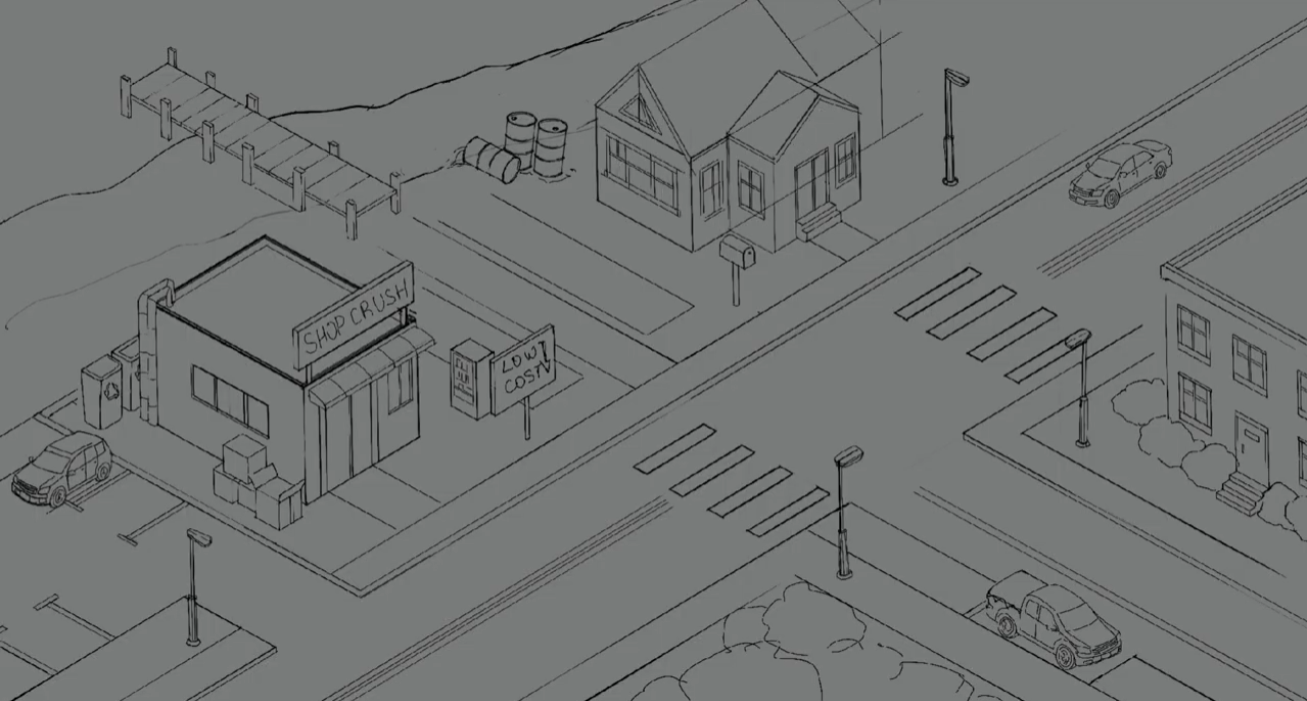
One of the game's core mechanics is Literal Illusions - visual puzzles where one image hides another.
Early in development, these illustrations were created using an AI-assisted workflow. We carefully planned each puzzle's composition, perspective, and concept, then used Think Diffusion to help generate the final images.
However, playtesters consistently pointed out that these illustrations didn't match the quality of the rest of the game. At the same time, many players told us they simply didn't want AI-generated content in the experience.
So we decided to replace every single illusion with hand-drawn artwork.
It was significantly more expensive and time-consuming, but I believe it was absolutely the right decision.
As a designer rather than an artist, I didn't immediately notice many of the visual shortcomings. The players did. Looking back now, the difference is obvious. The new illustrations feel far more polished and fit naturally within the game's artistic direction.
The puzzles themselves also became slightly simpler, but I'm comfortable with that trade-off. I've combined them with hidden-object gameplay elements to keep each puzzle engaging without becoming frustrating.
Like every other part of the game, this mechanic can still improve. It always can.
Interface
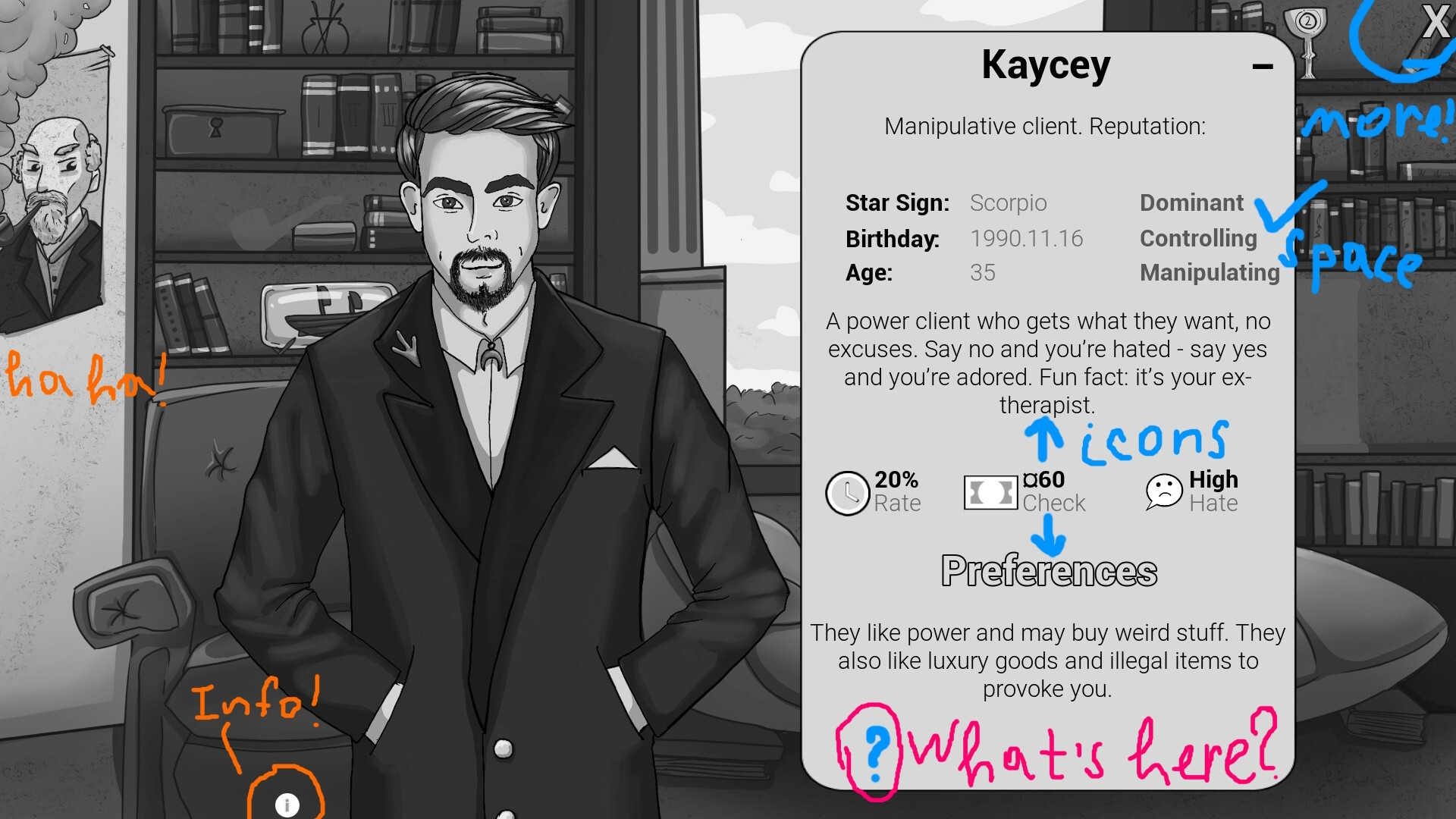
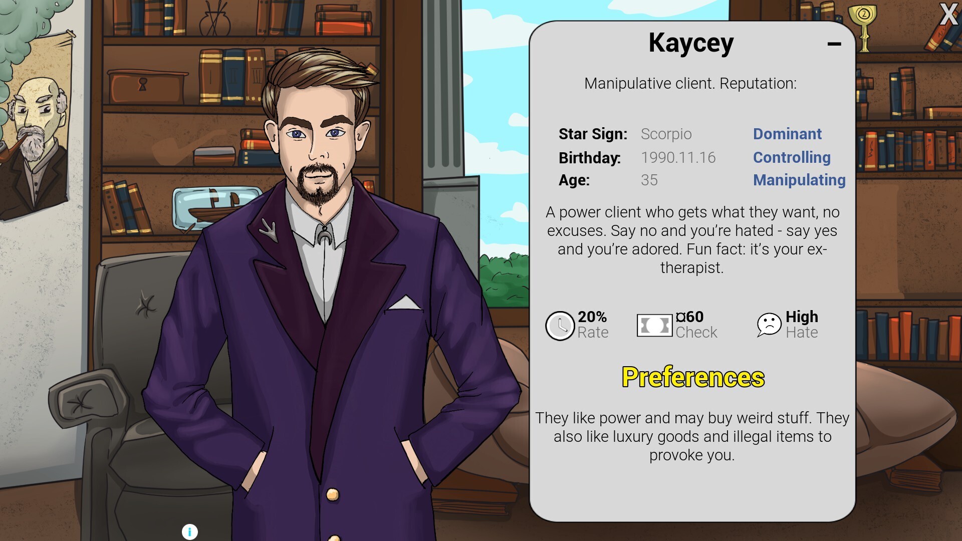
I've always enjoyed UI design, but playtests repeatedly showed that players struggled to understand the game's interface.
That feedback pushed me to study visual hierarchy, layout design, and how players naturally process information on the screen. Every round of testing led to another redesign.
The interface still isn't exactly where I want it to be, but I think it's finally becoming presentable.
For an interface-driven game, the UI is one of the most important parts of the experience. It needs to feel like a natural part of the world while also explaining itself almost instantly. The game doesn't have a tutorial yet, and that's intentional.
Before teaching players how to play, I want to make sure the core concept is understandable without any explanation. If the game isn't intuitive on its own, no tutorial can completely fix that.
Once the demo releases, there will absolutely be a proper tutorial. Until then, my goal is simple: players should understand the core idea just by looking at the screen - or even at the game's capsule art.
Narrative
Perhaps the biggest transformation happened in the story itself.
Shop Crush gradually evolved from what was essentially a meme game into a cozy management game that slowly transforms into psychological horror.
The central narrative is now built around mystery.
Although the game's world is surreal and often violent, I try to present those moments indirectly rather than showing them outright. I take inspiration from older films, where the camera often cuts away instead of lingering on explicit violence. Suggestion is frequently more powerful than showing everything.
That approach lets me focus on different kinds of horror: uncertainty, self-doubt, and questioning the reality of the game's world. There's still plenty I want to improve. I'll probably continue softening the story's pacing, remove even more unnecessary jokes and swearing, and make the player's introduction to the narrative feel more natural.
The story remains the part of Shop Crush that I spend the most time thinking about - and the part I'm most eager to hear feedback on.
Every playtest changes my understanding of the game a little more, and I expect that process to continue long after the demo is released.