
One of the major pieces of feedback we’ve gotten over time is that our HUD and Menu UI is just not doing it for people. It was functional and showed useful information, but it was ugly and we wanted to replace it almost entirely. We put this off initially as it was a large forklift, but we got some feedback about it that really pushed us forward:
- “Alright, I gotta say, the UIs are really bad. [...] This is bad. This is the first thing you experience in the video game.”
- “This is a graphic design disaster.”
- “Geometry Wars has a better UI than this.”
- “It’s so ugly.”
- “They’ve got the basics down right. It’s just the UI that’s a problem.”
We decided to dive head-first into revamping both the in-game HUD and all of the menus. Here are a few examples of what we've done to improve!
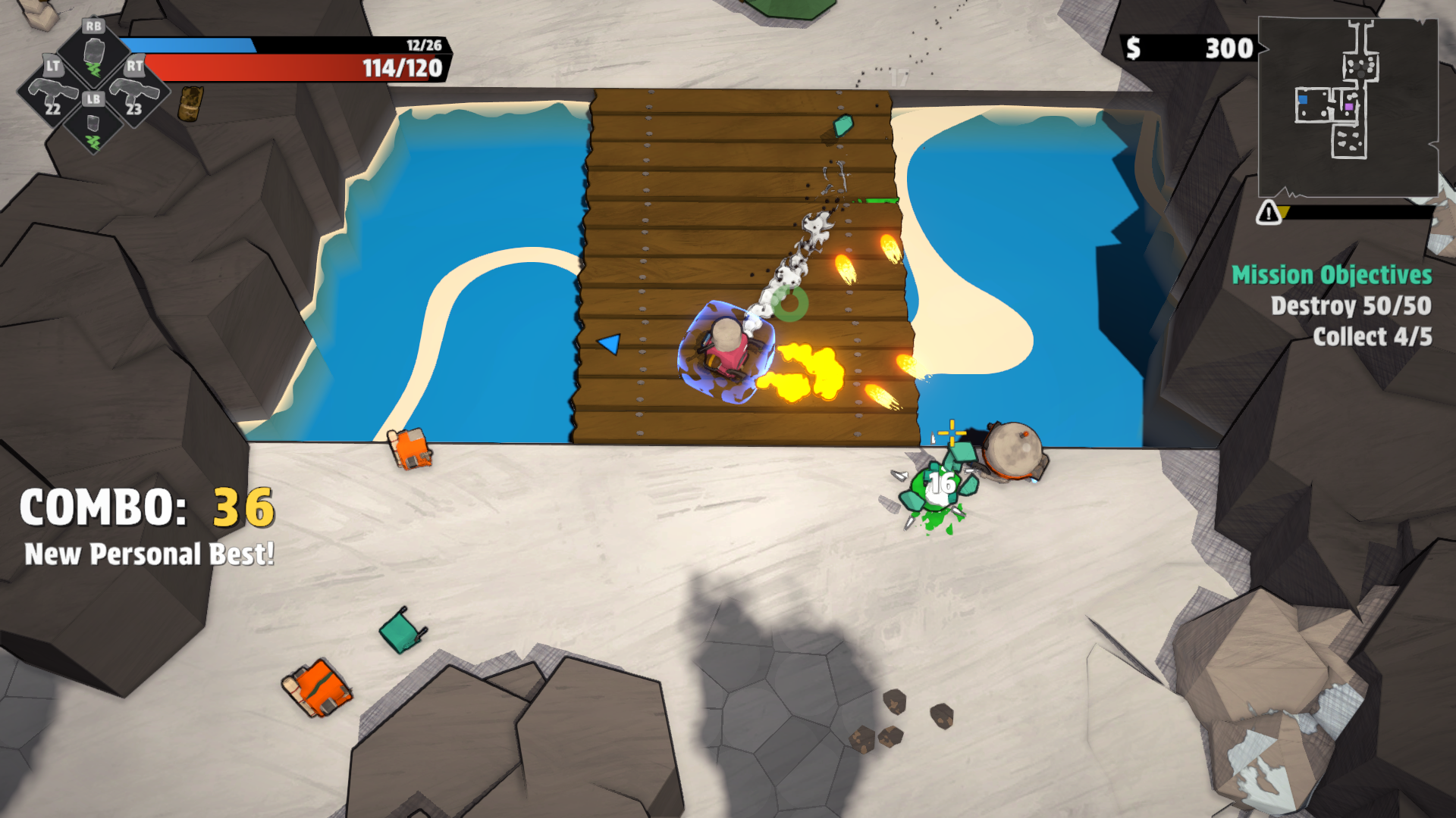
The HUD
The new HUD cluster is designed to take up less screen space yet still show all the information from the previous one. The new Escalation bar takes up a lot less screen space, positioned towards the top right, under the minimap.
The Menus
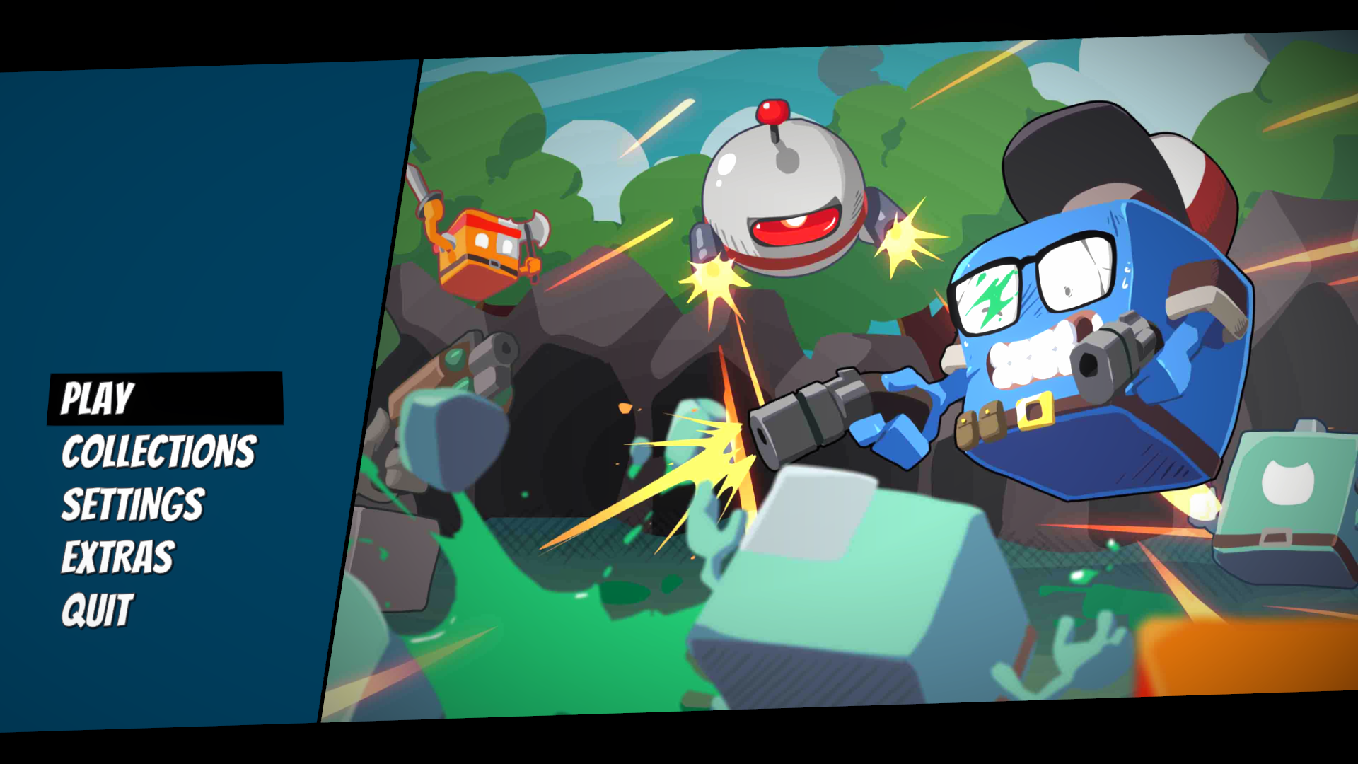
The menus have been entirely thrown out and replaced. This new look is much more sleek.
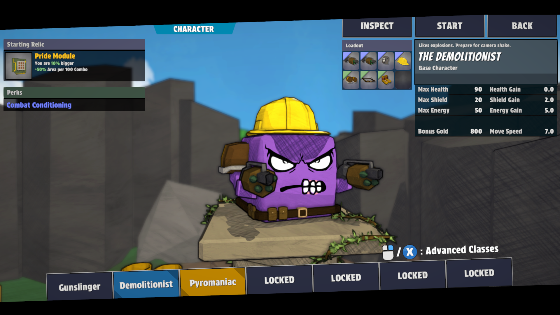
The new character select screen is great! Like the others, almost no trace of the original remains.
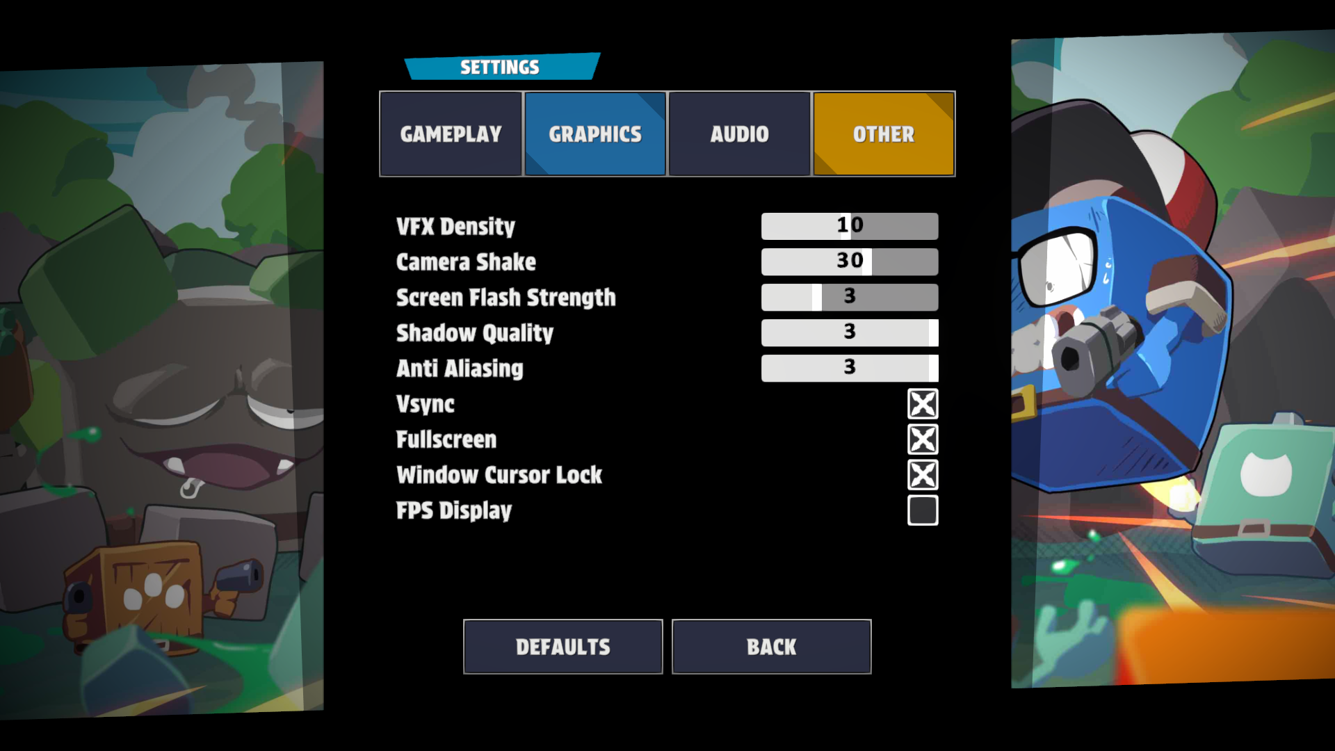
Even just the Options menu is now less clunky, using a sweet and completely rebuilt tab system.
This is still a work in progress, but these updates are starting to make the game look more and more like what we want it to be. We've still got a few more major updates to share - the next post will showcase the major updates to progression systems that we've been doing. Stay tuned for the post about it next Friday!