
Hey all! This week I've got some additional updates to the Unit Window to share today! A bit over a month ago, we revealed our redesign for the window, which was a massive improvement over the previous iteration. Thanks to some feedback we received, we've managed to make some further improvements while working on another of the previously incomplete tabs.
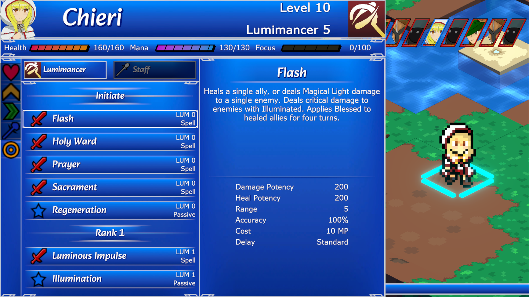
The Ranks tab of the Unit Window exists to allow you to reference the specifics of a unit's class rank or weapon rank. Here you'll find a sorted list of all skills and spells a class will learn as they rank up, as well as which Weaponskills they will learn. By default, these lists will show your current class and equipped weapons, but you can check any class or weapon by changing the selected class/weapon above the skill list.
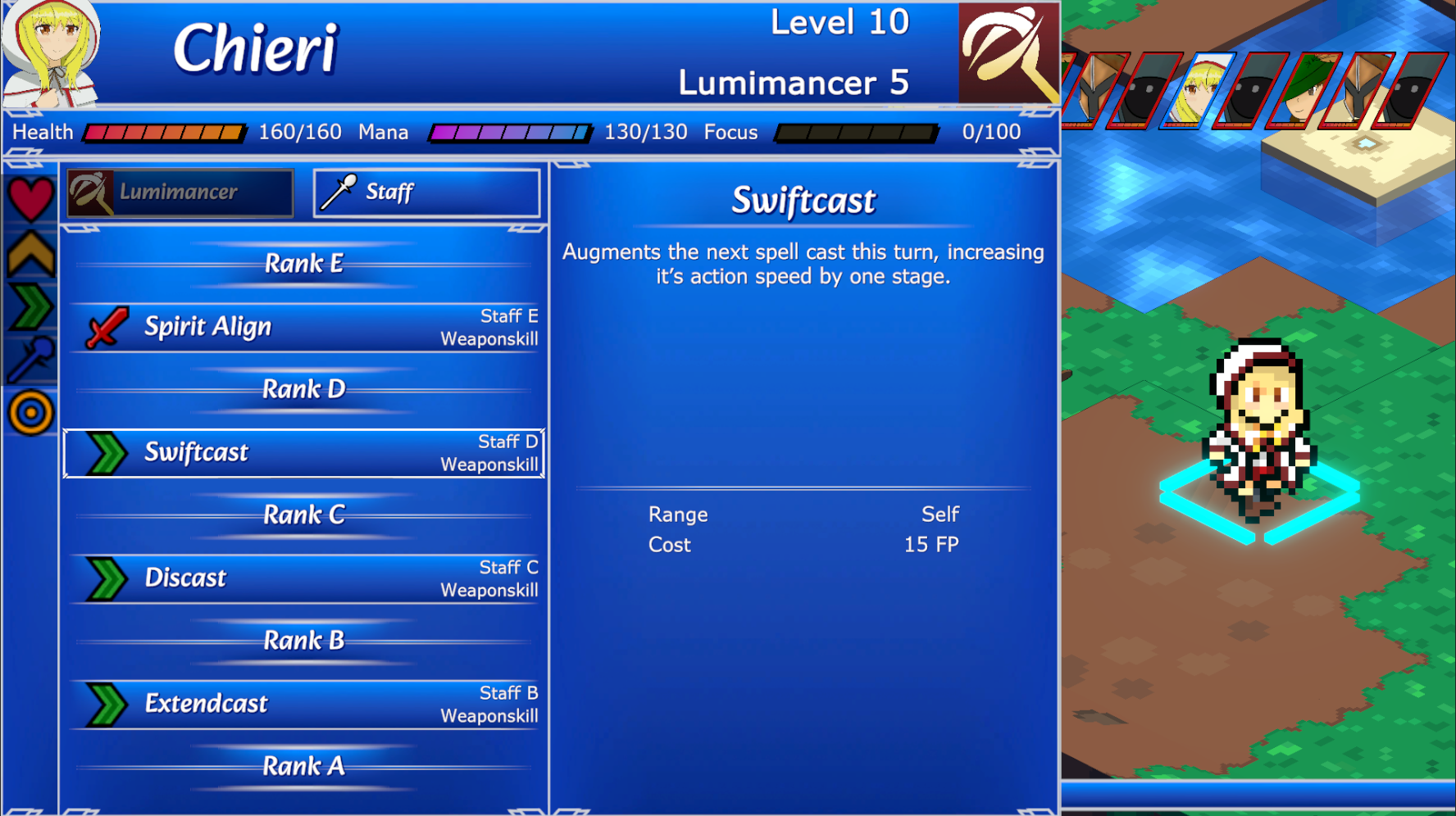
This tab is really only useful for checking your own units, as the Skills tab will allow you to see which skills any given unit has. Instead, the Ranks tab can be used for things like planning EXP distribution across units or seeing which Weaponskills you have on a different weapon without committing an action to equipping it. While it might not be the most immediately useful tab, we promise you'll still make good use of it when you need to.
But enough about that, we've also made some layout changes to try and improve readability and alignment of items. Currently, only the Ranks tab has been adjusted, but if reception is positive then we'll go and apply the layout to other relevant tabs. The first major change we've made is to collapse the list of tabs once a tab has been selected. In order to make this work, we're going to need to create icons for each one, but we have some temporary icons from other parts of the project purely for demonstration purposes today.
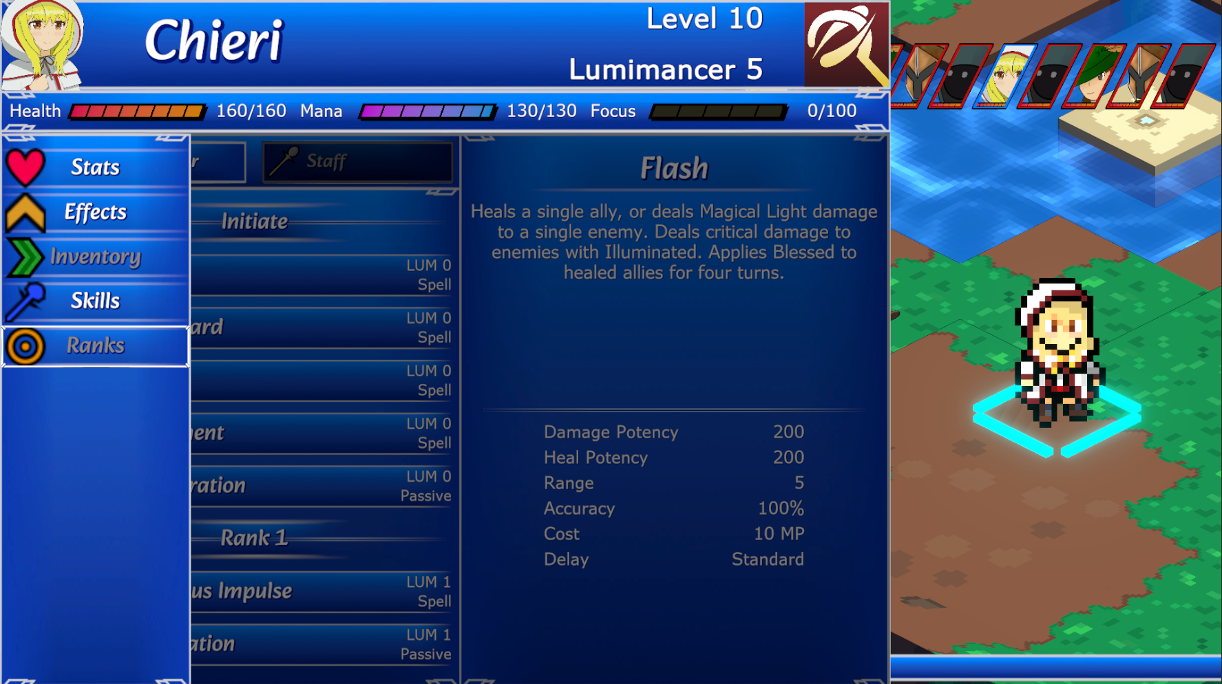
While still selecting a tab, the contents of the tab will appear behind the list, darkened and partially cut off. Upon confirming a tab, the list will collapse to the side, revealing the full tab and allowing interaction with it. You'll still be able to see the icons for tabs, but we've made much more room by collapsing the list to a fraction of its previous size.
With this new room, we've been able to split this type of tab into two columns; a list of elements to interact with, and all relevant information for the hovered element.
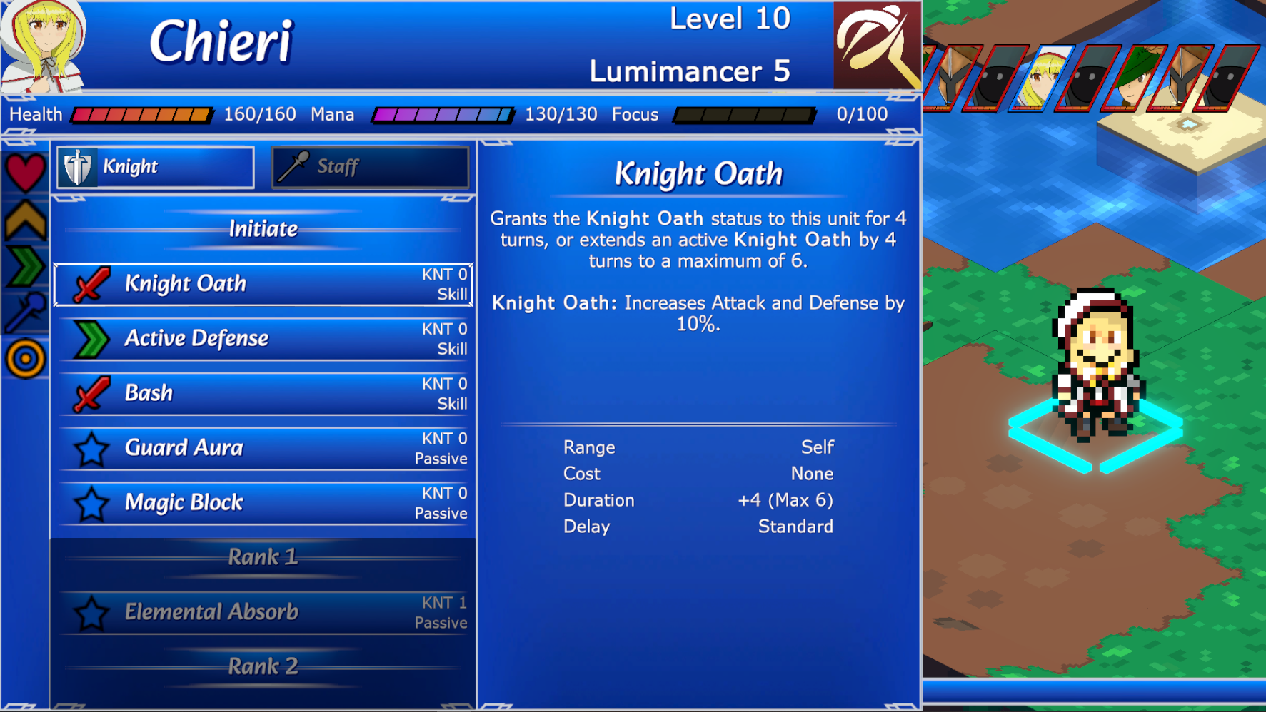
I personally like the layout a lot more now, but as always feedback is appreciated! That'll be all for this week; I know it's a bit heavy on screenshots, and I would have liked to have a gif or video for you, but there's a few issues with the implementation right now that will take a bit longer to fix before it's video-worthy. Thanks for tuning in, and I'll see you next week!