
Hey all! These last couple weeks, I've been experimenting with some ways to make the UI and menus a bit better, reducing confusion and increasing visual clarity as much as possible. So I figure, why not have a bit of a different kind of update today, where I ask for some feedback from you all?
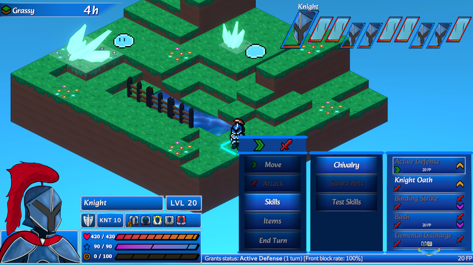
One of the things I've tried out is darkening earlier steps of the Action Menus. My thought process is that by darkening out the menus we can hopefully draw the players eyes back to their active menu. There's a lot of information all across the screen, and when the players have to move their focus to different UI elements on the other side of the screen it can get a bit busy. While implementing the darkening, I also had the idea to leave the menu options we clicked on at full brightness, so that you can at a glance see the path you took to get to your current menu.
I also believe this will make it a bit easier on viewers, making it easier to understand how the menus are structured when you're not playing the game yourself. The theory behind this change seems sound to me, but I'm a bit on the fence with the implementation. Since I'm unsure on it, I'm looking for early feedback on the direction to see if it's worth tuning up. I can make adjustments in a number of ways to try and improve it, and I'm also looking into replacing our current cursor graphic, but I'm curious to see what you all might have to say, so please let us know your impressions and thoughts!