Hi everyone!
Here is a quick test. Don't be afraid there are no bad answers ;)
Think about the most popular cafes that you know. What is the first thing that comes to your mind when you think about it?
I guess that some of you will think about the logo and it’s nothing surprising.
A logo is a very important part of your brand identity. Thanks to that, people can remember your company and when they have to choose where to go, there is a bigger chance that they will choose something that they know, for example, your coffee bar.
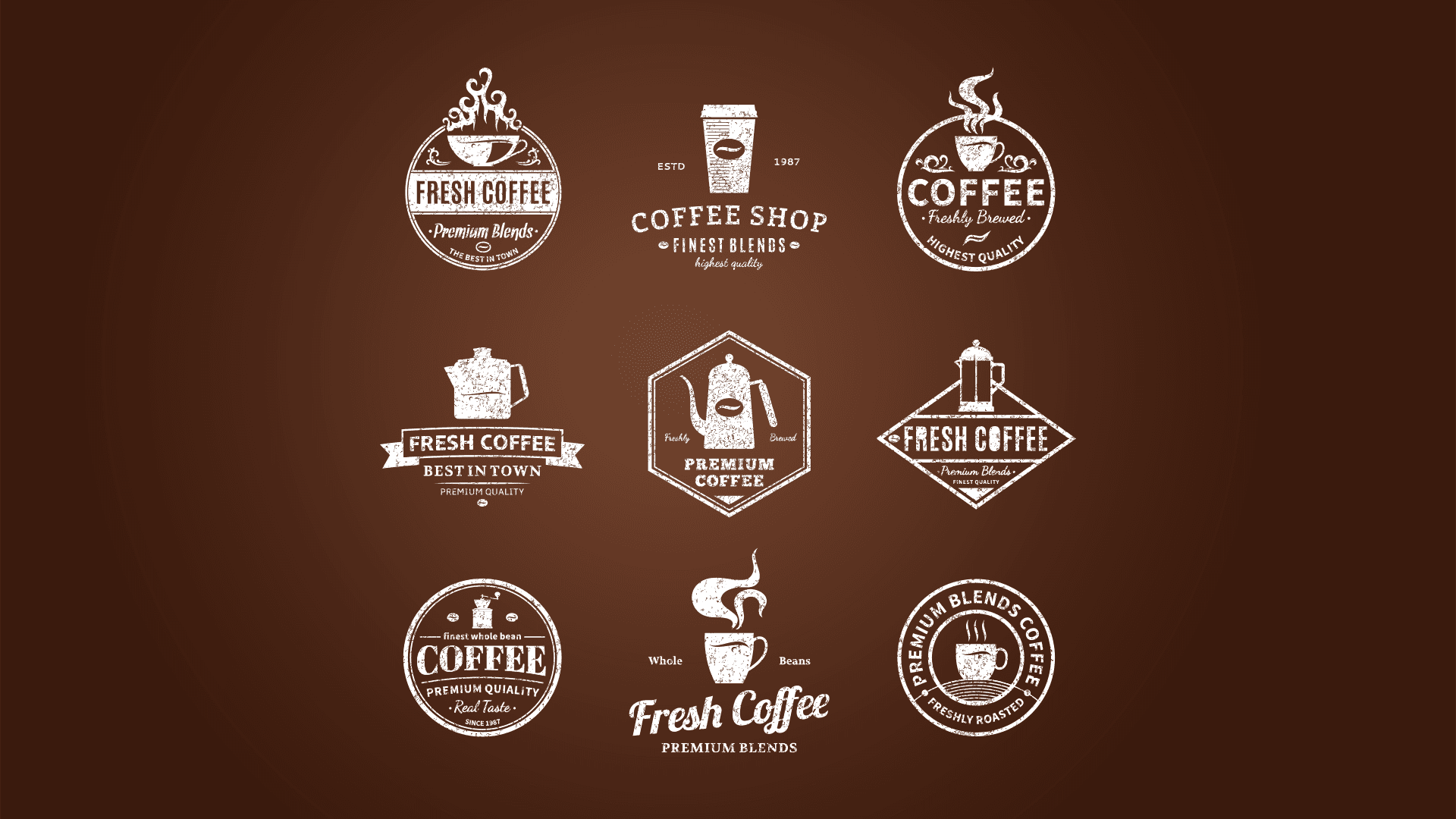
What is a perfect logo? There is a lot of things that you should pay attention to during creating your logo but we gonna share the most basic things:
Simple - When someone will see your logo it should be easy for them to guess what your company is doing. What is more, the more complicated a logo is, there is more chance that someone will not remember it, because it will be too difficult. Try not to use more than 3 colors and create it so that it will be possible to show it in one color.
Timeless - No matter if you see this logo in ‘91, 2021, or 2051 it should be the same accuracy. The logo shouldn’t go with trends because it passes very quickly.
Relevant - When you are a coffee bar you want to be associated with coffee, hot drinks, maybe some desserts, etc. but not with for example steaks. Try to use colors and things connected to things you do, to your philosophy.
Distinct - Show that your coffee bar is unique, don’t try to pose as someone else because it only brings trouble. If your logo will be too similar to someone else, your clients accidentally will mistake you for another cafe and go there or in a worse scenario, they will mistake you with the one with a bad reputation and won’t go to your place.
That’s all for today. Did you like that? Share with us your opinion or suggestion for the next devlogs!