
Hi folks,
There aren't many new stuff to tell you about, but for those who do follow the project, and are curious about what I've been up to - I am still working hard on it. Let's dive in, and see how things are going. ;)
Most of the development time (since last time we talked), went to bring the game into a playable (alpha) state, meaning that someone can (should?) now be able to play the game from start to finish with minimal issues. I added many of the old (Erannorth Reborn) cards. There are now about 1400 in the game, and changed them to fit in the new Expertise categorization. Also made the old events playable etc.
Being 'alpha' the bulk of the new content, stories and many features are still missing or are unpolished, need balance passes etc. But at least now someone other than me, can actually launch the game and even play (a bit) around. Hopefully our brave contest winners will give it a go and tell us how things are in practice ːsteamhappyː
Between adding new or adapting old content, I also made several changes and further improvements in the UI, in order to make it a bit more approachable and easier to understand per your suggestions. Might revise it more, but I feel it's in a good place.
Let's see a few examples
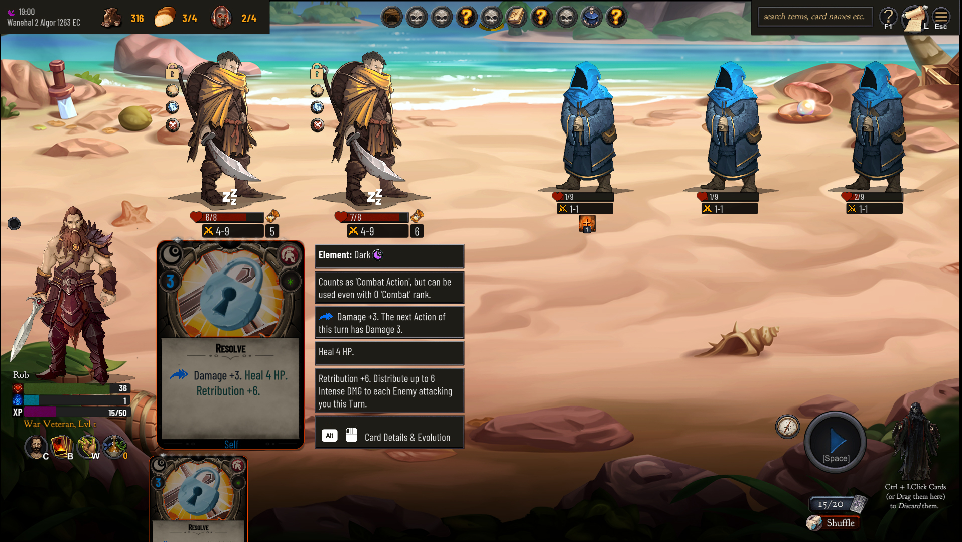
There are some more point on details when hovering over the Enemy, about what its effect does, without having to rely researching the Rulebook.
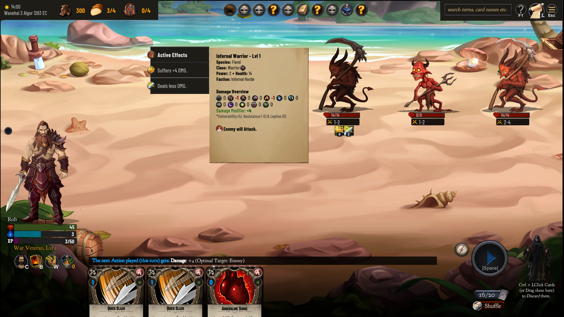
While still showing you enough information to assess the situation without the need of hovering when you have learned the various symbols by experience.
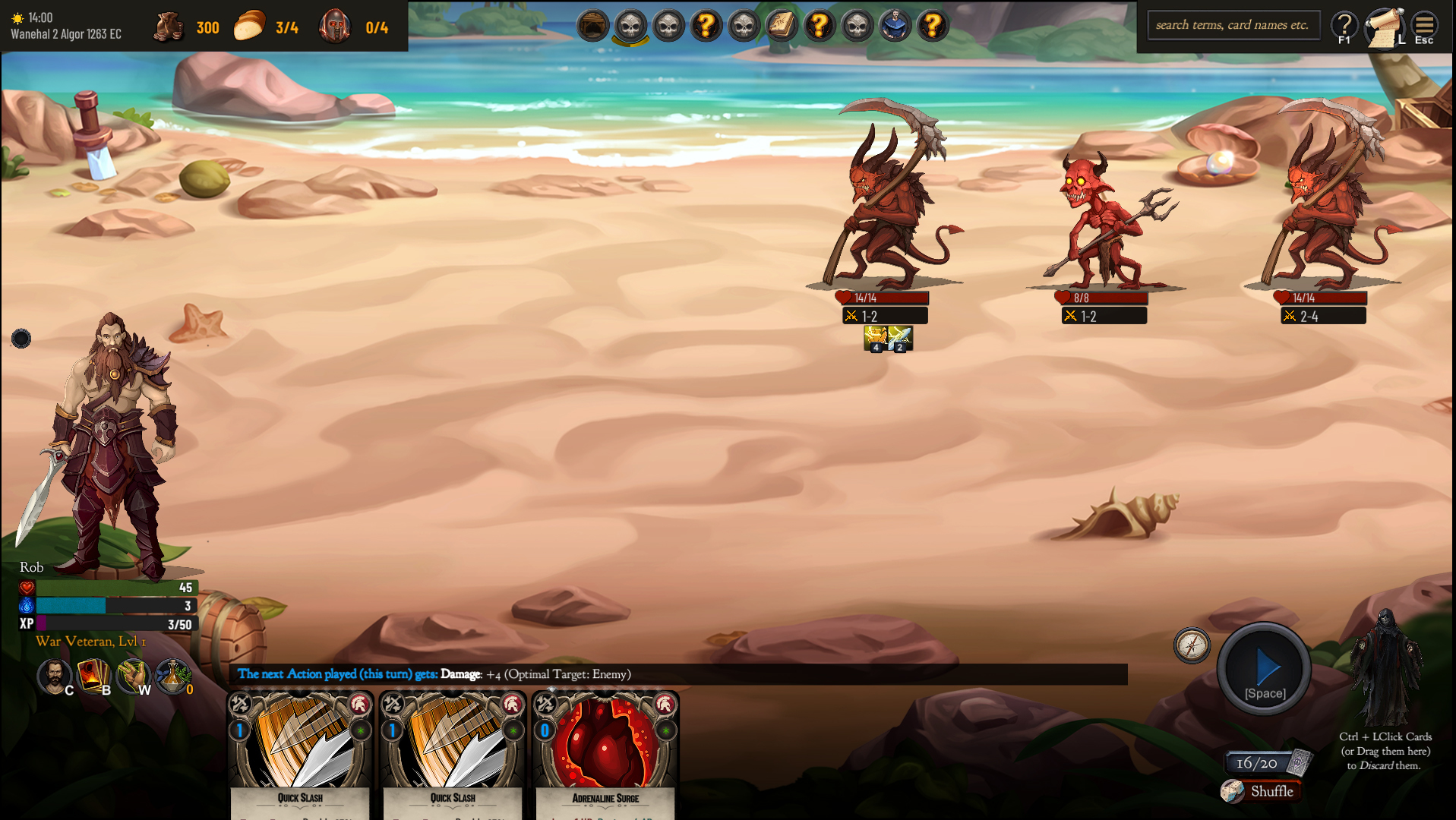
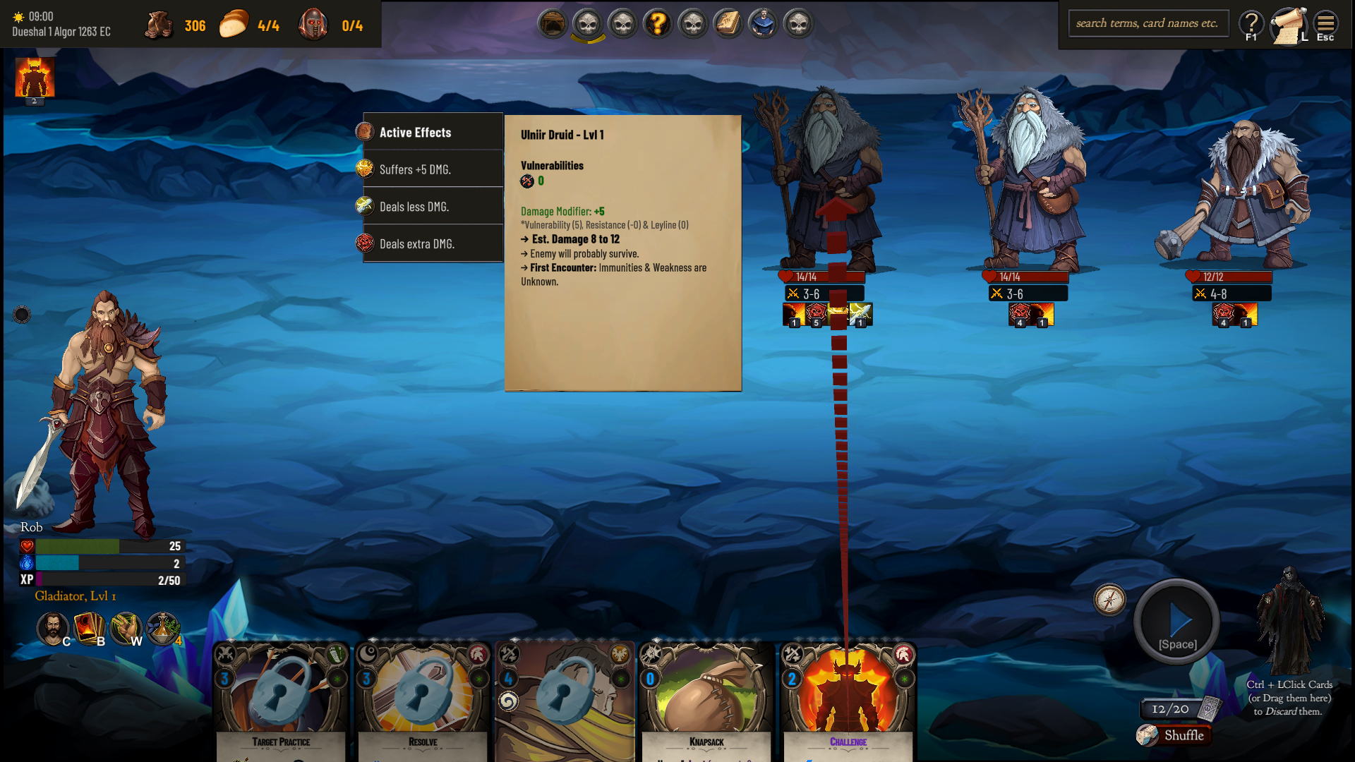
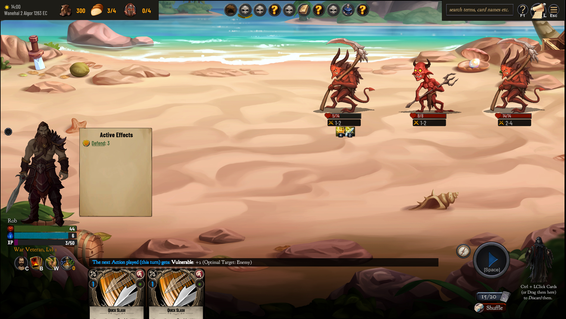
Player effects are now shown by hovering over them.
The larger available space should make it easier to categorize these things better, and I also want the space in the bottom for something else...
There are also some character sheet improvements, like being able to change your name at any time or your avatar, allowed modders to reference enemies as pc portraits, and made a bit clearer the presentation of the Perk effects.
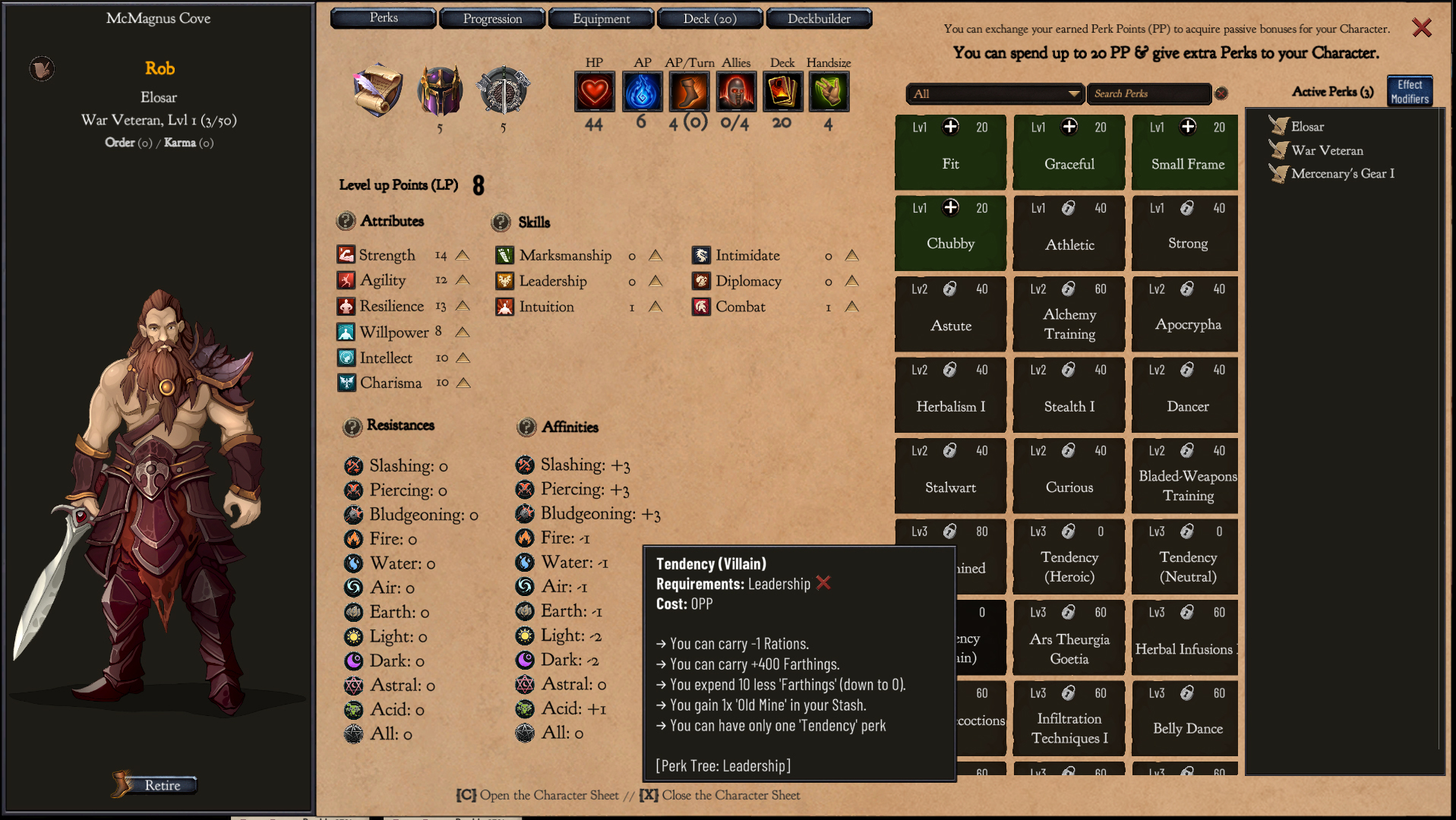
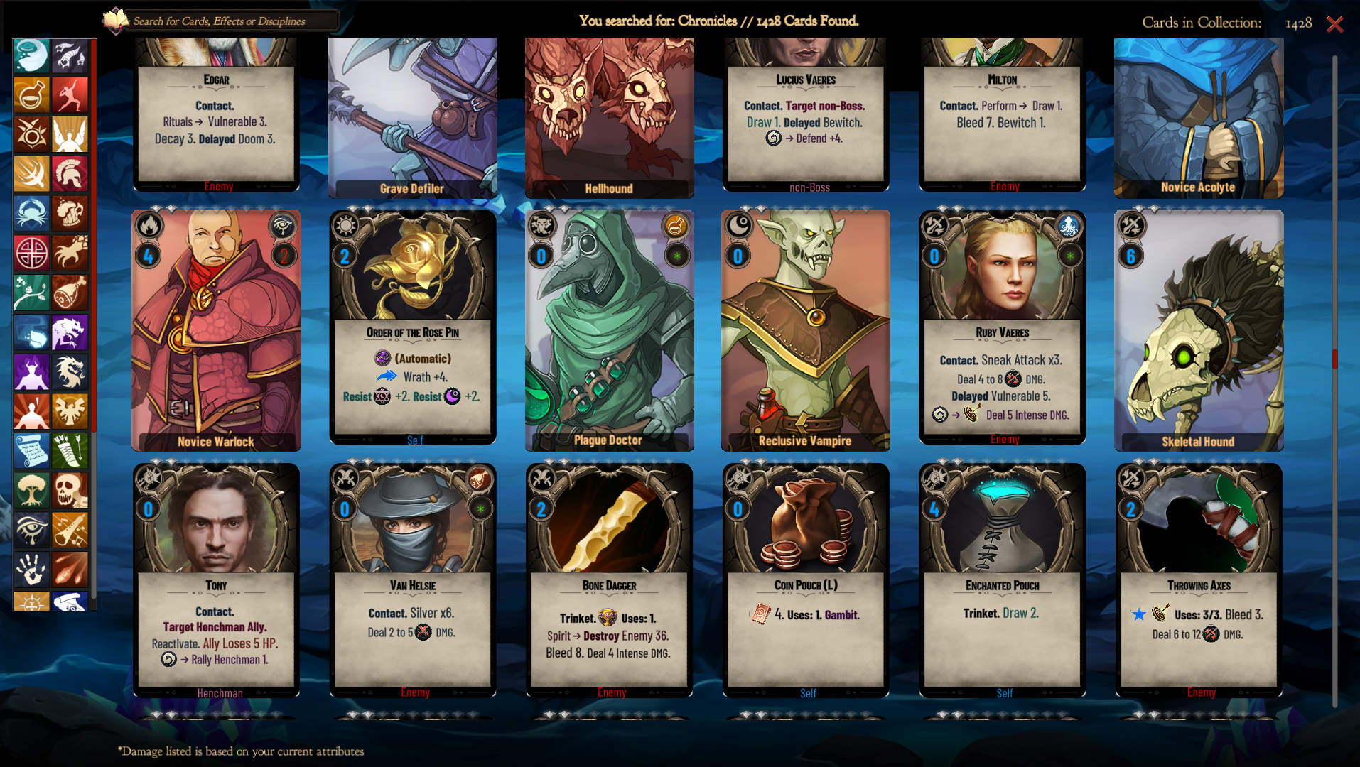
I replaced some more keywords with icons. And at this point I am trying to find a balance between 'too much text' and 'too many icons'. With the goal being to make the cards faster to read without feeling you have to decipher a rebus or read a short novel in order to understand what the card does.
Of course the info are still available when you hover on the card and the codex shortcut is much harder to miss now...
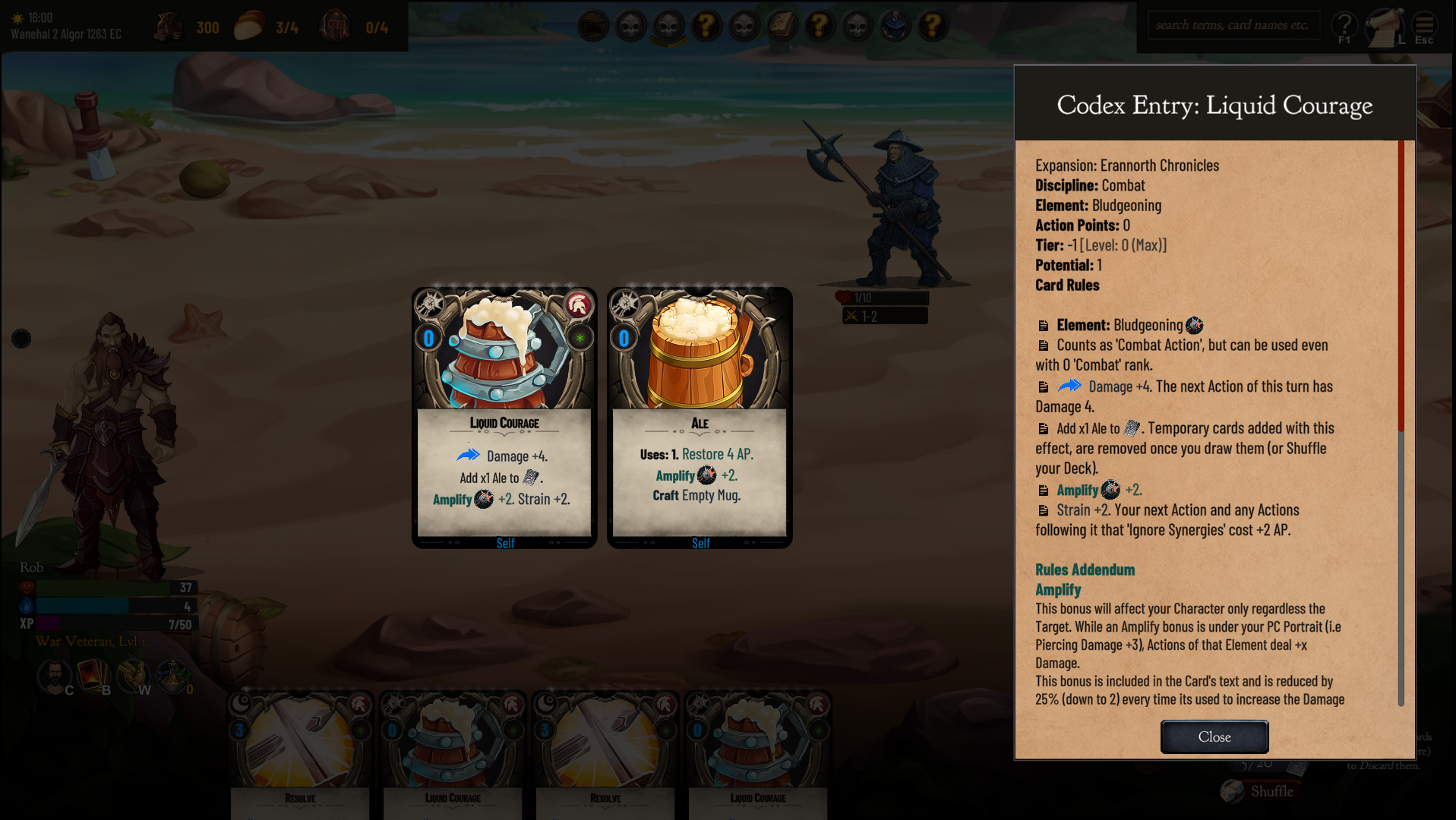
Speaking of the Codex I also improved its entry readability a bit by adding bullets to separate between each effect.
And that's all for now folks!
See you next time!