
Hi, I’m Michał Sztuka. From the very beginning, there were many ideas about how War Hospital should look. Many of them have changed or become abandoned, but the core remained unchanged. We wanted to show the cruel realities of The Great War as attractive to the player, but without losing historical reality.
Our goal was to make the art style recognizable among other war games. Their artistic convention is mostly grayish and dark because of the focus on historical accuracy.
At the same time, there are war-themed games with a more attractive and epic look that
makes them more like historical fantasy than anything.
We wanted to find something in between, which made my work quite a challenge. I couldn’t just let my imagination run wild.
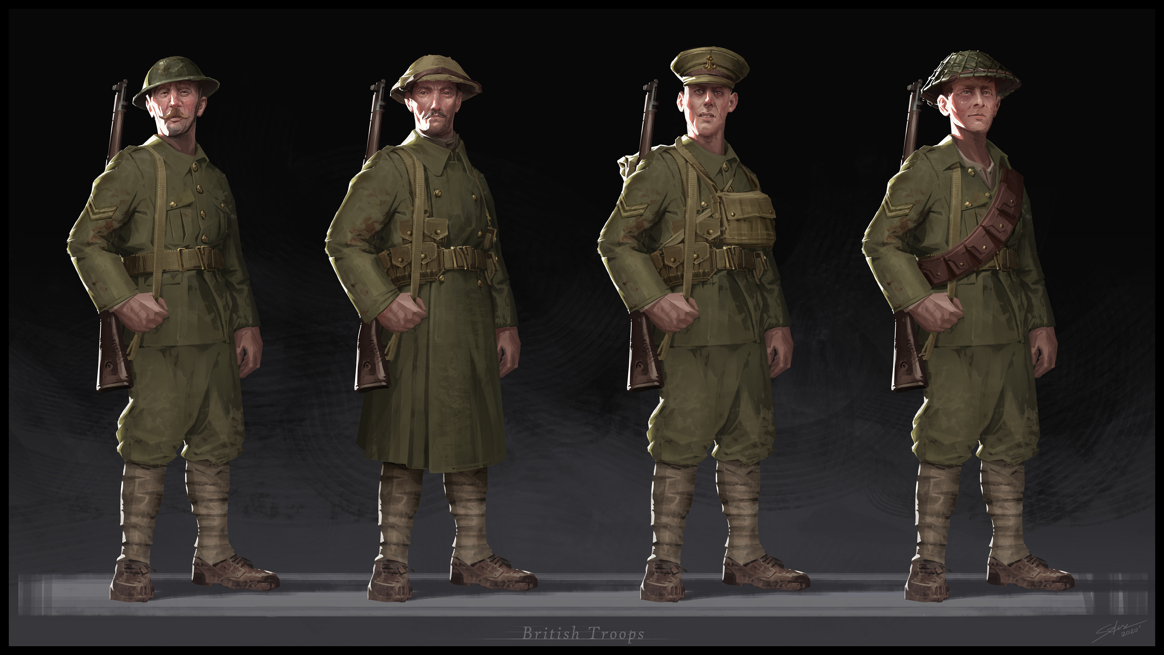
To give War Hospital its own personality, we decided to base it on the historical accuracy of World War I, but make specific elements delicately stylized. They are still grounded in reality, yet slightly unreal, which makes them unique and interesting. For example, we changed body proportions a bit, or made small changes to the uniforms, equipment, or elements of the environment.
I won’t hide the fact that from the very beginning our main design inspirations were Dishonored and Dishonored 2.
If you look at Dishonored characters, you can tell these are humans, but there is something special about them. We analyzed their designs, however with time, our ideas evolved. Still, if you see our early concept art, you’ll notice similarities.
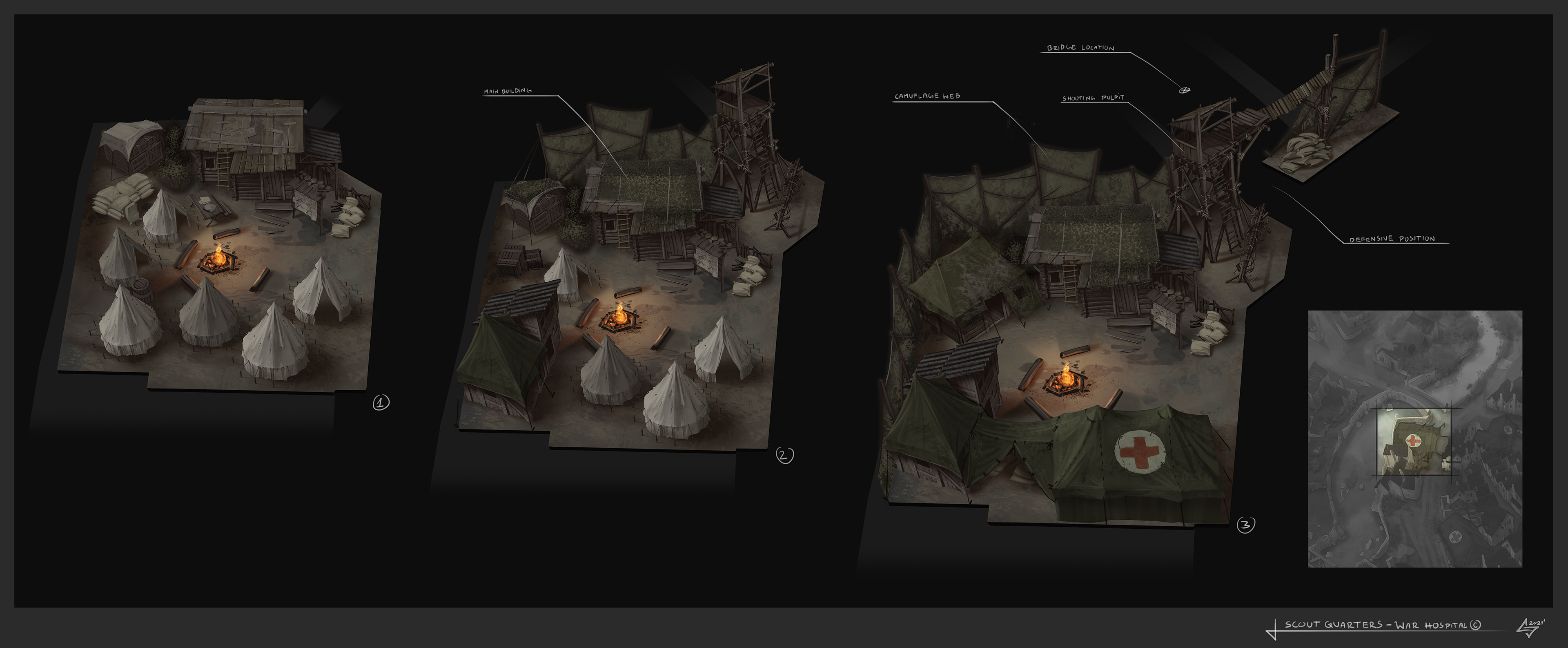
One of the reasons we started looking for a different approach is the fact we’re not making a first-person game. In the case of War Hospital, a strategy, the key part is the environment. The players spend most of their game time looking at the main base from above, so we needed to make the whole place interesting. It was quite a challenge because of the real life setting, which indeed was dark, greyish and monotonous. Also, the military environment doesn’t really encourage experimentation, considering that every single building looks almost the same.
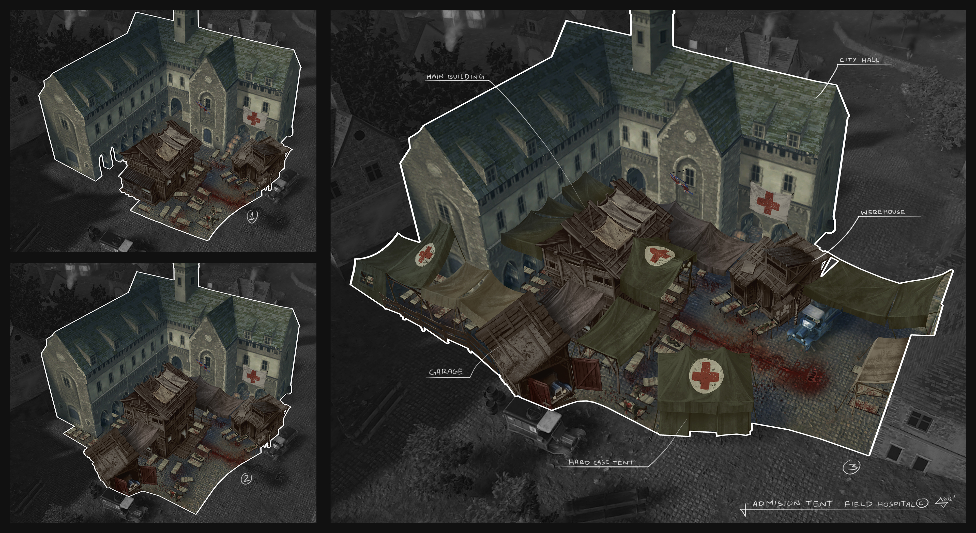
We decided to make our main buildings look makeshift; a mix of military assets and stuff found just laying around.
This gave us lots of possibilities to make every military structure unique. We also decided to overscale most of the environment, such as city buildings, nature, and ground elements. We managed to get into this by adopting a specific way of sculpting objects such as stones, bricks, wooden parts etc. As a result, they are now much more expressive.
Another key element to enlivening the atmosphere was the way we illuminate the environment. Lighting gave us the opportunity to differentiate one place from another, even if structure-wise, they look similar. You will see that we show the reality of war in a very pleasant and surprisingly colorful way, yet without sacrificing the mood.
But how to add humanity to a war game you see from afar?
This is a problem faced especially by strategy game designers. In RTS games like ours, a soldier is often reduced to a tiny blob that rushes at a target and dies. We wanted every unit to feel like a living person, so we created many additional visual assets, such as portraits or scene representations. These are our visual aids to emphasize the dramatism of situations that take place in your military hospital. They elevate these “grain of sand” units to the position of human beings whose life truly counts.
Did you like this inside look at game development? Wishlist and follow War Hospital, and join me next time. We’ll talk closely about the various aspects of the color palette.