
Hello, future mad professors!
We are busy at work with the final version of Creature Lab and we have encountered some second thoughts about certain aspects of the game. One of them is the UI/menu font. Some of us think that the currently used font may be a little tiring/unclear for readers.
As our players are our best authority, we ask you for feedback!
We are wondering if the font in the game is:
- attractive
- clear
- easy on the eye (not tiring the eye)
For reference, image A is a current font, and image B is a proposed alternative (which may not be the final font we'd use, but it has the parameters that we are aiming for)

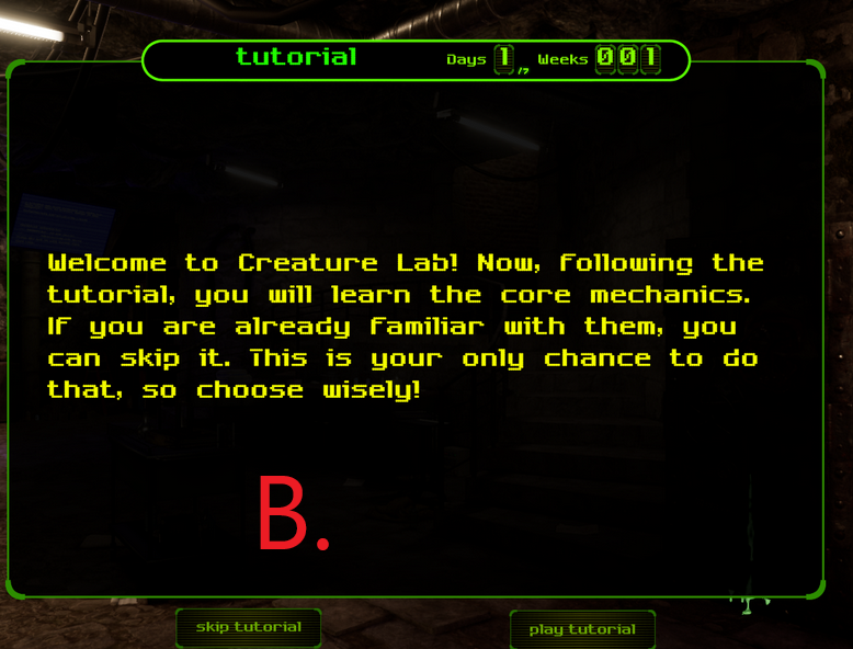
We kindly ask you for the feedback! Feel free to comment here or message us.
Remember that you can also talk with us directly via Discord:

https://store.steampowered.com/app/1309990/Creature_Lab/