Greetings, Travellers!
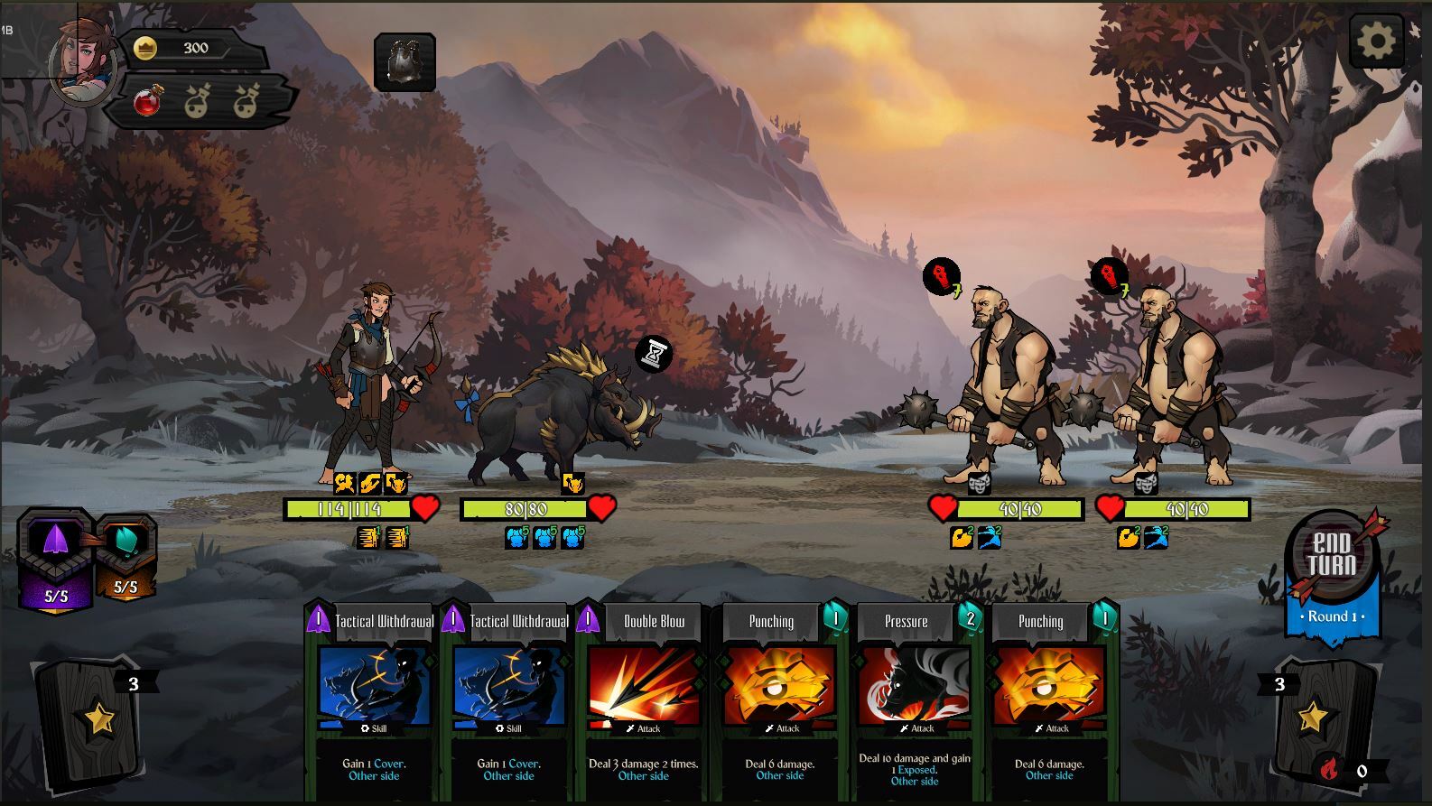
The thought of how to make a clear and nice interface has been on our mind for quite a long time. And today it dawned on us: what if we move the buffs/debuffs icons closer to the center? Which variant seems more convenient and logical to you?
We are waiting for your opinion in the comments!
1. Classic UI:
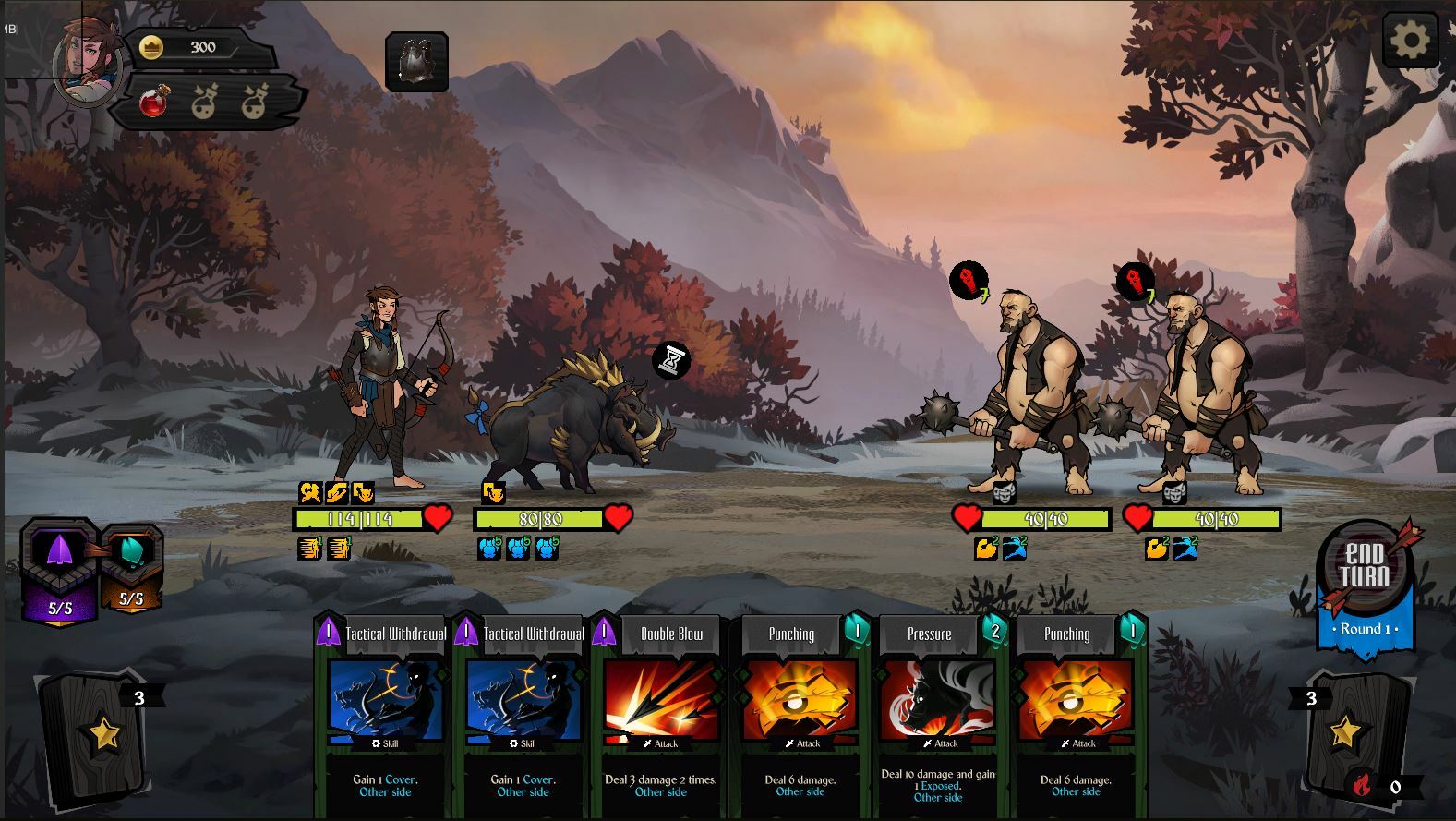
2. New suggestion: