We had a lot of feedback from the Kickstarter and internal testing to incorporate into the game design. A lot of our focus these past months have been towards 2 items; improving our tutorial methods for teaching new players and improving the intuitiveness of the game controls.
Tutorial Improvements
We've moved our tutorial instructions into a simple itemized checklist that includes a video example on the side of the screen. This keeps the dialog of the characters from becoming a word salad of instructions. A picture is worth a thousand words, so a video is worth a million ;)
Battle Controls
The game controls have changed to allow users 2 primary moves (attack or move) to be based on mouse drag. The new controls use LeftClick+Drag to attack and RightClick+Drag to move. This is more intuitive for players - and unique skills on the Skill wheel are now accessed with a quick RightClick.
The core battle loop of attack, movement, and skill usage has been streamlined to create faster animations and improved understanding of the battlefield. Targeting reticles are shown when attacking that describe the damage type & amount that will occur if you proceed with that attack. This makes attacks that do Area-of-Effect or Piercing damage easier to understand.
Part of improving the game controls has been to condense strategic information into a quick glance. For that goal simply hovering over a card will show you all the important info in a glance (what skills does that unit have, it's status, etc.)
New Team Member
This month we were able to hire a local artist to help us with icon creation for all our unit abilities. Please welcome Olha to the team! We'll be sharing some of their work as we incorporate it into the game soon. In the meantime you can see some of their previous work on their artstation.
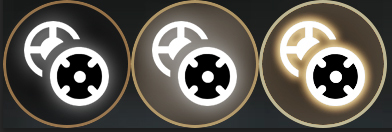
Here's a sneak peak of some of the new skill icon styling.