
Hi all,
I'm making some sweeping changes in the looks department. So next build is still few days away. But I've some GIF eye candy in this post to keep you up-to-date.
- One ugly issue I want to fix has to do with the crowds of enemies. Right now each enemy is rendered in a single sprite. As a result when they make a mess when they are close together. It's common to see the feet of some enemies trampling over the heads of their neighbours - completely spoiling the illusion of a top down look. I've now fixed this issue by dividing the enemy visuals in 3 sprites that are kept in their own sorting layers. As a result, when enemies are crowded, they are mostly seen as bunch of heads, as you would in real life.
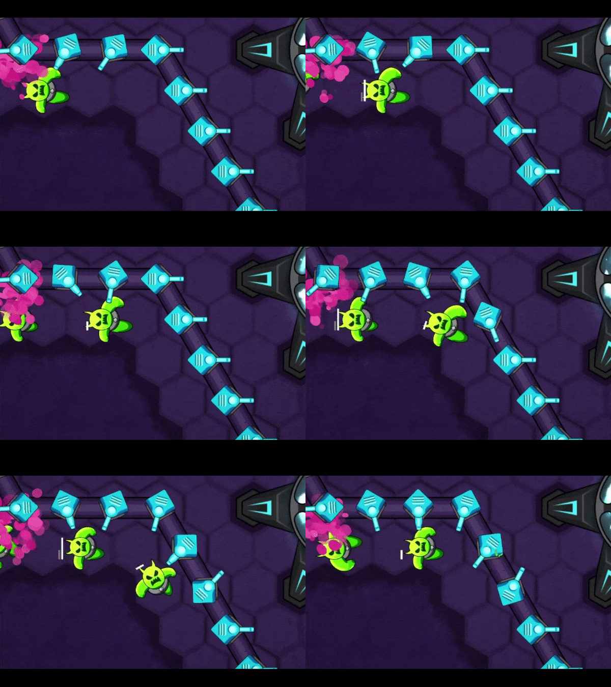
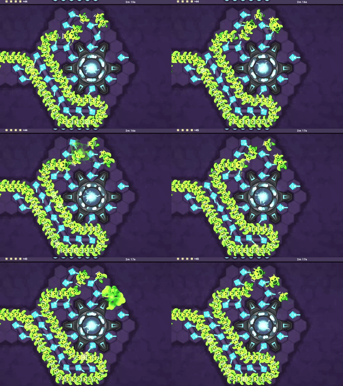 Did you notice the expressions? Is the enemy pain conveyed adequately now?!
- I'm experimenting with colors. In the past I had a tendency to maintain a two-colour palette, one for the player side (blue) and another for the enemy (pink-purple). That made it easy to distinguish between regions of threats and strengths on the map. However it also made the overall look dull. Lately I've been playing Hades a lot and binged Arcane on Netflix. These are milestone examples of how to create energetic experiences using stylized graphics. I would like to infuse same kind of energy in Dofense, without disturbing the player interaction (no screen shakes!)
So in that regard, I've assigned different colors to each of the enemy classes. I've also redone the visuals of Sprinters completely.
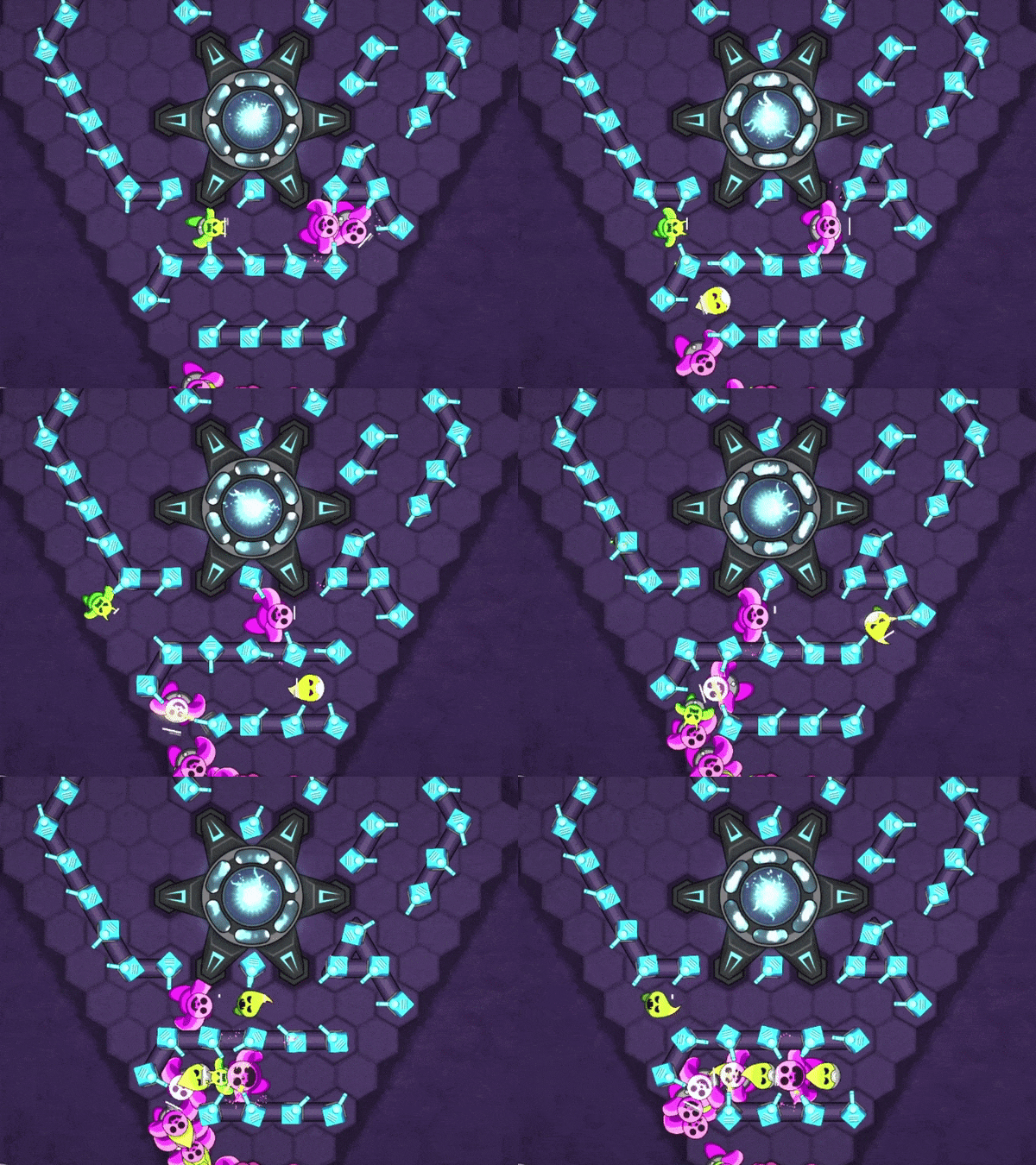
- Do you like the explosions? The slimy monsters now explode with a punch.
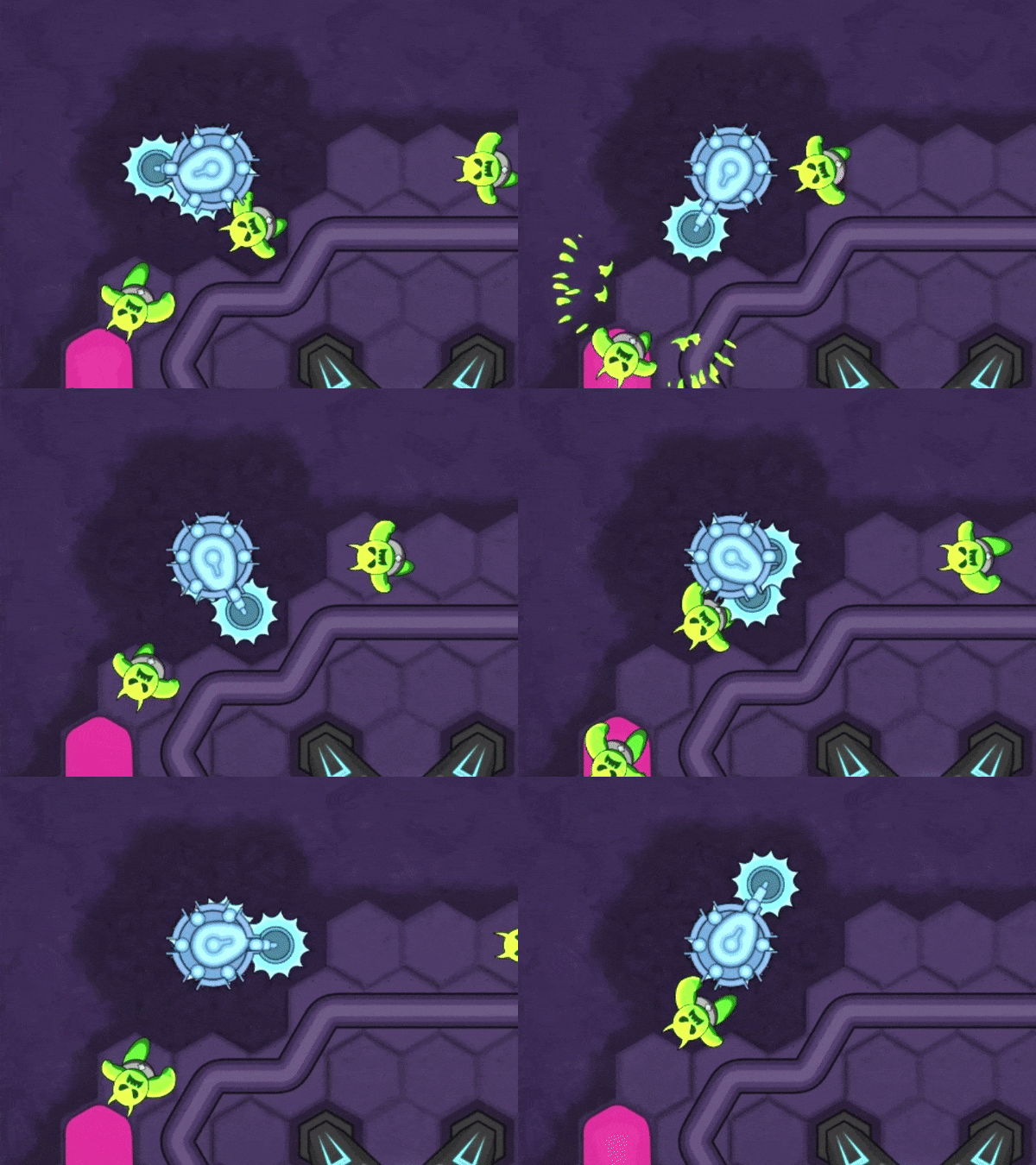
- Wait for the new burn FX.
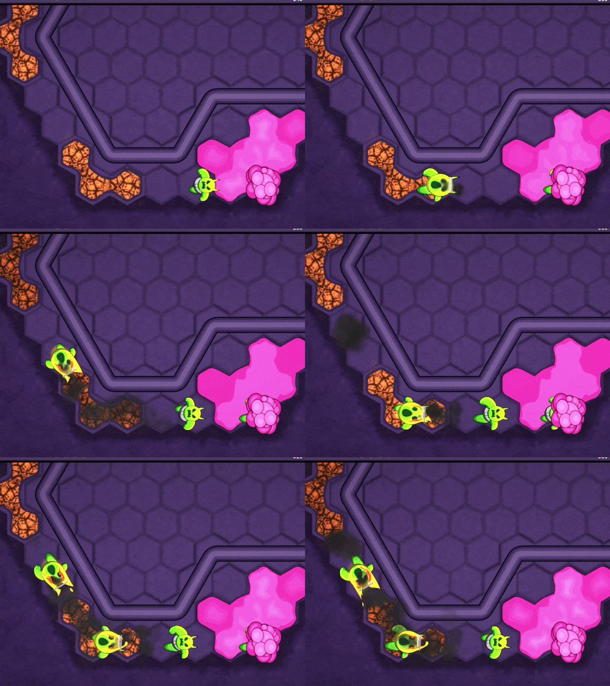 What do you think?
I still have a lot of changes in the pipeline. You might have noticed new sprites for Gun towers. I want to upgrade the looks of all the towers (and the Energy center, and the Enemy gates, and the terrain, and ...). Hope you will be patient with me.
The good news is Omicron seems to have spoiled my vacation plans, so I'll get to spend that time working on this long list. Yay! ;).
Stay safe and take care!
What do you think?
I still have a lot of changes in the pipeline. You might have noticed new sprites for Gun towers. I want to upgrade the looks of all the towers (and the Energy center, and the Enemy gates, and the terrain, and ...). Hope you will be patient with me.
The good news is Omicron seems to have spoiled my vacation plans, so I'll get to spend that time working on this long list. Yay! ;).
Stay safe and take care!