
Dofense is not out yet (even in early access) and has only been played by handful of people so far, but it has already been 1.5 years since I started working full time on it. I wanted to take a moment to recap the development history of Dofense, for the sake of my own record.
First prototype (Fall 2018)
I started working on this tower defense game as a more thought out commercial version of Fold Wars (my earlier 2D web based tower defense game). In the Fall of 2018 I had this first prototype working using Unity.
Since I'm not an artist (although I'm trying), I wanted to maintain the minimal abstract look from Fold Wars. I had decided to go for low poly models that I created myself. I implemented the basic gameplay, but I was disappointed with the look. I couldn't get the juicy look that many low poly indie games achieve.
In search of glamour (Late 2018)
After this prototype, I decided to focus on learning how to create more glamorous look. While pursuing another game idea I had developed some skills in creating mechanical models. So I started experimenting with tower models that were elaborate mechanical devices. I thought that will make them look better. It was at the same time that I started learning about the concept loosely called "Game juice". I made some models and posted on Reddit to get some feedback and some of them received good response. Here's one for example.
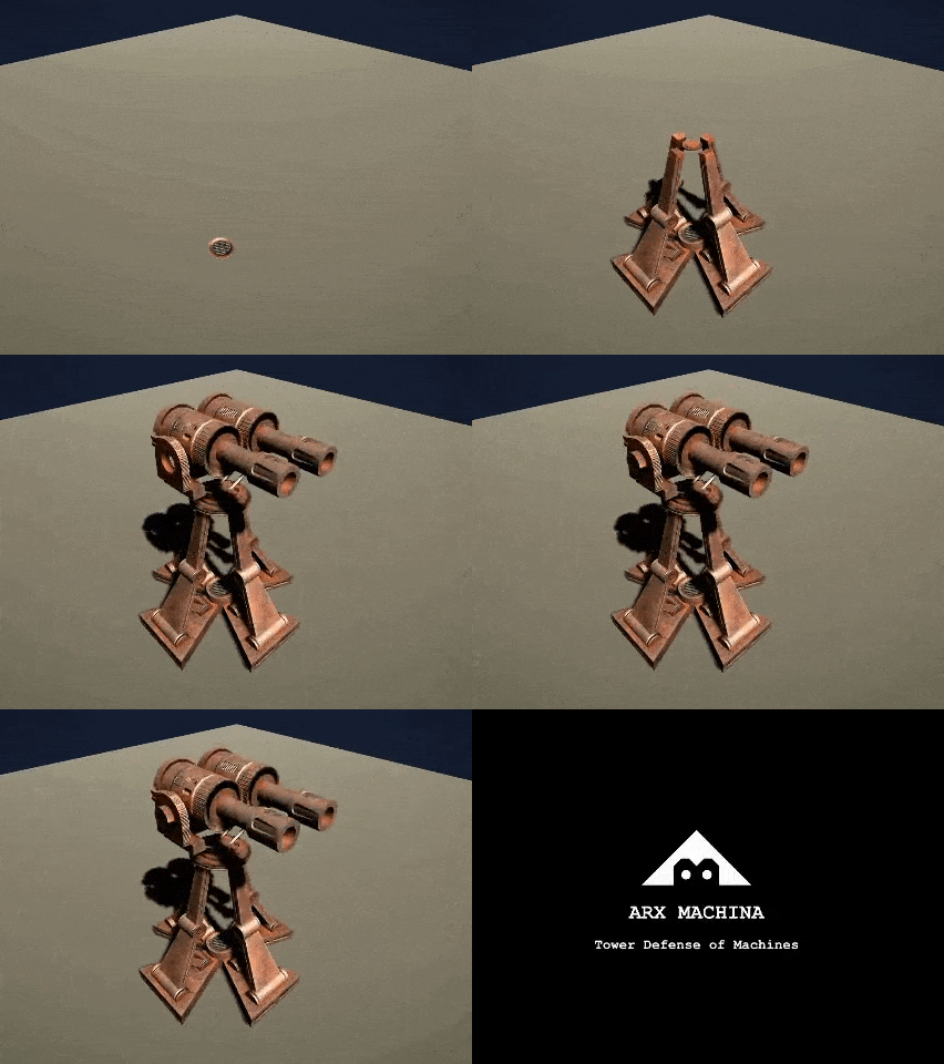
I discovered several new techniques to create better looking visuals. I use Blender for 3D modeling. Around this time I learnt about Substance Painter, which is super useful to create beautiful materials after they come out of Blender. I started giving rustic metal look to the towers. Here's another screenshot from those days. In addition to rich materials this one uses Post processing techniques available in Unity.
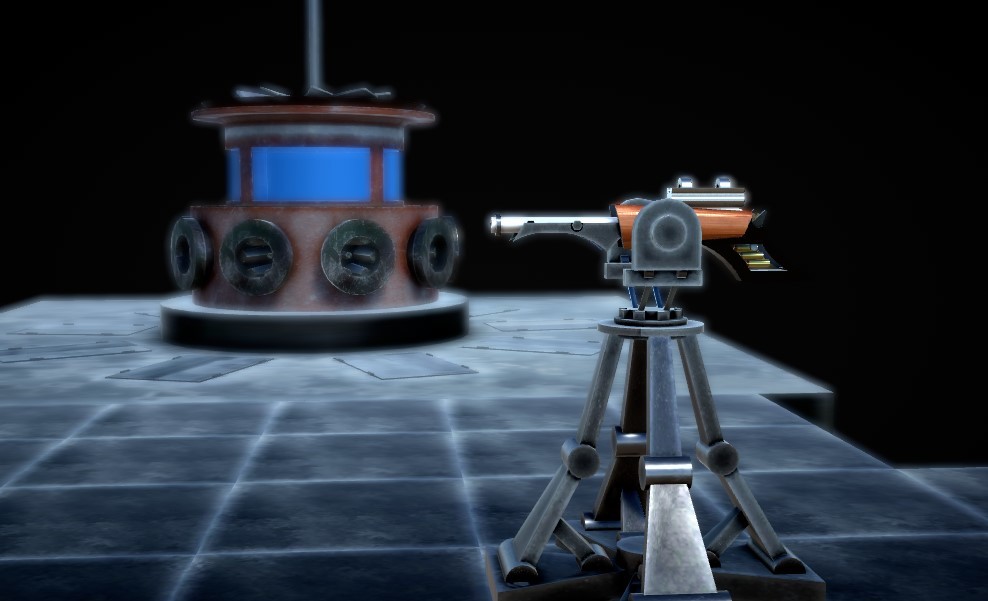
Even though the look was appealing now, I found that my focus on mechanical details of the models wasn't serving the bigger goal of creating fun gameplay. Given the enormous amount of work needed to create such elaborate 3D models, it proved to be the wrong path. A typical RTS game's view point is top-down. Most of the time the camera is high up in the sky. The details of the models are not distinguishable to the player from that distance. The thing I learned is: Adding details won't make models necessarily beautiful.
Dungeons (Summer 2019)
Around this time (early 2019), I decided to start from scratch and build a new version focused on gameplay. I decided not to spend any time in creating any original 3D models - and use off the shelf stuff from Unity asset store. In this iteration I switched from square grid to hexagonal grid. Also I decided to not use Unity's NavMesh for path finding and instead write my own. In retrospect this was the best decision I made. Unity's NavMesh is a sophisticated solution that also incorporates physics into path finding. This was not necessary for my requirement. Due to the physics, the NavMesh solution gets very slow as number of agents increase (about 100+). Also they start behaving erratically. My implementation doesn't care about collisions between attacker units. It scales well and I've been able to tweak the algorithm and data structures as my requirements have changed over time.
This implementation became "Tau Defense". The name under which I first created this Steam product page. I made a snappy trailer.
The early version had about 12 battles, 6 types of towers and 8 kinds of enemies. It was fun to play. The gameplay was set. The look was pretty. I was almost ready to release it like that.
... However, some things were still not quite right.
The dungeon themed environment and enemies were gorgeous. I had started with stock 3D models from asset store and modified them so much that in the end I had almost created them from scratch to get the look I wanted. I also animated them on my own. But even though this made them look pretty, the details were not quite visible from the bird's eye (as I described earlier). Or to be more correct, the details were not giving the satisfaction of killing the crowds of enemy with cleverly placed towers. The enemies and the background environment were in similar warm colors, so any added details were lost due to the lack of color contrast. It didn't feel satisfactory. However I didn't abandon this look right away. It happened gradually during the Fall of 2019. And it happened as I started making a map editor.
Editor (Late 2019)
As you can see I did get the map editor generate the dungeon theme battles.
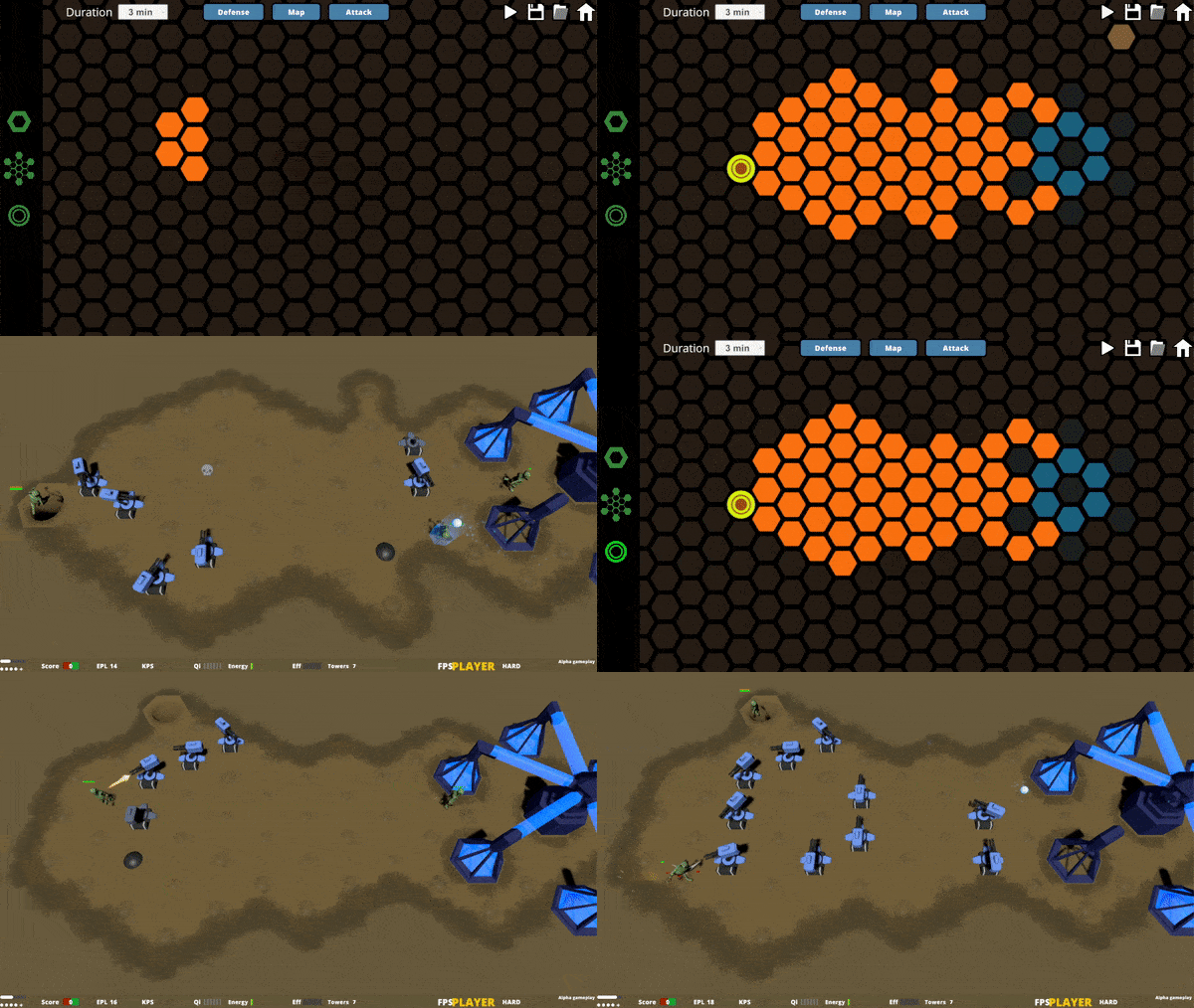
But around this time I again started experimenting with abstract models, in the hope of fixing the lost-details-problem. I also discovered a local play-testing event in Montreal and first time saw other people playing my game. The feedback from this was very useful and I made changes based on some good suggestions.
Gameplay simplification (January 2020)
During past few weeks I made a fundamental change in the logic of gameplay. Thus far the game consisted of enemies coming to steal your Qi. You as a player build towers so that they get killed before they carry the Qi to their gate. This was the same basic mechanic in Fold Wars and it was inspired by Defense Grid 2. It gave an opportunity to create a detailed scoring mechanism and multiple aspects of strategy (path length, energy usage etc.) that could be optimized by the player. This is what had attracted me to it in the beginning.
However the more I thought about it, I realized that it's only an elaborate scoring mechanism. It doesn't contribute in any way towards making the gameplay fun. In fact, it makes the goal of the game less clear. I found this out when I saw some players getting confused when they started playing the game during playtesting. One player didn't really know why he should care to save the Qi. The enemy threat had to be more tangible. This is why I made a small, yet important change in the gameplay.
The goal now is simple. Save the base. Enemy is coming to destroy your base and you have to kill it before it succeeds in doing so.
Once I started down the path, I found some good metaphors. The base is now an Egg that you protect. The enemy are these colorful squishy humanoid that you have to shoot down with the towers. And a load of fun it is to see them explode. The enemy models are not detailed and are painted in single color. Yet they have roughly humanoid shape which gives them certain character. The role their look has to play is clearly indicate the advance of enemy waves and show its destruction with most satisfying effects.
If you fail to kill the enemies, they will attack your egg and they will be terrifyingly loud. It lets you know that it's not good for you. The threat is evident. I'm hoping that this change makes the goal pretty clear. I look forward to feedback.
In future posts I'll post screenshots and videos of the new look. Some of it you can already see in the artwork and screenshots.