
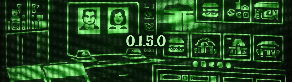
Some updates add content… and some updates change the way you perceive it.
With this update, the Agency has put on new makeup — but not to please. Colors, interfaces, icons, and images have been redesigned from top to bottom to push the 1950s atmosphere even further… that neat, orderly patina that, when you look closely, always hides something underneath.
🛠 Update – Total Restyling
Redesigned the colors of the entire office to better match the 1950s
Replaced all images of candidates to be hired
Replaced all images of the “Which do you prefer?” test
Replaced all investment images
Redesigned the UI of the investments
Redesigned the final icons
Redesigned the purchase icons
Redesigned the graphics of the personality meters
Redesigned the Steam store graphics
Fixed the bug in the Dealer cutscene
Fixed various textual typos
“When everything looks cleaner, more orderly, more ‘right’… that’s often the exact moment you should start doubting. Because in certain places, what changes isn’t what happens… it’s how well it manages to hide.”
Thank you for being here.
Daniele