Hello, I’m Sean Jung, Art Director at Ember and Blade.
It’s been a while since I last reached out! It feels like just yesterday I introduced myself in last year’s dev log, yet here we are, on the verge of launching Demo 2.0. A lot has happened both in and beyond the game since then, and the world we’re building has changed in many ways. In particular, for Demo 2.0 we focused on streamlining the player experience into ACT 1 and refining it so you can enjoy more fun and a richer sense of the world in that segment. We’ve made the battlefield more intuitive, and we’ve enhanced the Sanctuary you return to after battle with greater depth and detail.
## Even a Single Act Needs Momentum
While gathering feedback from players of Ember and Blade, one concern kept coming up repeatedly.
“The early part of the game feels a bit slow.”
This feedback likely isn’t just about visuals, but it pushed our development team to do our best thinking in every relevant area. I, too, took another close look at whether ACT 1’s environment adequately sustains the game’s tension.
In fact, from the beginning we intended for the atmosphere to build steadily throughout the full environmental arc from ACT 1 to ACT 5.
We intended to begin with a relatively restrained tone and, as players progressed, reveal the world’s darker and heavier aspects.
However, seeing player feedback shifted our thinking somewhat. Just as there’s a main story arc across all ACTS, each ACT also needs its own emotional trajectory where tension builds step by step. We realized we had to engage players faster than we had originally anticipated.
So we stepped back and re-examined ACT 1 as a single journey. We wanted the opening area, the mid-boss room, and the final boss room to each leave a distinct impression, while still conveying a clear sense that danger draws nearer as you move forward. Rather than simply making spaces darker and more intense, we aimed to let players naturally read where they are in the journey through changes in color, weather, and the surrounding environment.
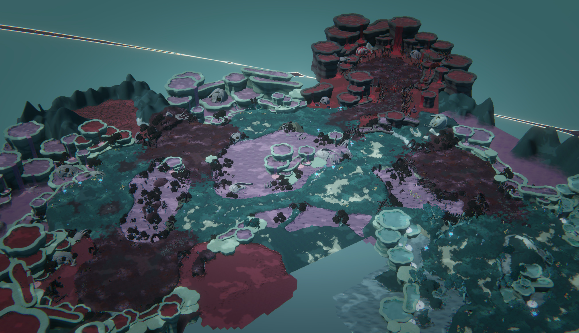 * The revised environment of Act 1
To create that flow, the first thing we adjusted was the puddles scattered across the map. Previously, only the boss room’s puddles were red, and all preceding puddles were blue. Looking at each area on its own, this wasn’t a problem, but when viewing the map as a single flow, the shift between the two colors felt too abrupt. So we introduced gradual color steps, making the blue puddles at the start turn progressively redder as you approach the boss room, creating a very slow color gradient across the entire map. Even if players don’t consciously notice it, we hoped they would sense they’re nearing the climax through the gradually reddening water.
We could have stopped there, but after changing the puddle colors, another detail caught our eye: the color of the water splashes when monsters are knocked into puddles. Since the puddles now vary in color by area, having the same splash color everywhere would make the carefully crafted changes feel awkward.
So we decided to make the splash color match the puddle the monster falls into. It sounds simple in theory, but making it work seamlessly in-game turned out to involve more technical challenges than we expected.
At this point, we even wondered for a moment whether a game of our scale really needed to go this far. But developers armed with a “Why not?” mindset ultimately made it happen, and now in ACT 1, each puddle’s splash rises in a color that mirrors its own.
We’re not sure how many players will notice these differences amid combat. Still, when small details like these click together naturally, the entire space finally comes together as one cohesive world.
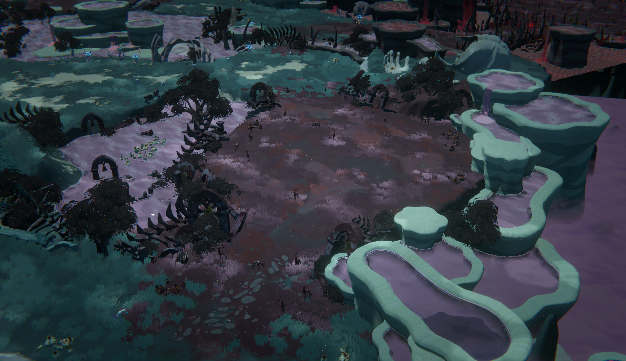
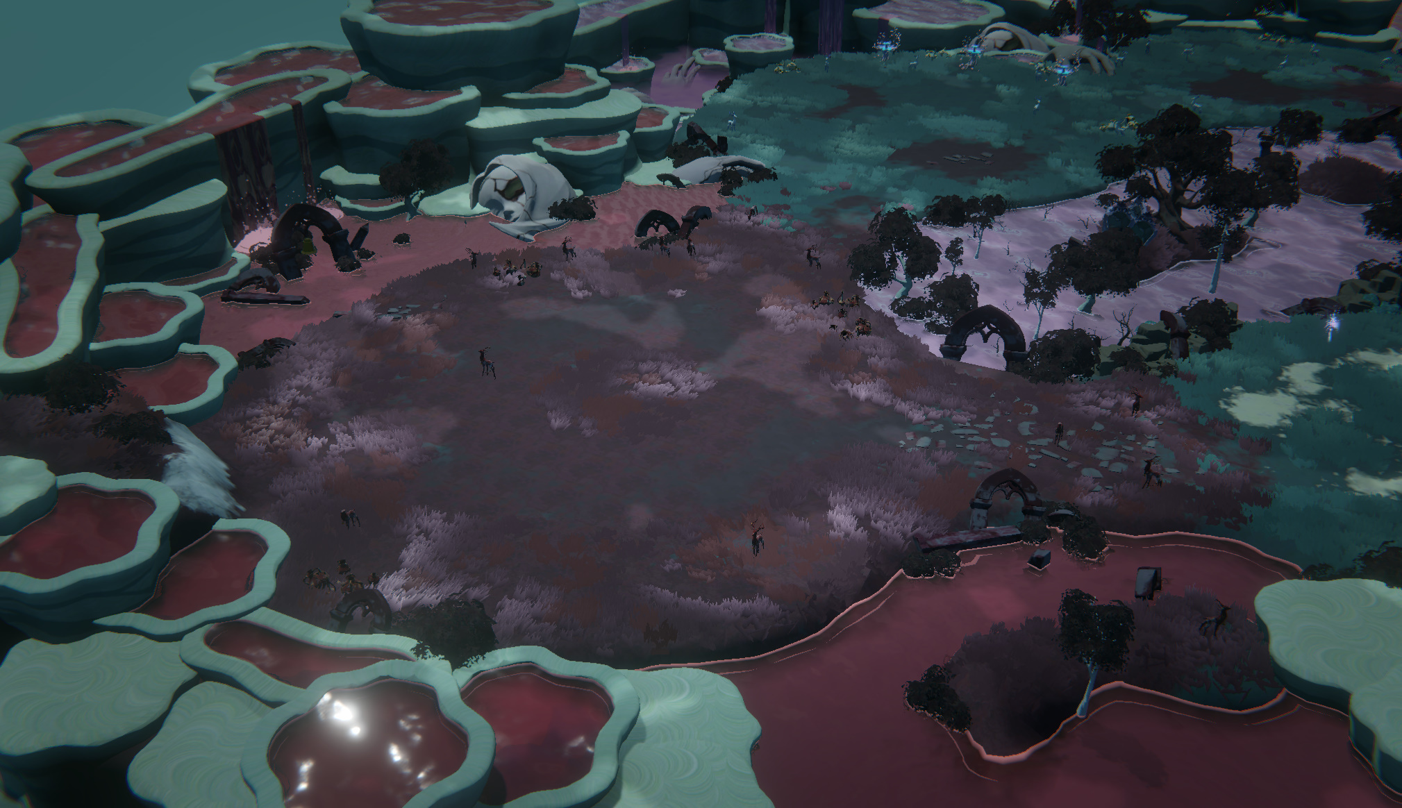 * Redesigned mid-boss area
The mid-boss area needed a signal more direct than shifts in color. We wanted players to immediately feel, the moment they entered, that they had arrived somewhere different from the fields up to that point. So we made the lighting turn dark upon entering the mid-boss area, and we added assets around the perimeter that give a more threatening impression than before. We also used a reddish tone for the ground and grass to distinguish them from the earlier field. Even without any explicit explanation, these visual changes—lighting, assets, and color—make it clear that you’ve stepped into a far more dangerous zone.
The arena where Baphomet, the final boss of ACT 1, awaits was also reworked along the same lines.
While preparing Demo 2.0, we created a new entrance sequence for Baphomet, focusing on crafting a far more solemn and ominous atmosphere than before. The boss room itself had to be able to fully carry that presentation. If the entrance scene became more dramatic while the space he stands in remained unchanged, its impact would inevitably be diminished.
We replaced the floor and grass with reddish tones, and the deer statues were changed to appear broken or stained with blood. Ultimately, we wanted Baphomet to feel less like a powerful foe who suddenly appears, and more like an ominous presence that has long occupied this place.
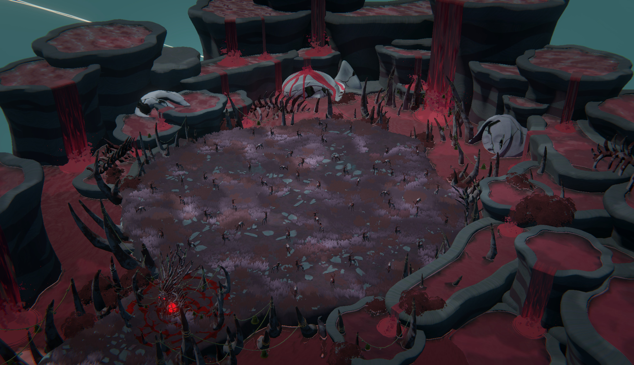 * Reworked boss area
In this way, the design of the settings in ACT 1 focuses less on simply adding new elements and more on creating the emotional flow players experience as they move through the space. Alongside the revamped combat system, we believe these changes are what will help deliver a gameplay experience that feels far more dynamic, intuitive, and vivid.
## A Sanctuary Worth Returning To
While we worked to heighten the tension of the battlefield, the Sanctuary presented the opposite concern.
The Sanctuary is the place you return to after finishing intense, grueling battles. It functions as a practical hub for gearing up for the next battle, but above all, we wanted it to be a place where you can briefly let the tension go. Yet while wandering the wide, quiet Sanctuary, it could still feel somewhat empty and silent. We wanted to fill this large space with more life and add something that would welcome both Fenrix and the player. That’s how the ideas for the new golem and marimos took shape.
At first, we thought about giving these small golems a more serious role. We considered assigning the golems roles in which they would show hidden aspects of the narrative, and we also explored ideas that would have them take on a wider range of functions within the Sanctuary. But after weighing various possibilities, the conclusion we ultimately reached was cuteness. “Cuteness saves the world.”
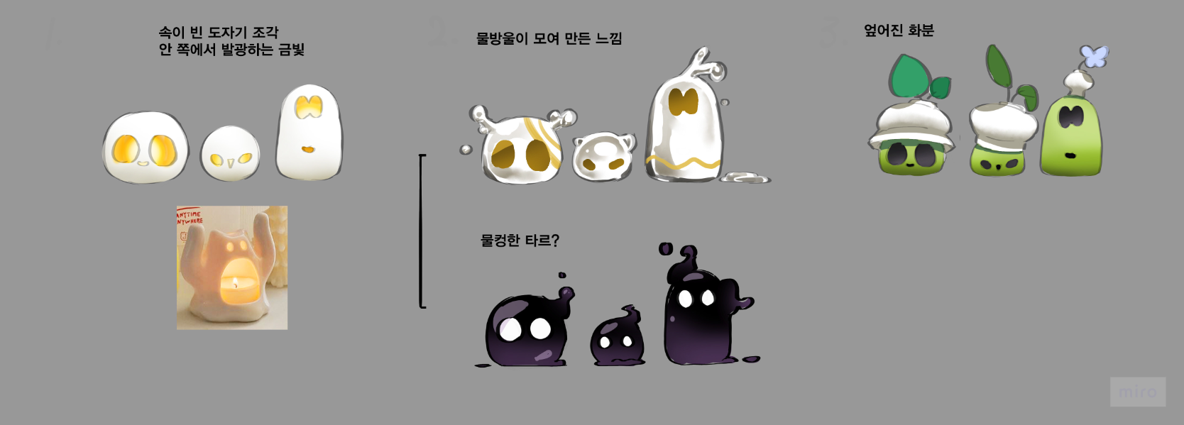
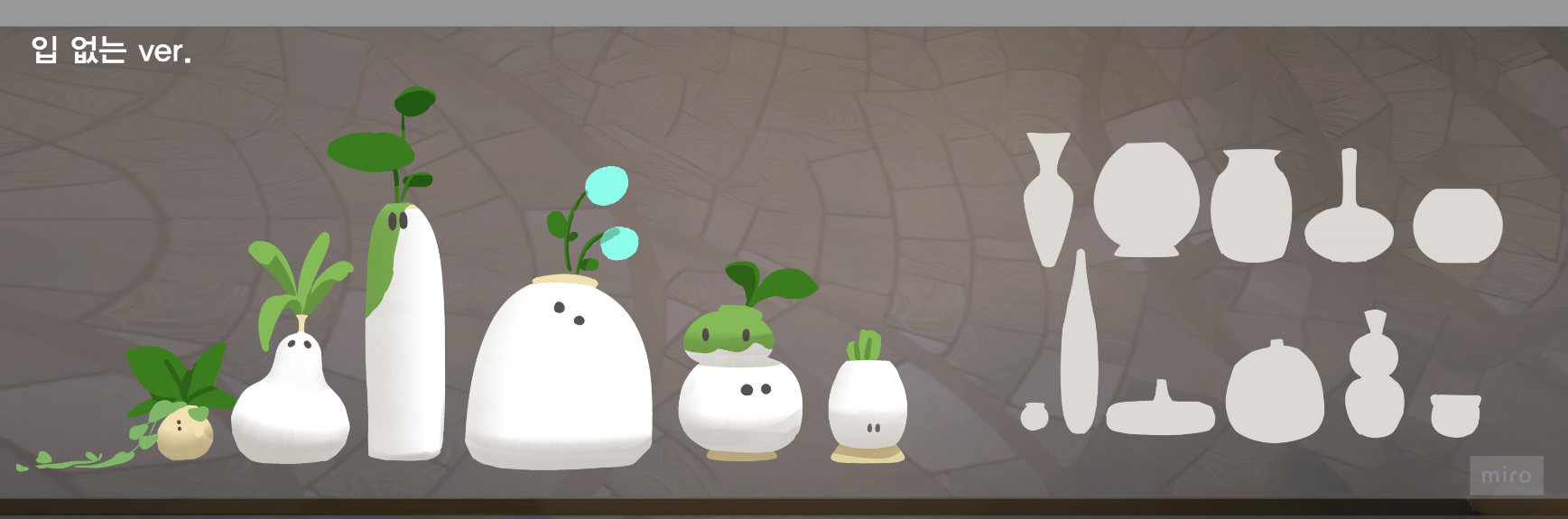
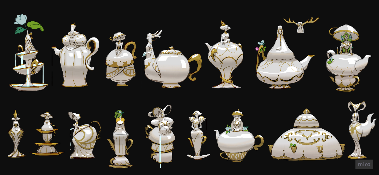
* Early concepts for the mini golems and Mama Golem (now Kiri)
And so we began designing small ceramic golems with varied forms. Just imagining these tiny golems wandering around the Sanctuary made the space feel instantly more lively. But once we placed the designs in the actual Sanctuary, a new problem emerged. The Sanctuary is designed around broad white and gold tones. Placing small ceramic golems of similar colors there meant they were not only tiny, but their hues also blended into the background, weakening their presence.
So instead of ceramic golems, we drew inspiration from “marimos” themselves. Their small, round forms preserved the cuteness we originally intended, and their green color stood out clearly against the Sanctuary’s white and gold. In this way, the mini golem concept evolved into the small marimos we have today.
However, the small marimos alone didn’t seem quite enough to fill the vast, soaring Sanctuary. We needed one more substantial presence to complete the scene of marimos gathered together—a larger companion who could look after them and play with them. That’s how we created Kiri, the large elephant golem who waters the marimos and plays with them in the water.
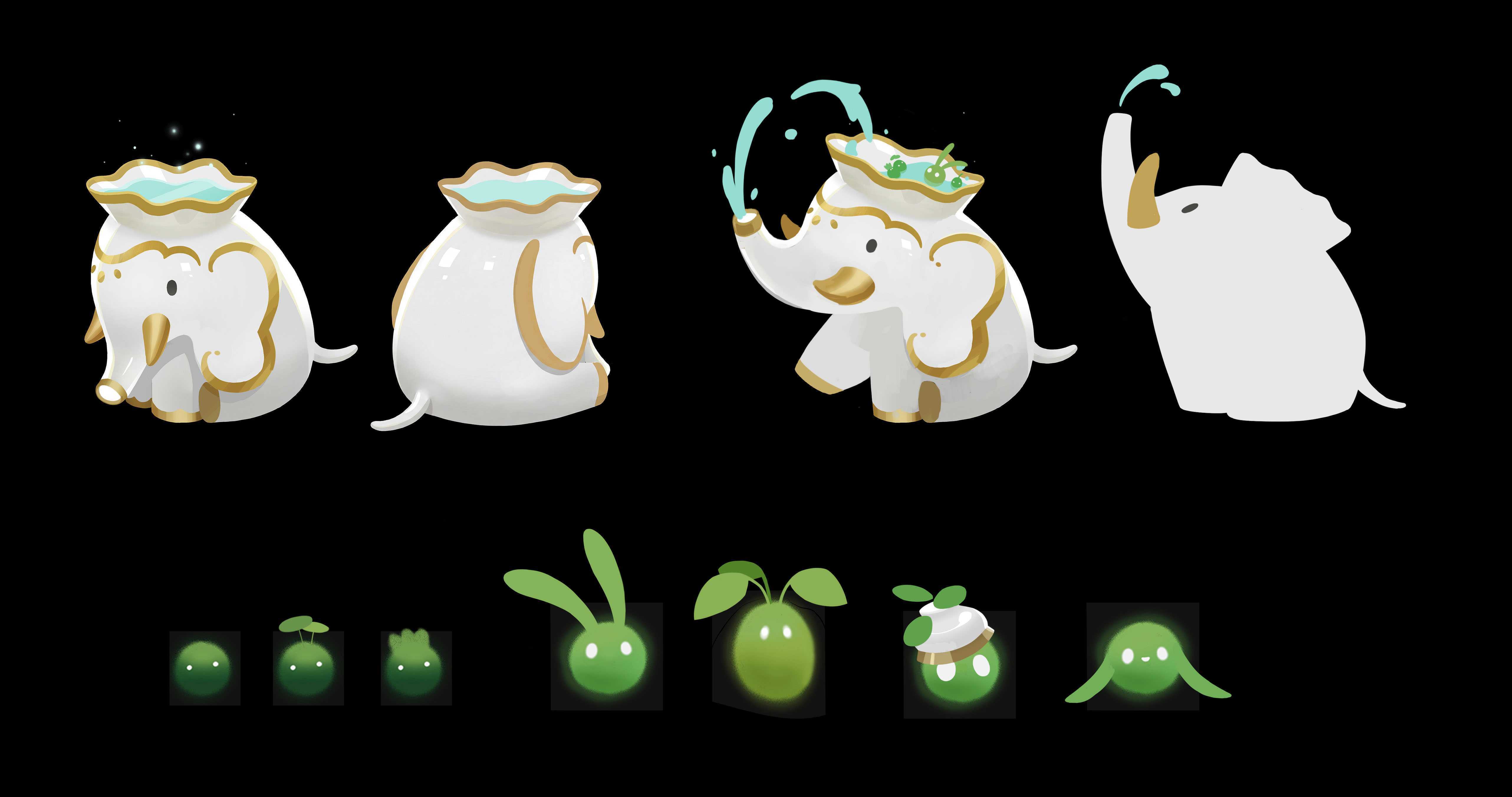 * Kiri and Marimo design
Marimos and Kiri are not merely decorative elements meant to make the Sanctuary look cute. The marimos react to Fenrix’s actions, follow him around after he returns from battle, and warmly welcome him back. Sometimes they increase his movement speed or provide simple information needed for gameplay. You can also watch them splashing in the water with Kiri or piling themselves into towers to pass the time. In this manner, Marimos and Kiri were designed not only to fill empty spaces in the Sanctuary, but also to establish small, meaningful relationships with the player within it.
Their presence does not significantly alter the flow of the game, nor are they essential elements required to progress. However, I have always believed that such small details make the world feel more convincing. I hope they offer a small comfort to Fenrix and to the player as they return from a long battle.
## Final Thoughts
As we were preparing Demo 2.0, we refined the settings of ACT 1 and the Sanctuary in different ways.
On the battlefield, we adjusted the lighting, assets, and colors so that the flow of danger would be conveyed more clearly. In the Sanctuary, we added new creatures to make it a place where players would want to linger and look around. Though these two efforts may seem to move in different directions, they were ultimately elements of the same process: making clearer what players should feel within each space. If the battlefield feels more vivid and the Sanctuary feels more alive, then the purpose of this work has been fully achieved.
Thank you for taking the time to read this update. We hope you experience the newly updated ACT 1 and the Sanctuary’s little companions in Demo 2.0.