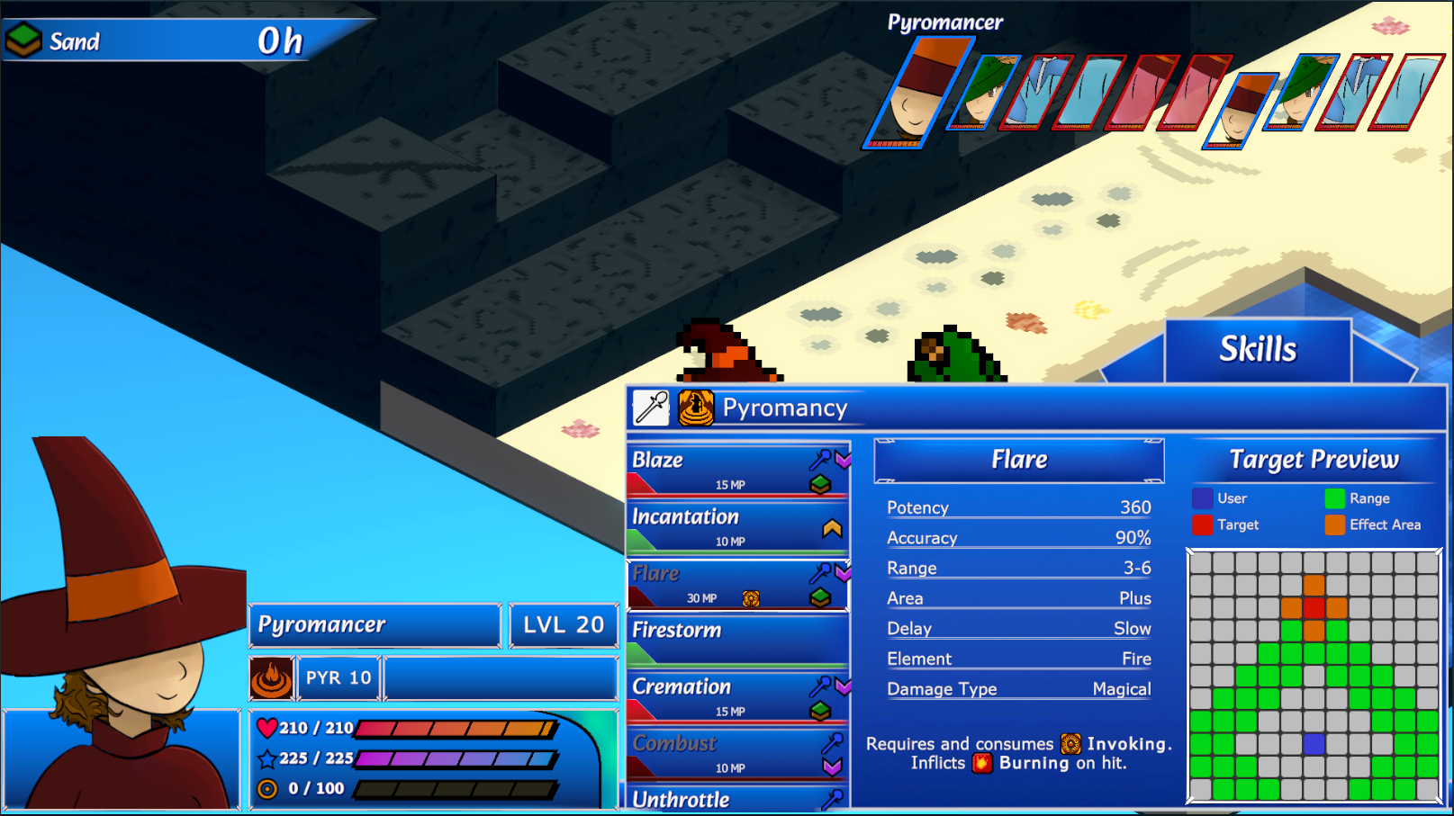
Hey all! Here's a first look at a new menu I've been working on. I've been doing a ton of research recently and have a bunch of new ideas for how to improve some aspects of Crystal Horizons, primarily focusing on the UI. Recently, I've been trying to improve the Action Menus, which are a little bit important seeing as they are your primary point of interaction in the game.
Since the very beginning of the project, we've been using a design that involves small vertical menus that kind of fold out from the bottom right of the screen, pushing older submenus further left as you navigate through them. While there are some upsides to a layout like this, I constantly felt restricted when trying to convey information to the player. There's only so much space for information, and I cannot stress how important it is that a player has access to as much valuable information as possible as efficiently as possible.
So, after a few failed attempts at making the old design work, I've moved on to a new layout. At this stage, we'll still be using the vertical menu for the first level of the action menu, which has options like Move, Attack, Skills and Items. I'm looking into something new for that too, but it isn't ready just yet. For options like Skills, previously we would open another vertical menu for skill categories (for example, Archer would have Archery, Elemental Quiver and Bow Arts as options), which would then open a third menu with all of the actual skills.
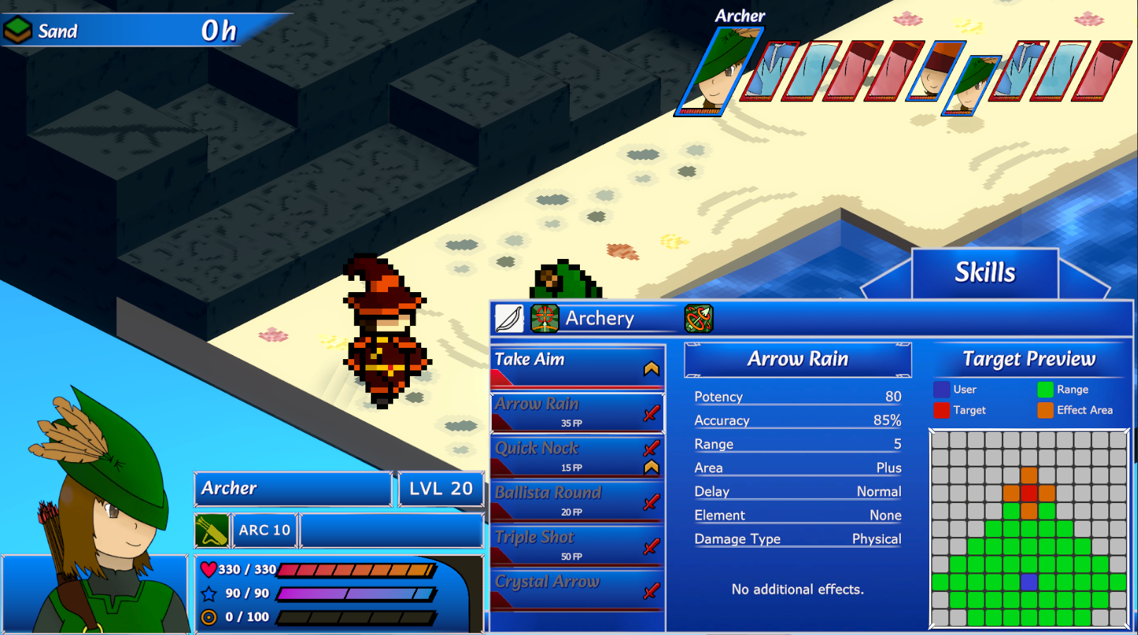
With this new design, however, I've managed to streamline the process into a single larger menu. Upon selecting Skills, you'll now open the Skill Menu, which has lists of skills just like before. Instead of being under different menus, requiring navigating back and forth through different levels, we now have other skill categories as separate tabs that can be accessed with a simple left or right input. Most importantly however, we're able to include a lot more information. I'm very excited about this, but nothing here excites me as much as the Target Preview.
This little thing has been on my wishlist for years now, but I could never find a place for it that was both useful and easily accessible. Playtests have shown that attack range and area of effect are often some of the most confusing things for players to understand on a skill-by-skill basis. Now, when selecting a skill to use, you'll be able to get a strong idea of how the skill works without needing to select the skill and begin the targeting phase. This should make some of our more unique skills a bit less confusing to use.
As always, we'll be looking to make small improvements here and there and clean up any errors. In fact, we've already made the panel a little bit smaller since we got the screenshots, but you'll have to wait until next week to see the difference. Additionally, we'll need to create some simple icons for the different skill categories, as right now I'm just reusing old status icons and the weapon icons. I'll be sitting on this one for a while and seeing what feedback I get and how it goes in tests, but I'm a big fan of the design personally so I have high hopes. Thanks as always for tuning in!