
Hey all! Here's a quick look at some design changes we're trying out for status icons. First, we have a before-and-after comparison with the Ruptured icon (from Thief), where we've changed the background and background accent to be gradients rather than flat colors. It's a simple change, but a pretty impactful one in my opinion.
Before | After |
|---|---|
|
|
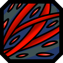
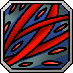
The other change I want to highlight is the adjustment of the border used for the icons. As part of our goal to diversify our collection of UI assets, we spent some time identifying what works and doesn't work across Crystal Horizons so we can figure out where best to focus our efforts. In line with our findings, we're trying out a silver border for the icons to better match the rest of the UI.
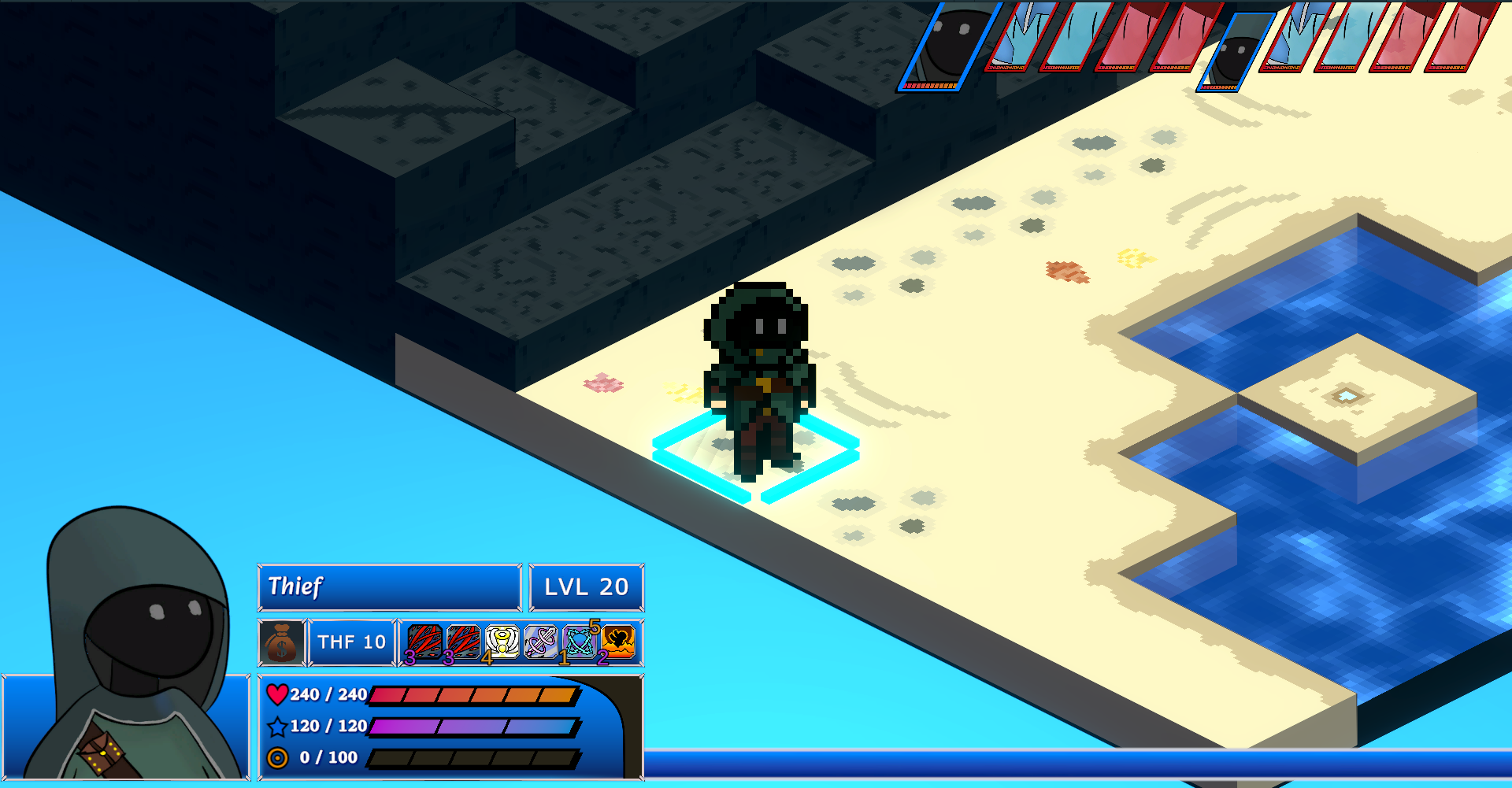
We've also slightly increased the size of the icons on the Unit Info Panel to better make use of the space and allow the details to display slightly better. Here you can see the previous version of Ruptured along with a collection of other icons that have had their border updated. Only Ruptured has had its background changed from this set, but the others will receive the same treatment over time.
Depending on how we feel about the changes, we'll roll them out over time to all our existing icons. We also have a small selection of icons we're looking to redesign, so unless we make any other universal changes that will be our focus for the moment. That's all for this week though; thanks for tuning in!