Adventures!
We’re getting very close to release (September 14!), so before you get your hands on Sigilfarer, we wanted to show you one of the areas that has changed the most over the past few months: the UI.
A lot has happened since the earlier builds. Playtests, new mechanics, buffs, debuffs, additional dice effects and general usability feedback pushed us to rethink several parts of the interface.
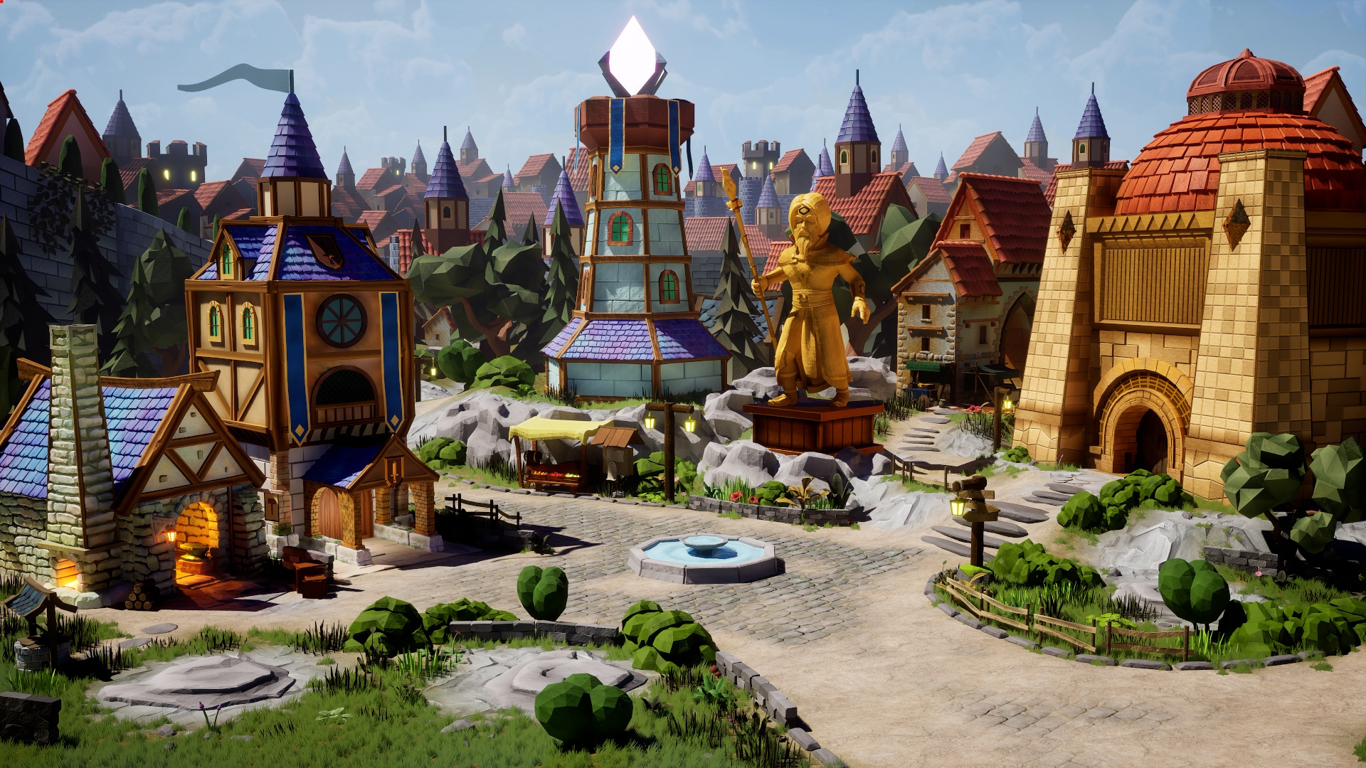
Welcome to The Anchorite City
The Anchorite City is your main hub between expeditions. From here, you can access every major part of the city and prepare your party for the next run: adjust your characters, equipment, dice, formation and expedition conditions. And one thing connects almost everything you do here: Memory Shards.
You collect Memory Shards during expeditions and spend them back in the city to permanently increase the strength and flexibility of your party. Spend them wisely. :)
Guild
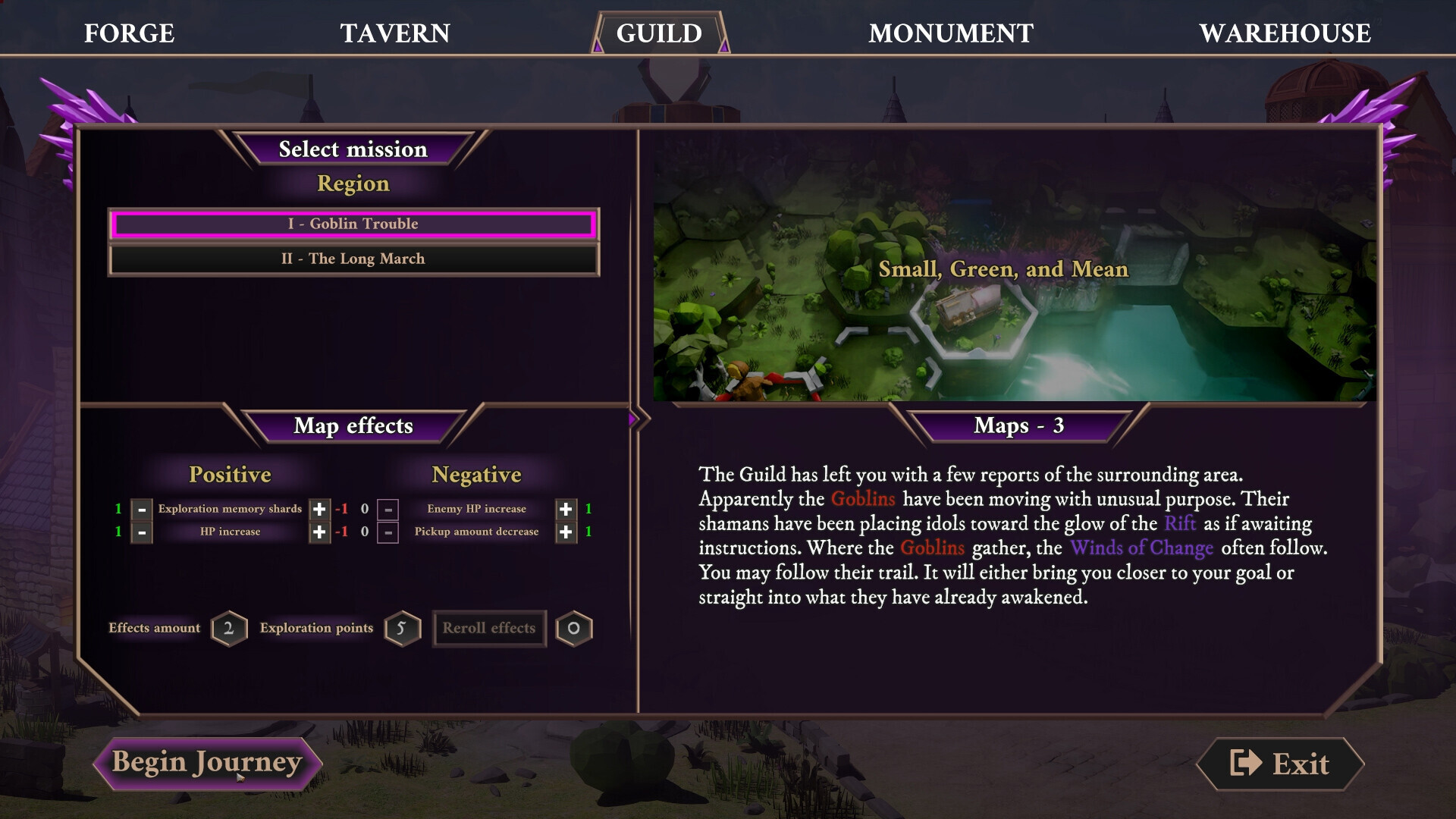
The Guild is where every new expedition begins.
Here you can select the conditions of your next run and adjust the difficulty to match what you’re looking for. You can modify both positive and negative effects, creating a run that is either safer or significantly more rewarding. Want more Memory Shards? You may have to make things harder for yourself. Experiment with the modifiers and keep pushing the difficulty — your party will become stronger with every run.
Warehouse
The Warehouse is your main equipment planning screen.
This is where you decide which weapons and armor each member of your party will take into the next expedition. Different equipment can change much more than raw stats, so planning your loadout also means planning how your dice will behave once the fighting starts.
Monument
At the Monument, you can finally put those hard-earned Memory Shards to work.
This is where you purchase permanent upgrades for your characters, dice, abilities and other systems that will help you during future expeditions. Every run makes the next one a little different — and potentially a little stronger.
Forge
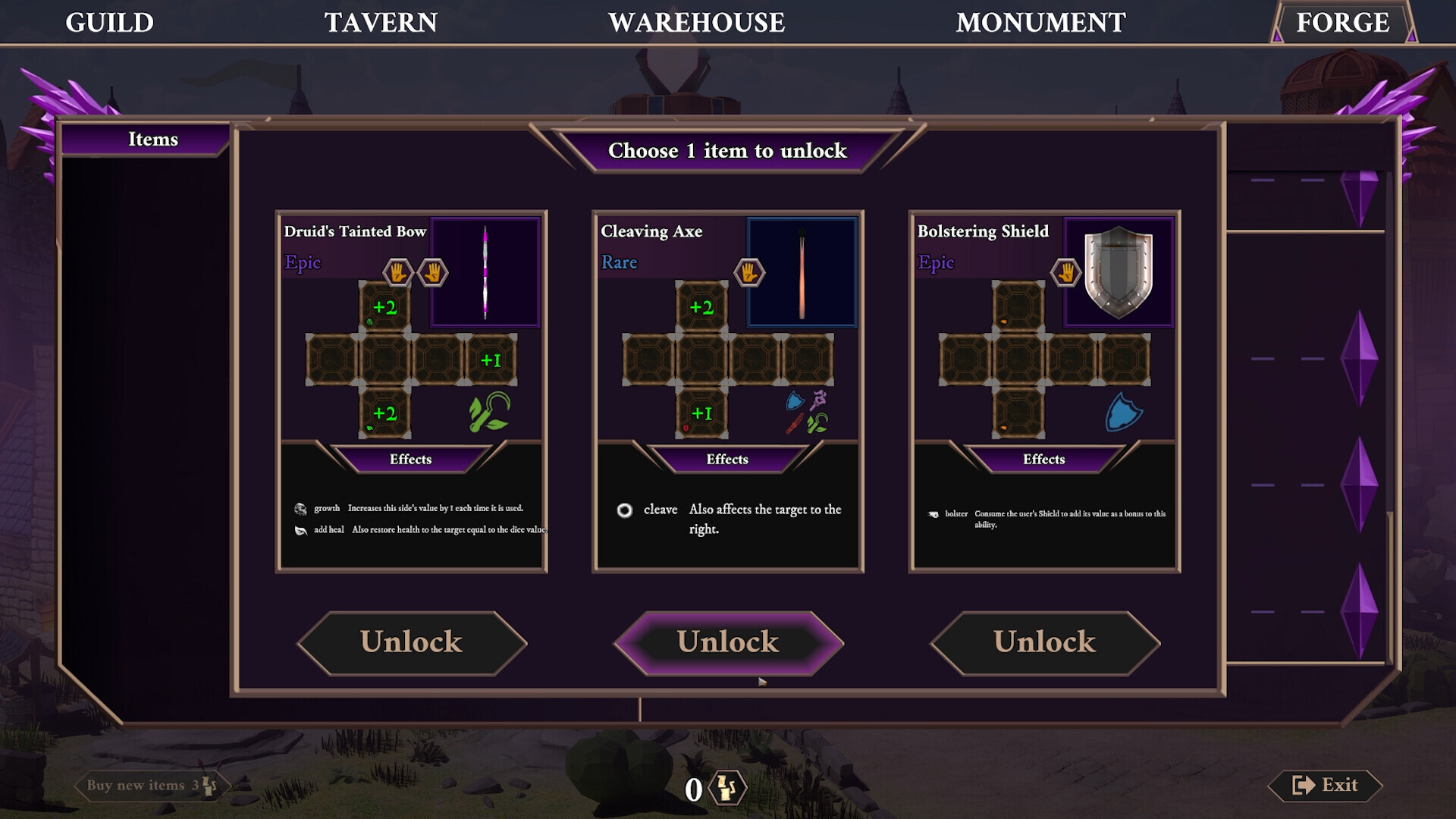
The Forge allows you to craft new equipment.
And equipment is one of the foundations of increasing the power of your dice. Weapons and armor can introduce new effects, alter existing ones and open up new combinations, so crafting the right item can be just as important as improving the characters themselves.
Tavern
The Tavern is where you manage your party formation.
Positioning matters. Some dice effects interact with party members standing next to a character, so changing the order of your heroes can have a real impact on how your builds perform. Sometimes moving one character by a single slot can make the whole setup work.

Combat UI
Combat is probably where the changes are easiest to notice.
Playtesting — combined with the addition of buffs, debuffs and more complex dice effects — showed us that the old interface simply wasn’t doing enough. Looking at the comparison below, you can see just how much has changed.
BEFORE ❌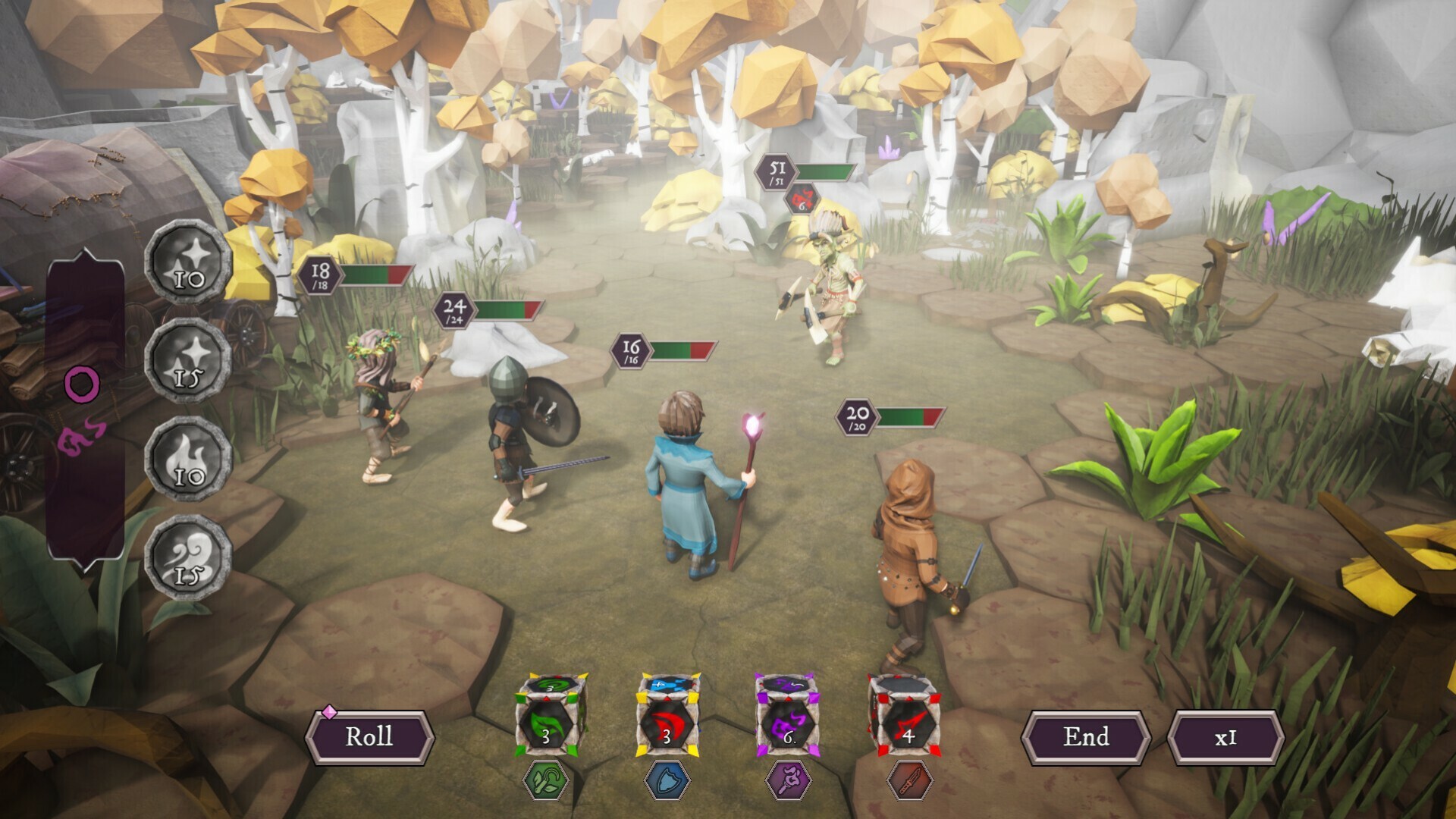
AFTER ✅
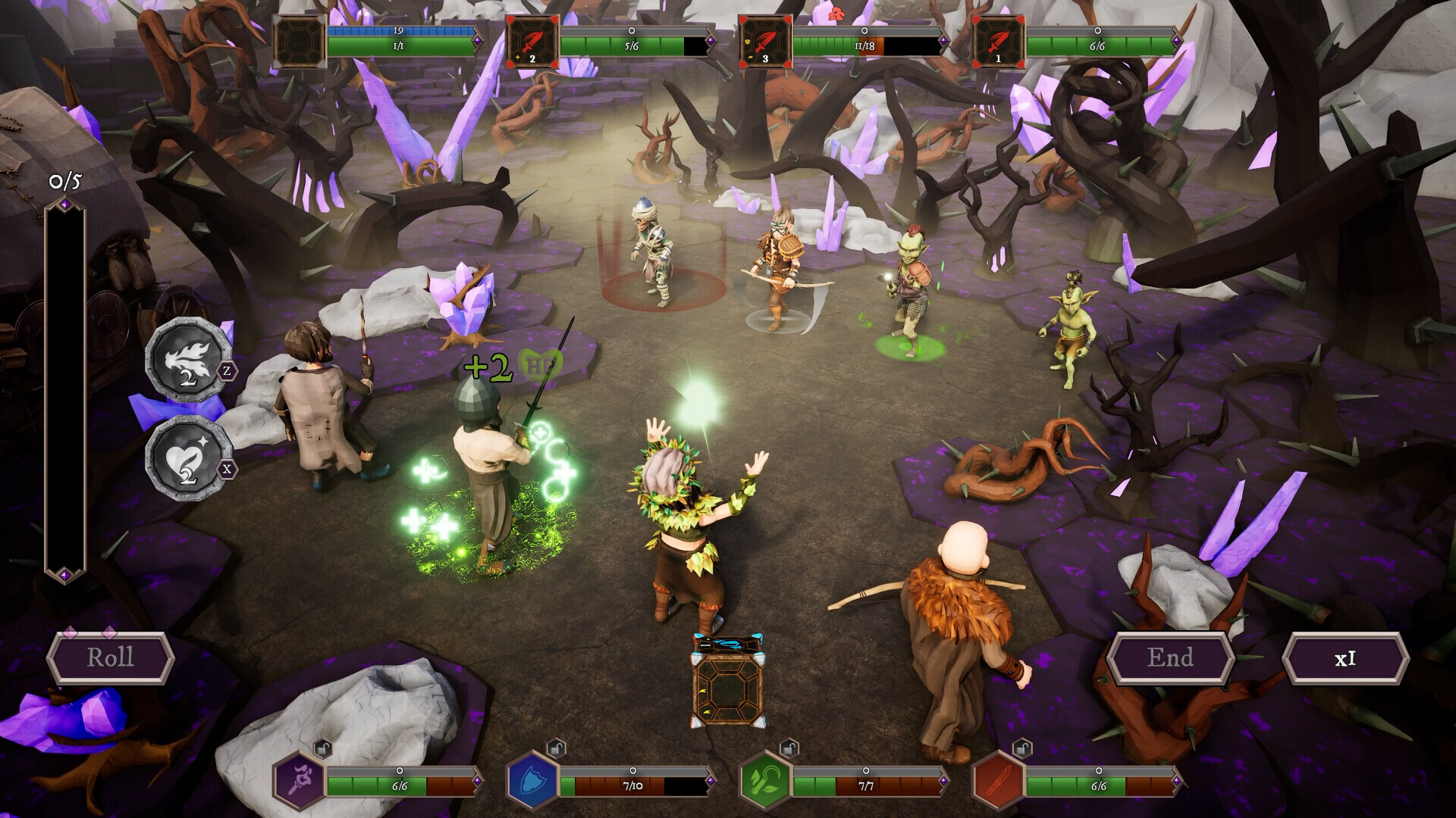
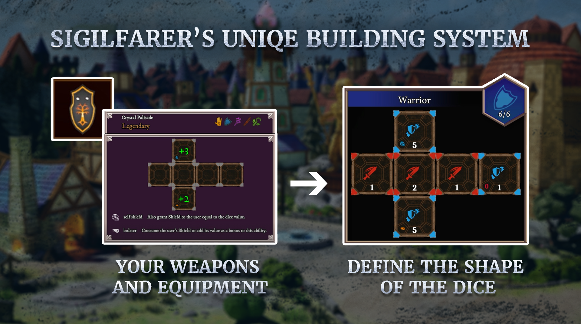
One of the biggest improvements is the new dice design. Dice are cleaner and easier to read, and now use smaller effect icons directly on their faces. Each icon represents an effect triggered by that particular side of the die.
These effects can do very different things.
They may:
heal or shield enemies,
support members of your party,
modify weapon effectiveness,
introduce additional combat effects,
or become part of larger dice combinations.
And there’s an important catch: not every equipment effect is purely positive. Sometimes you’ll have to choose between something like reduced base damage and gaining access to additional dice effects.
The interesting part is that many of those effects can be combined. That trade-off is a big part of building your party. The strongest option on paper won’t always create the strongest build. We also redesigned character and enemy health bars to make the state of combat easier to understand at a glance.
Exploration UI
Exploration needed almost the opposite treatment. Instead of adding more information, we decided to remove it.Earlier versions of the game were simply showing too much at the same time.
BEFORE ❌
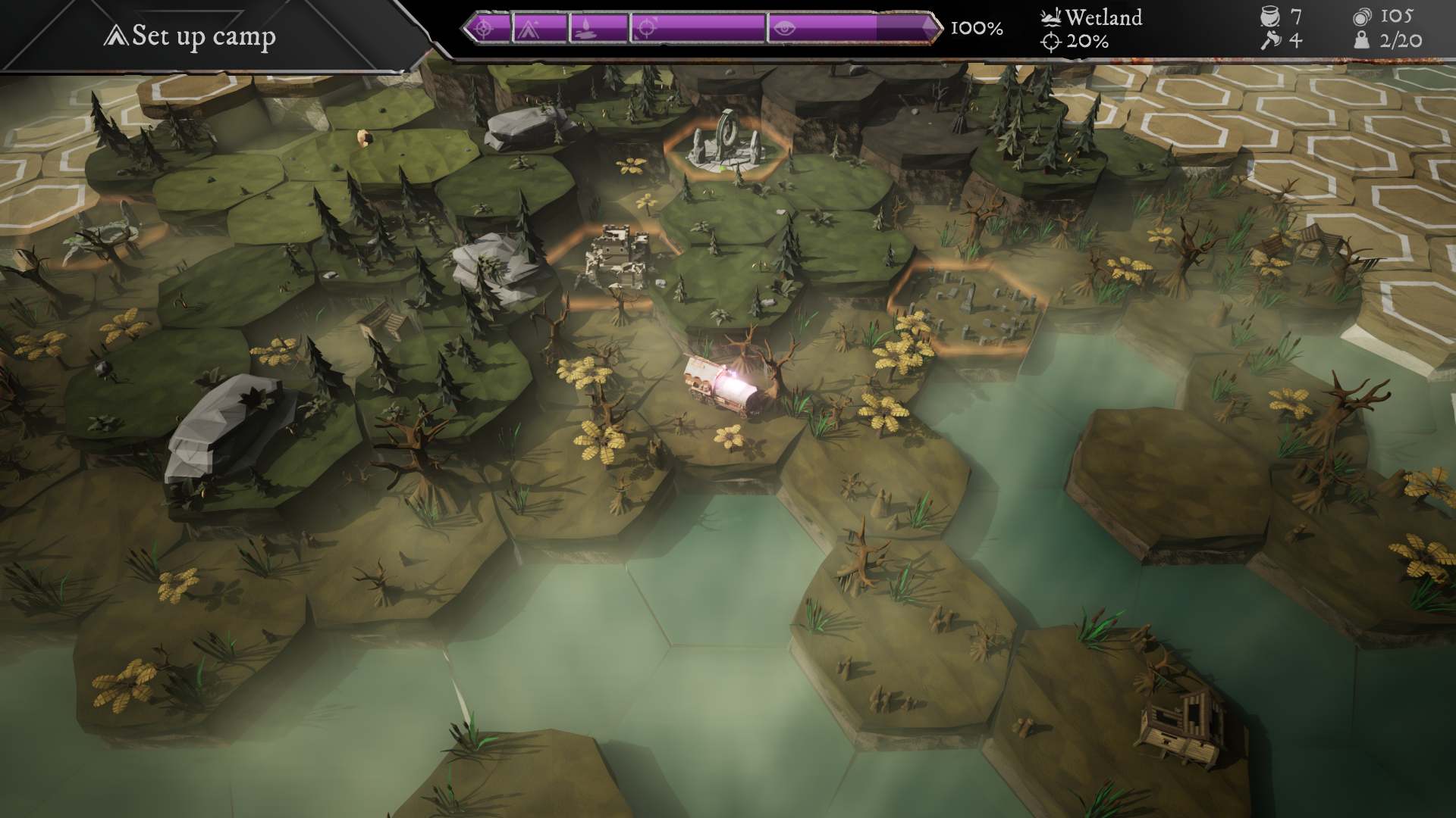
BEFORE ❌
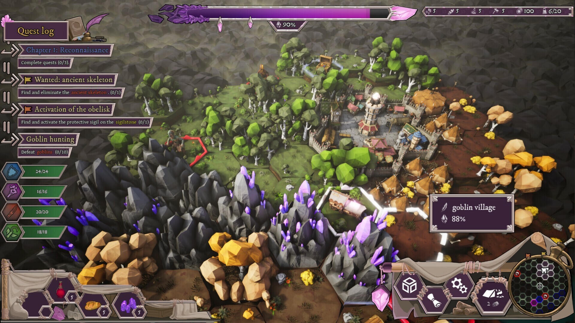
AFTER ✅
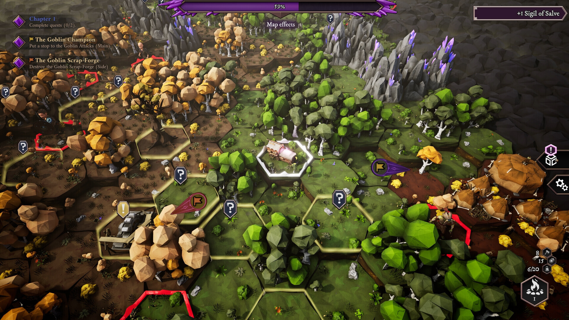
For the new exploration interface, we:
removed the minimap,
reduced the number of resources you need to keep track of during exploration,
cleaned up the overall screen,
and redesigned the Quest Log to make it clearer and easier to use.
The goal was simple: keep the information that actually helps you make decisions and remove the things that were mostly creating visual noise.
You feedback matters
We can’t wait for you to finally play the new version of Sigilfarer in less than two weeks. The game is being made by a small development team, and your feedback has already helped shape many of the changes you see above.
So once you start playing, keep it coming. Tell us what works, what doesn’t, which systems need more explanation and — most importantly — show us the ridiculous dice combinations you manage to create.
Review keys are also available now.
If you’re a creator, streamer or member of the press interested in covering Sigilfarer, you can request a key through Lurkit or find more information on our website.
Wishlist the game now! ✅
Watch the Release Date Trailer! 🎬
See you on the road, Adventurers! ⚔️🏹
/ Sigilfarer Team 🎲

