Hello everyone!
Accessibility is an important matter for us as we work on Farmwand. We want to provide the best experience for as many players as possible, and balancing our view for the game with the different needs of all kinds of players is not always easy. In this article we will talk about some of the challenges we face and how we are trying to solve them.
Working on color for colorblind players
Working out how to achieve the best experience for colorblind players has been a challenge, as we are not colorblind ourselves. There are some filters that simulate what the world (or in this case, our game) looks like for people with different kinds of colorblindness.
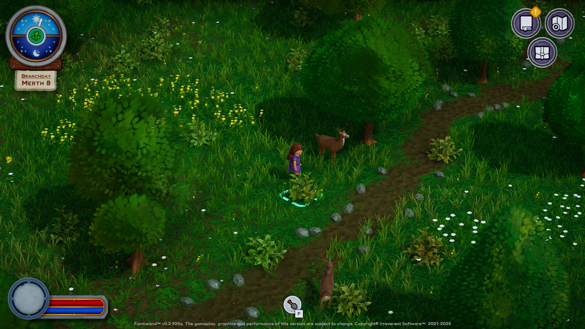
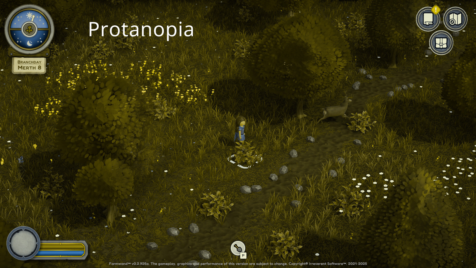
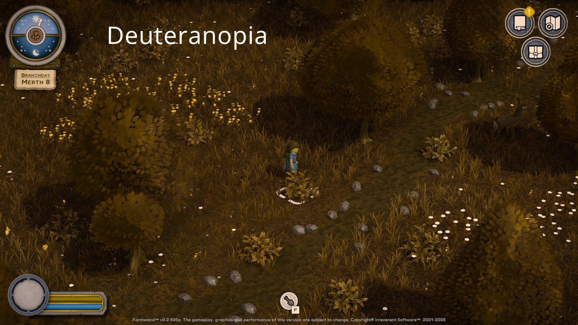
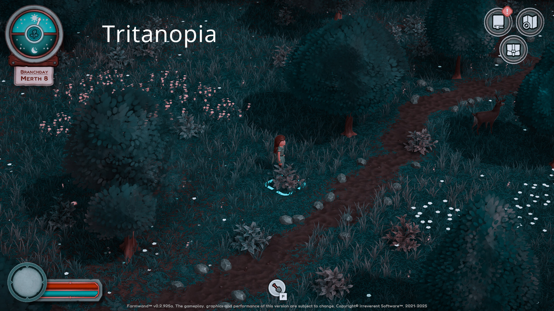
These filters allowed us to notice that certain features on our terrain, such as dirt roads, were not easily noticeable for people with red-green colorblindness (protanopia / deuteranopia). Now, this is a problem since we cannot really tweak the colors of the dirt roads themselves as they are painted onto the ground itself.
It is tempting (and we see this in a lot of games) to just adjust the hue of the scene with a post process effect so that the elements that appear yellow-brown to people with colorblindness shift towards pink or blue, making them more noticeable to them. That however, is not correct.
While to people looking at the filter through a colorblind sim the trees or the road may have shifted from one unnatural color to another (for example from yellow to pink or purple) for people with colorblindness trees are supposed to look yellow-brown. It would be, for non-colorblind people, as if trees had suddenly turned from green to...well, pink or purple. It is just plain weird to look at.
So what can we do?
Our current approach has been to do a side by side comparison, one with the colorblindness simulator and one without it. We tweak the colors so that they are distinguishable in the colorblindness sim while making sure that on the other side they remain somewhat natural.
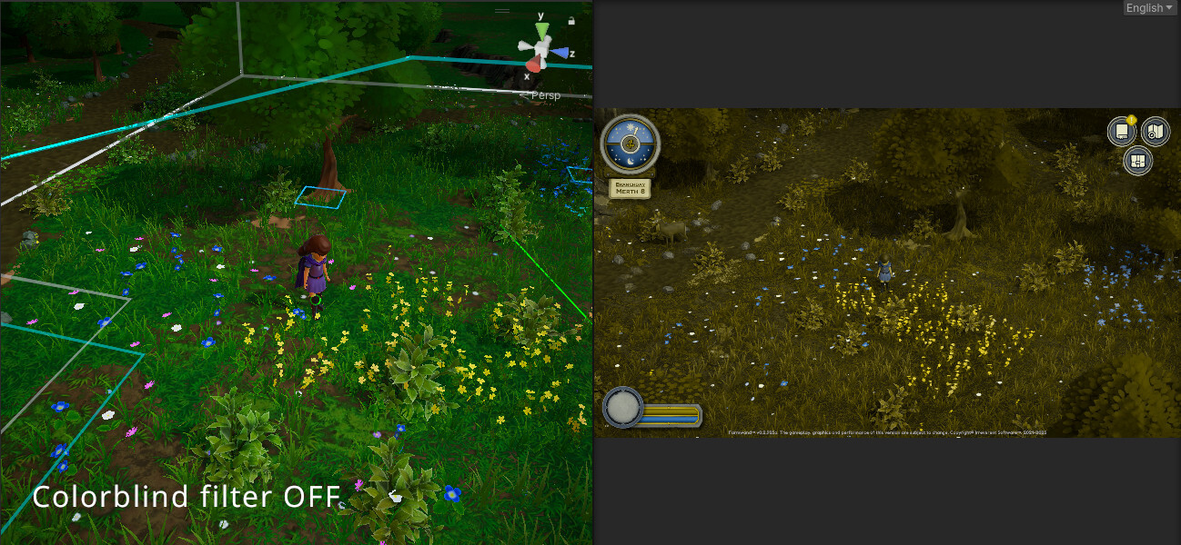
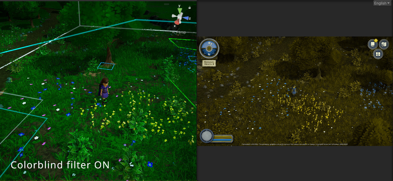
We achieve this by playing mostly with lightness, saturation and contrast rather than with strong hue shifts.
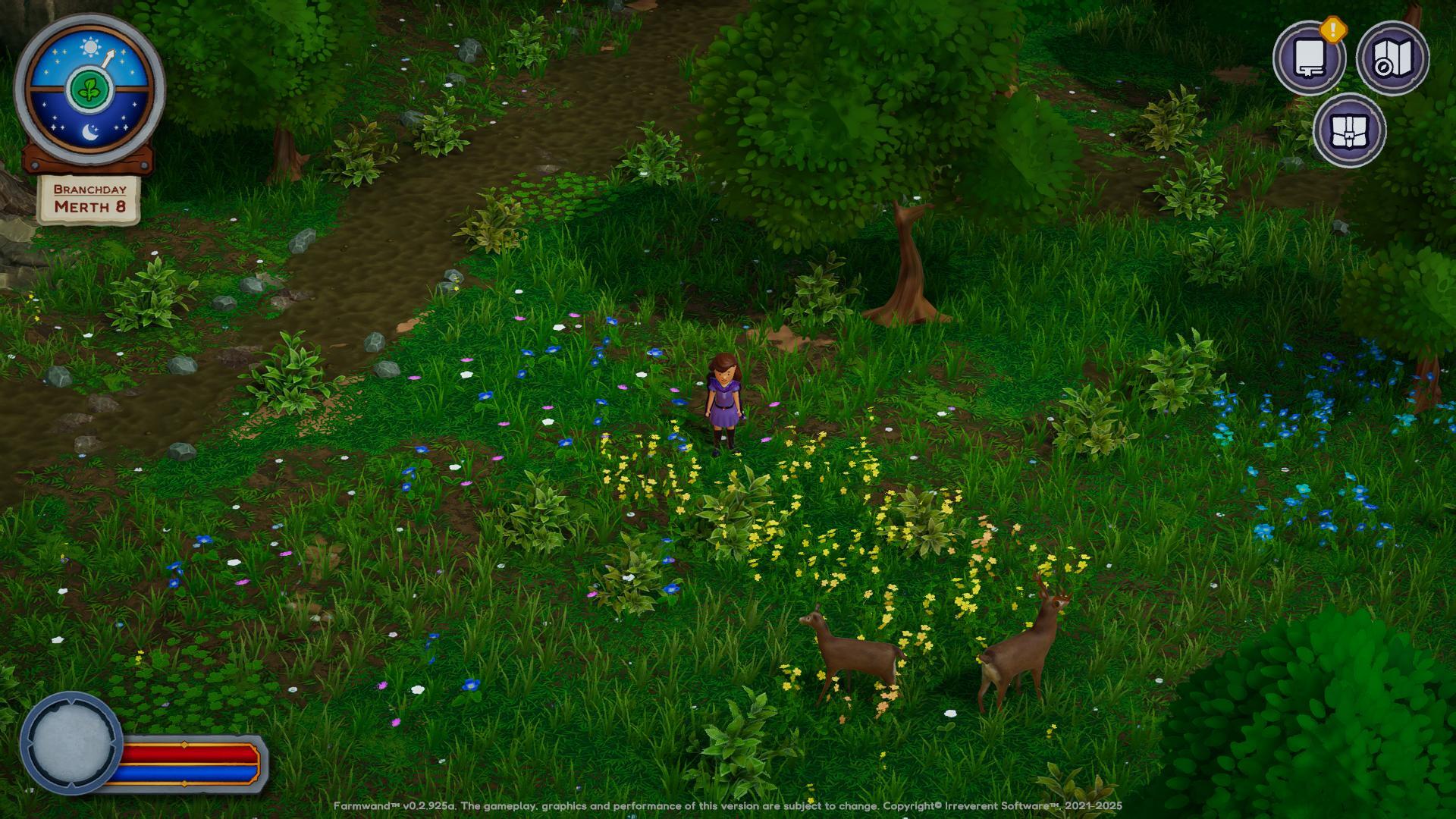
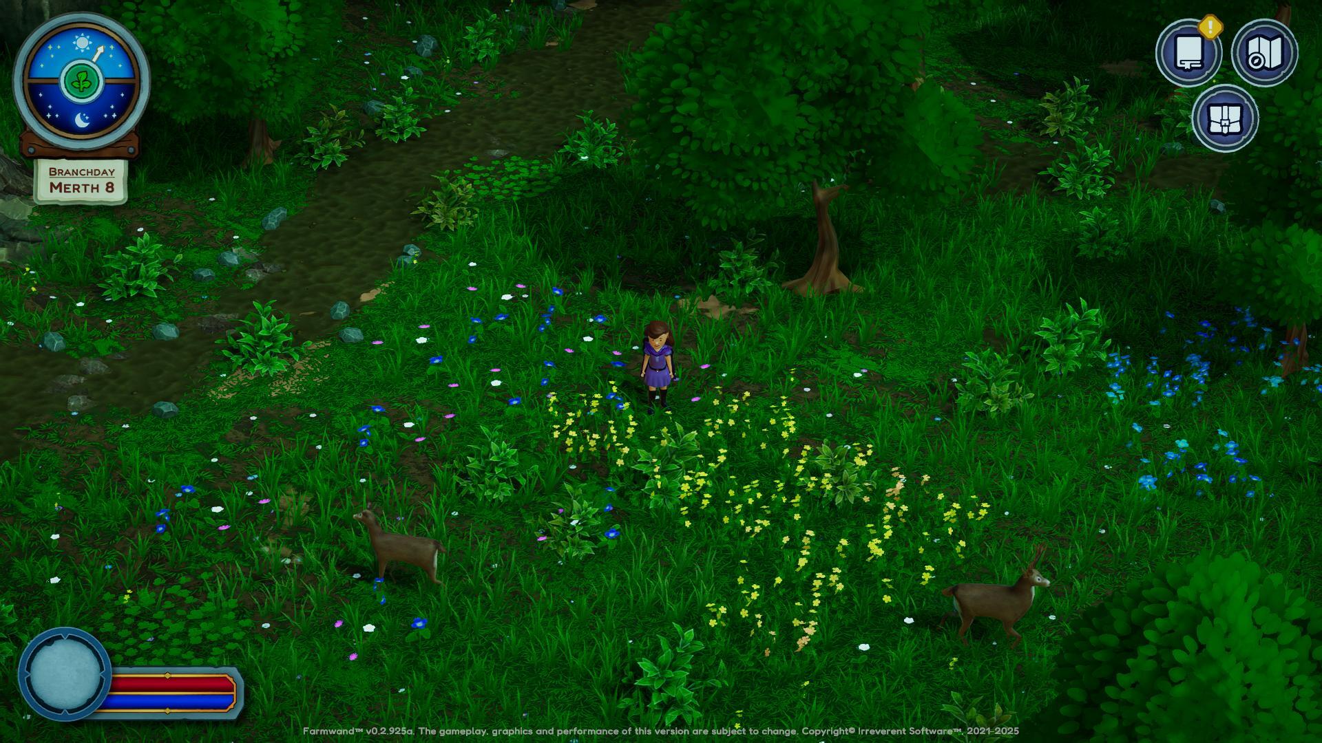
It took a little while to wrap our heads around adjusting colors in this manner and it is by no means perfect, but hopefully the results are helpful to the target audience.
Still, the best way to ensure people do not struggle more than necessary with this is to make sure that color is not the only indicator in game.
Icon-based Prompts
Originally, we used to indicate whether something was interactive or not by showing a small outline in the ground around the object in question. Trees had a green outline when you were in "cutting" range, weeds a cyan outline, etc.
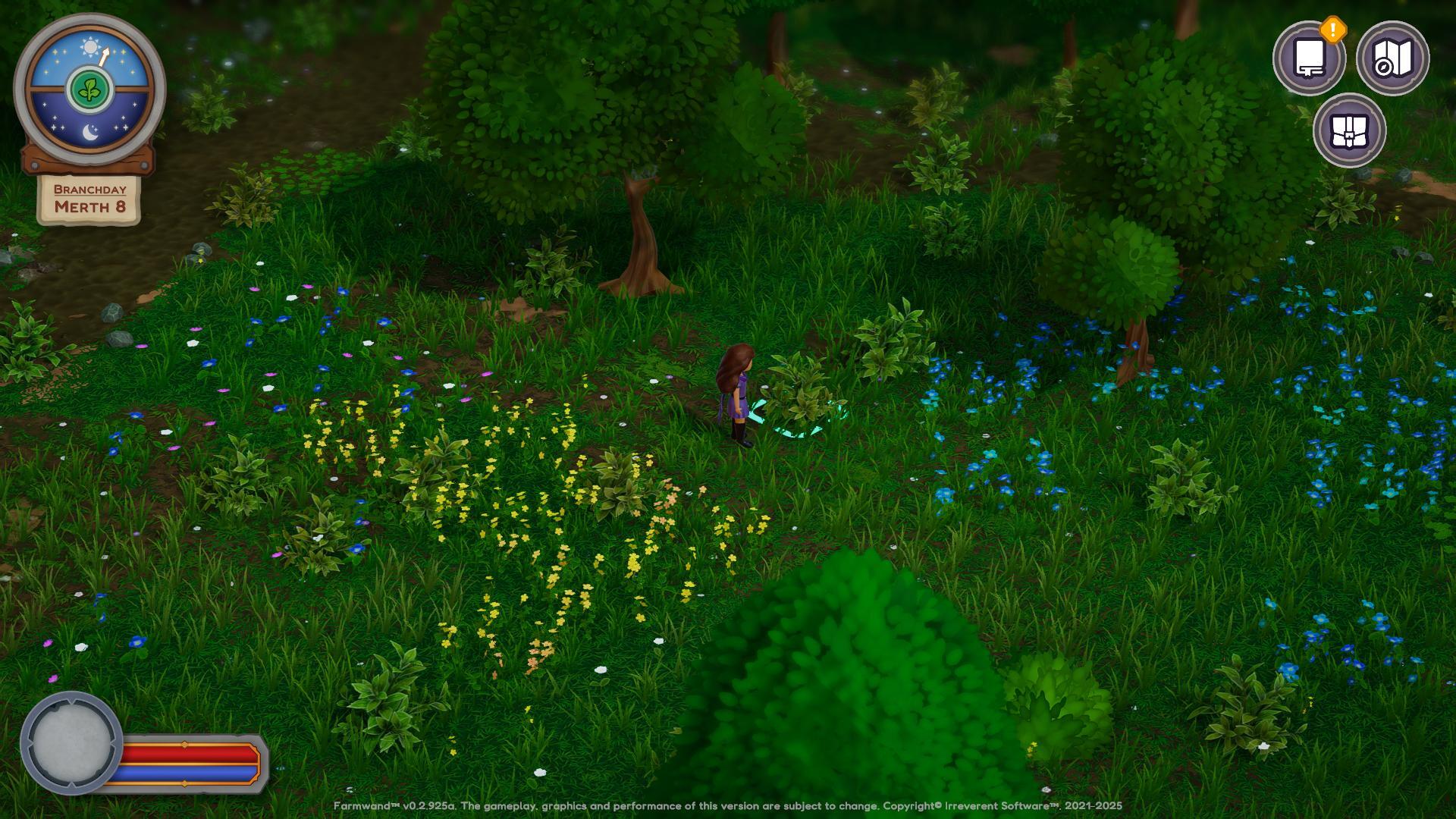
However, we have now added prompts for essentially every action you can take in the game. These prompts are small so that they are not overly distracting, but they should greatly help players to know when they are supposed to interact with something and how to interact with it, without guesses nor struggles.
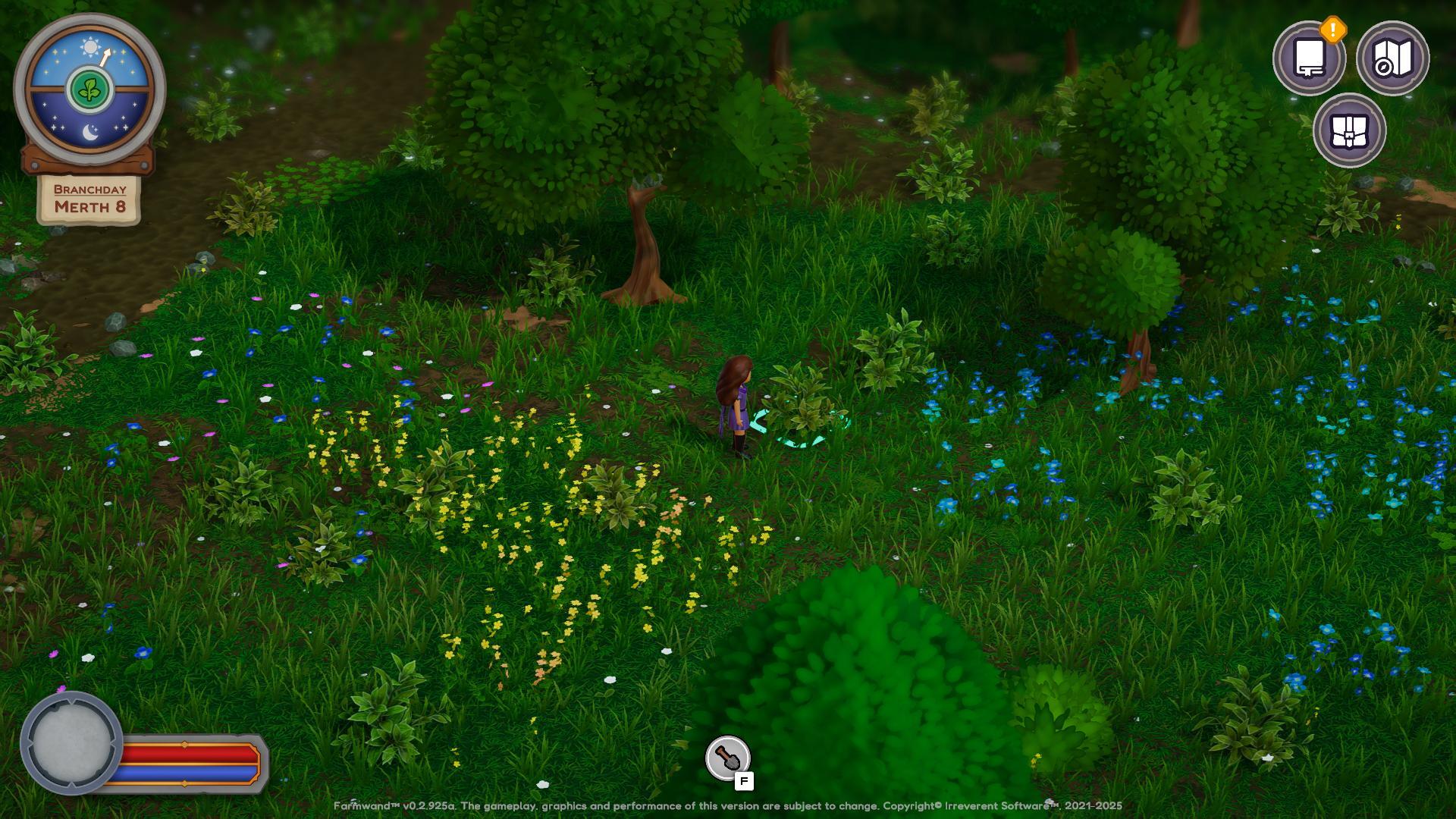
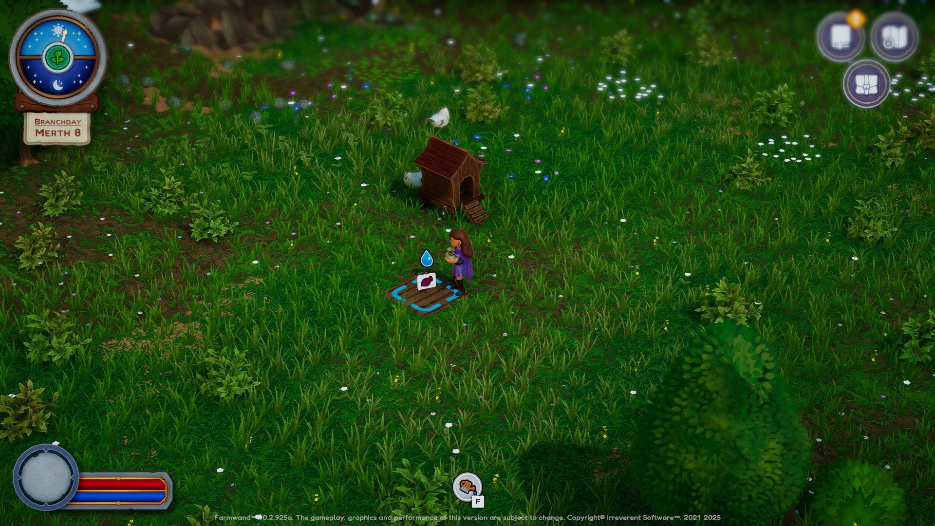
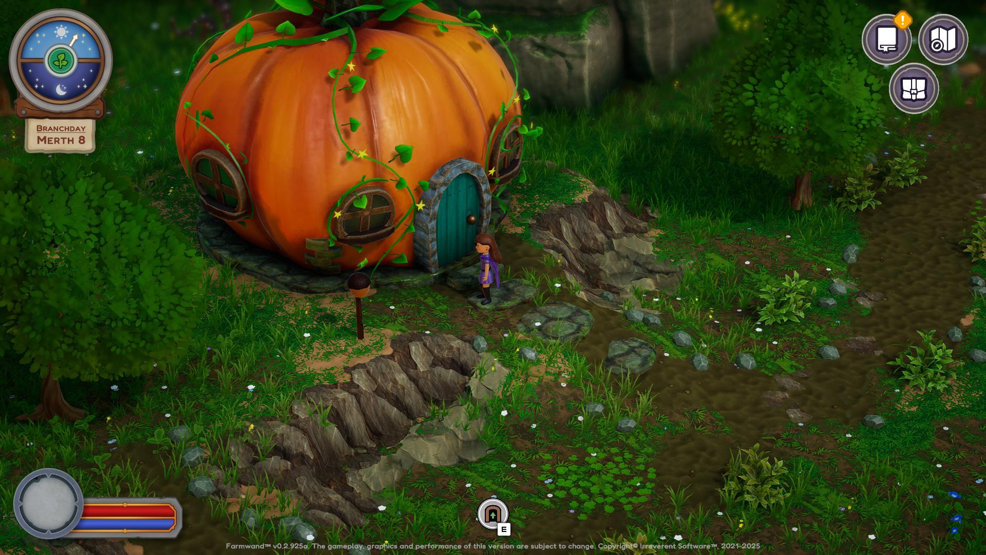
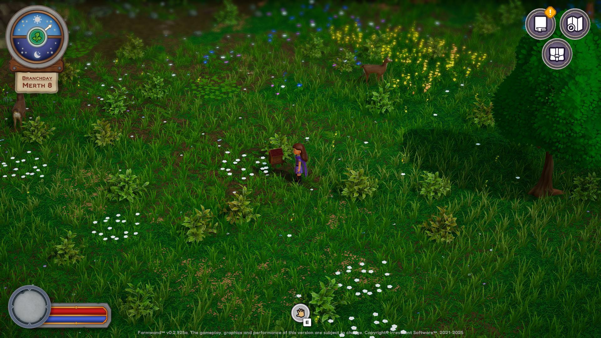
We also opted for using icons instead of text whenever possible since, at least at launch, we will have limited localization and we want to make the game more approachable to people who may not have the best grasp on English. While the more story-related elements may still be difficult to get, the rest of the gameplay can be made more accessible. At least until we add more languages!
How to move around
We have been working on different ways to control the character, testing carefully that each one is as easy and fun to use as possible. We are aware that there are players with limited mobility or who simply prefer to play their games in a different way. There are even different keyboard configurations to account for!
As such, we are including customizable bindings for keyboard, multiple layouts for gamepads and we are even working on a mouse-only mode to control the game. All of these should provide enough customization so that most players can enjoy the game with as little friction as possible.
Of course, as we play-test and go into Early Access, we will also keep open communications with all of you to add more layouts or tweaks that help make the game more enjoyable!
It is all in the UI details
Another thing we've been working on is the UI. We have made many different UI designs over the development of Farmwand, we have finally settled on a design that is both pretty and easy to navigate. We've been tweaking the colors slightly to make sure that they are readable under all circumstances, adding settings to adjust the size of the texts on top of that.
Something that people with weaker eyesight, such as my wife, can appreciate.
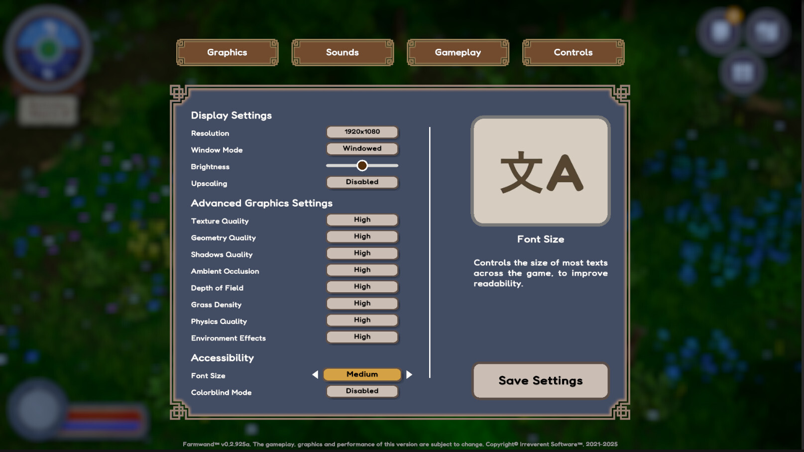
Tailoring the game to your liking
One last thing we've been working on from the very beginning is in adding lots of little tweaks that players can do to the gameplay of Farmwand whenever they want. While our vision for the game requires that it has a certain level of challenge (there is no true adventure without it!), what is exactly challenging for a player can be wildly different.
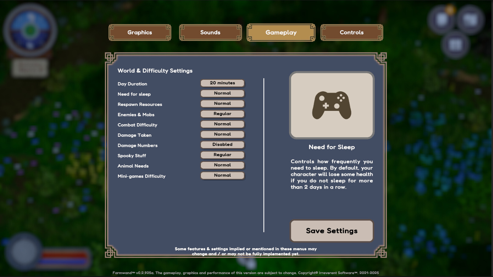
You can adjust the length of the days, how often you need to sleep, how resources are respawned around the world, how many enemies are there and how difficult to beat they are...
And while this is really useful for players who want the game to be more accessible, it also allows you to go on the opposite direction and make it quite more challenging. Whatever makes you happier!
Final thoughts
Accessibility is not something you can work on with a simple toggle. It requires you to think about your game's design, the different choices you make at every step and most of all to think about the needs of the players that want to enjoy what you have created.
We are a tiny team and our resources are limited. But we believe that with the support of our community and as more and more of you play our game and provide us with your feedback we can do our very best to make Farmwand a game that you can truly have many hours of fun with.