
Hi! Michał here, the art director for War Hospital. Today, I’d like to tell you about the process of looking for the visual atmosphere for our game, and the way we approached colors.
Disclaimer: I rarely start work without any research. Even when designing fantasy or sci-fi I like to find some references first. Usually, I’m not looking for anything specific. Instead, I’d rather go and search for something that would set the mood for my artwork. However, in the case of War Hospital, the process was slightly different.
When you’re making a game where historical accuracy is crucial, the pre-designing process takes much more time than usual. Sometimes as much as half of the time you’re going to spend on the project! Especially when we’re talking about War Hospital.
I started by very precisely researching original documentaries and other useful information.
It’s more than just photos and paintings of war scenes. These were necessary, but I also looked for interesting photos from the northern region of France. These were mostly contemporary photos of nature that gave me a fully colored view of the place, which wasn’t entirely accurate in colorized photos. I also used photos from the proper period to see the arrangement of villages, roads, and such).
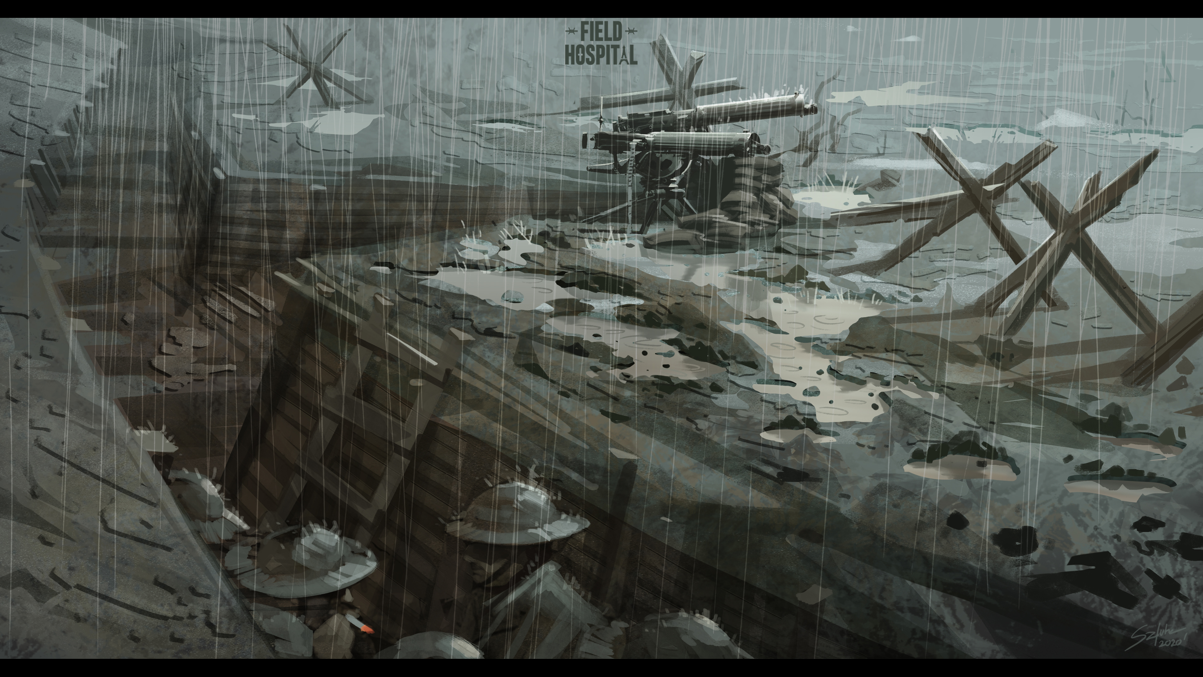
Let’s say that I have to create a character based on our script.
I have to determine how this particular type of unit will fit in our game and to do so, I need to know how its uniform looked, what equipment it should have, etc. Although our characters and their inventory are heavily stylized and exaggerated, their details need to match. Thus, I’m not starting painting until I have a strong, historical foundation.
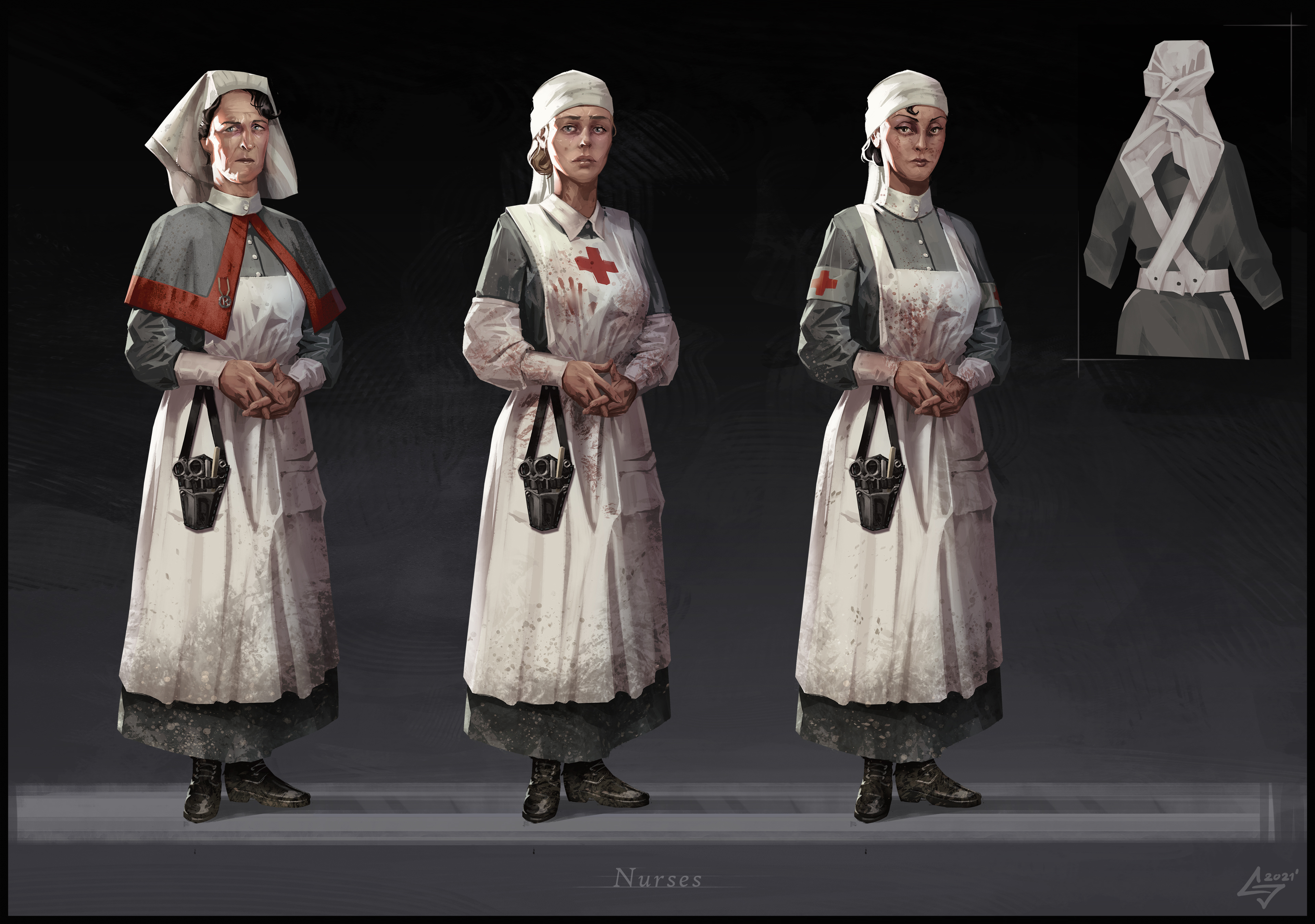
I must say that creating the main characters, like Henry Wells or Sister Janet, was quite a challenge.
Similarly looking at military uniforms doesn’t make the design any easier if you want to have unique and expressive characters. I dealt with it by shaking up smaller details of uniforms and equipment, and by differentiating body proportions, sometimes even to a point of caricature. There are also expressive, memorable faces that match the character description.
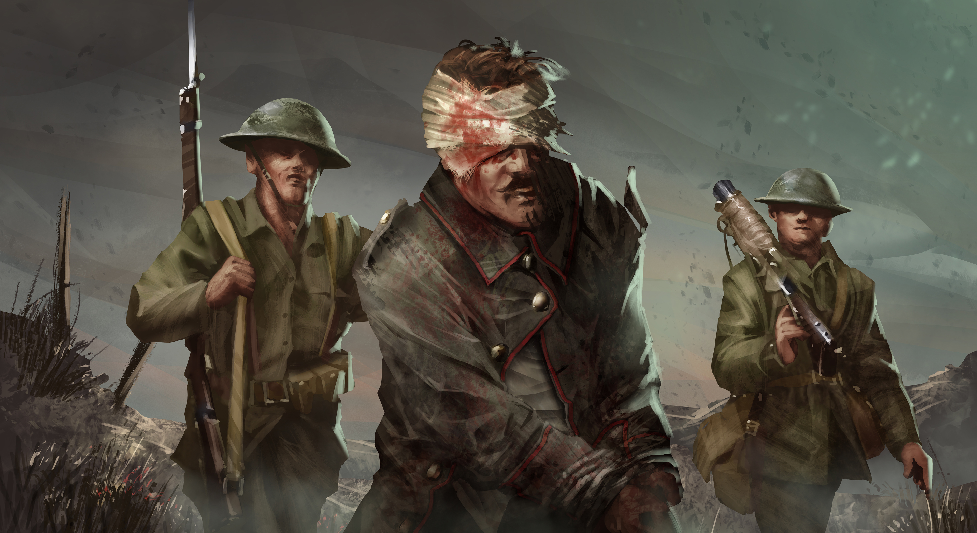
In terms of environment the process is quite similar, but with small differences.
The main buildings in our game are very different from typical military barracks and tents from World War I.
They are like this because we want them to be as interesting as possible. Still, if you look closely, you will see some more traditionally militaristic elements such as tent sheathings, furniture, packs, or boxes. Combining the two, I’m able to develop buildings totally unique in form, but with an atmosphere suitable for a British WWI base.
One considerable challenge was creating the whole town where most of War Hospital gameplay takes place. As the main reference, I decided to use the French town of Rochefort-en-Terre, which remembers the medieval times. It became my basis for the general look of buildings. On the other hand, I used my architectural education to create the town layout.
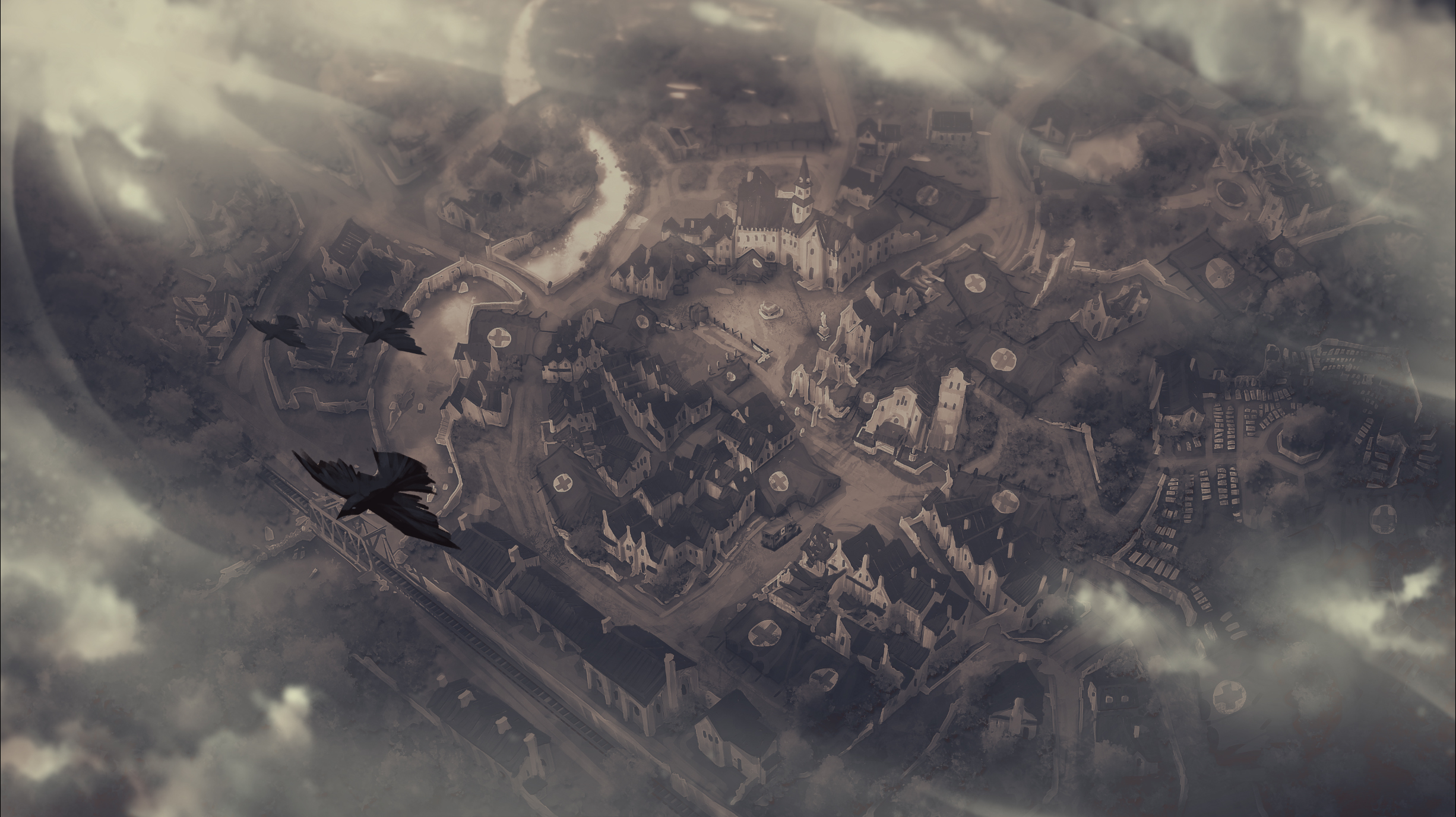
Besides everything I’ve discussed above, I also created mood boards and atmospheric art. Here I have to thank our wonderful 3D artists that did a fantastic job putting my ideas into the game engine.
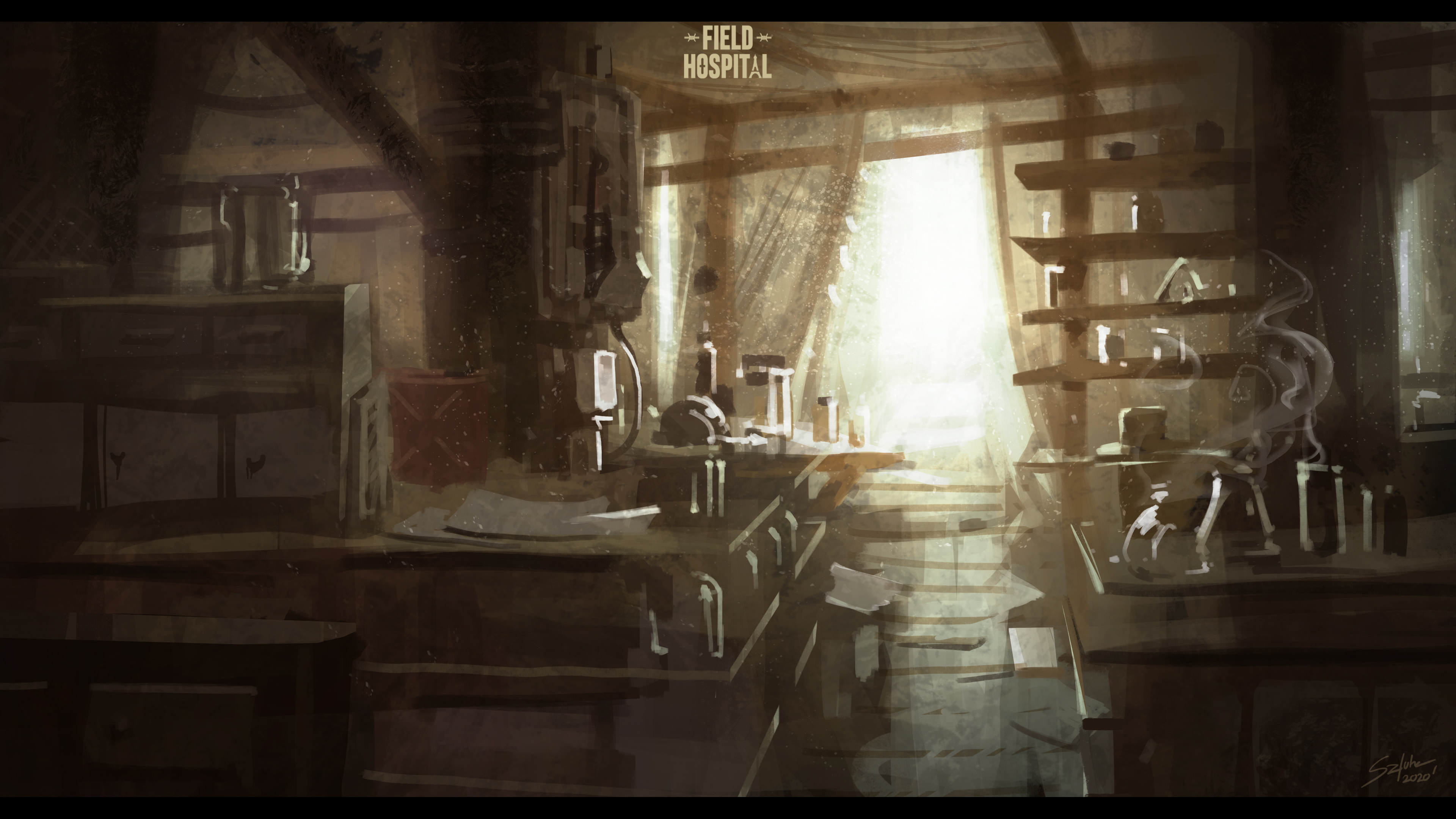
One of the most important goals for me was to avoid the greyish color palette typical for WWI and WWII games.
We tend to identify the past with desaturated colors due to the way it was archived - via black-and-white or sepia photography. But the early 20th Century wasn’t monochromatic at all. With War Hospital, we got a chance to create a fresh and good-looking world, both diverse and colorful, that breaks with the tradition of war visuals.
Adding color doesn’t take away from the tense atmosphere. On the contrary, it grounds it, making it much more relatable. We aren’t looking at some alien planet with a brown filter anymore. It’s our world, and this horrific conflict takes place in our backyard.
Did you like this inside look at game development? Wishlist and follow War Hospital, and join me next time in our Dev Diary!