
Hello heroes! 👋
Before we begin today's episode, a little heads-up: Are you following Laz the Burger Boss's 10-minute entrepreneurial adventures on YouTube? Catch his latest attempt to discover the perfect burger recipe 🍔 in sunny Australia while serving picky staff at the train station! 🚉
Now, let's get into this dairy.
Sometime in July, we posted a short update about how we began overhauling the game's UX to eliminate pain points players had experienced during our alpha playtest. In this episode, we'll take you behind the scenes to see all the changes we've made.
Strategy games are a fascinating mix of careful planning, decision-making, and intricate game mechanics. A well-designed UX is the only way to fuse these elements into an engaging challenge, making the experience of victory even more satisfying. 🏆
For us, our goal was simple:
Design a UX that welcomes all skill levels, combining intuitive design with the depth and complexity loved by expert players.
We needed to clearly present ample information and diverse functions while guiding players through complexity without overwhelming them. 🤯
Formulating UX Design Principles 🪨
Inspired by player feedback, we crafted four foundational UX tenets based on several user questions to guide our current and future design efforts.
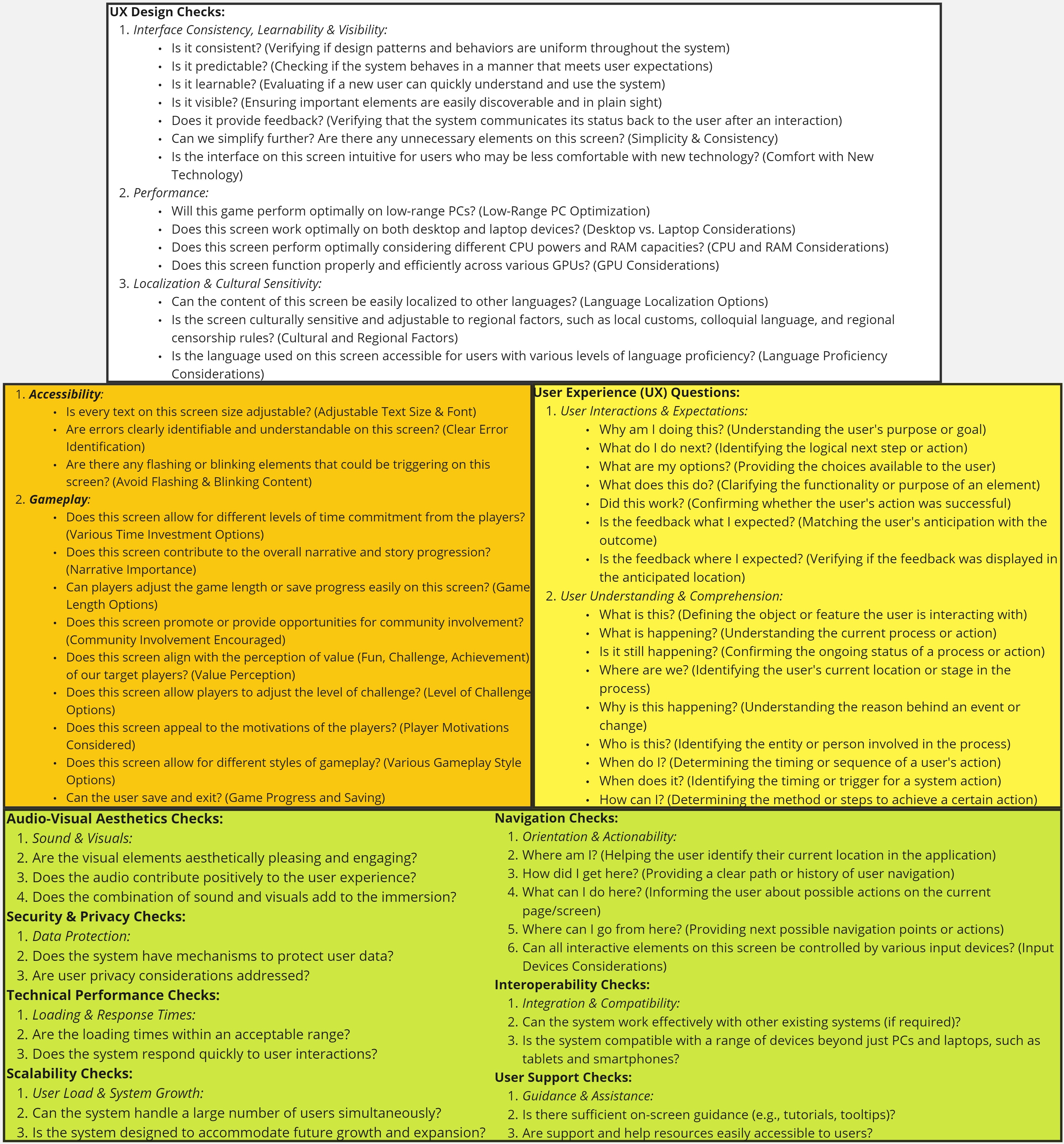
Here’s a summarized version of what we came up with:
- Enriched Engagement: Foster player agency and optimal interaction by providing comprehensive data for informed decision-making and an intuitive, predictable interface.
- Immersive Feedback & Aesthetics: Use pleasing audio-visual elements with immediate, clear feedback mechanisms to create a deeply resonant and immersive player experience.
- Seamless Performance & Navigation: Ensure a stable gaming experience across diverse platforms, with intuitive navigation and quick load times to maximize playtime.
- Universal Inclusivity & Community: Make the game universally enjoyable, focusing on cultural sensitivity, accessibility, and diverse gameplay styles to cater to varied demographics.
Ranking Game Mechanics ⚙️
To achieve a smooth progression curve for all skill levels📈, we listed all the game's mechanics and collectively ranked 🔢 them.
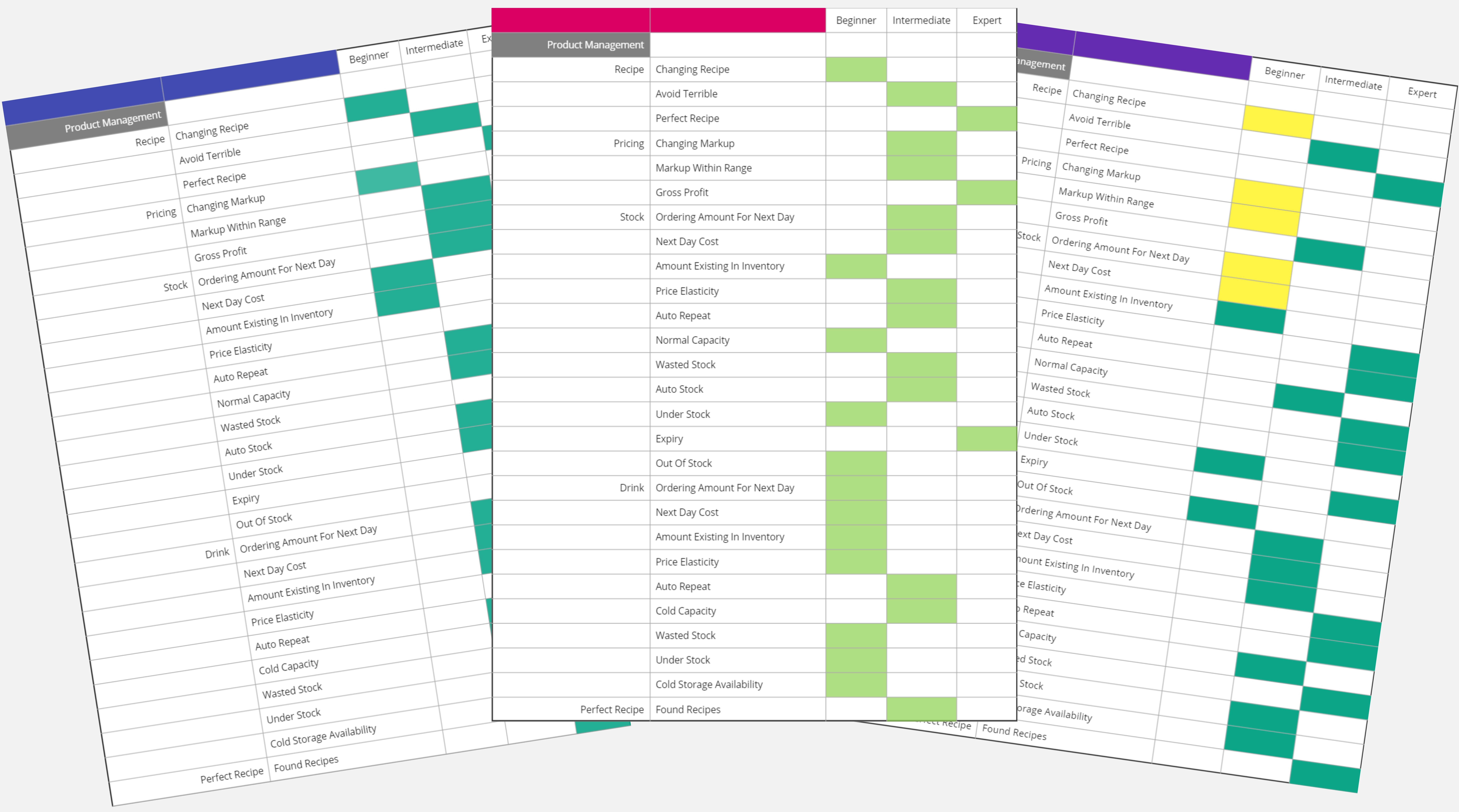
On aggregate, we ranked mechanics like basic recipe changes, inventory cost, stand range effects, pricing, etc., for beginner players.
More complex mechanics like expiry, perfect recipes, service speed, employee absence, branding, and so on were ranked for intermediate to advanced players.
User Flow Analysis and Review ↙️⬇️↘️
Next, we analyzed how players navigate through the game to identify opportunities for improvement and eliminate potential roadblocks in the user journey.
One key 🗝️ revelation of this analysis was that the decision-making process for new players was often overwhelming.
To counter this, we streamlined the game's initial stages and minimized the number of choices to encourage a smoother learning curve.
Player Progression Paths 🐾
The insights from our User Flow Analysis became a foundation for developing player progression paths for new and expert players. The main challenge we faced here was to balance complexity with accessibility. We wanted to ensure that the game was easy for beginners yet offered depth and complexity for our more seasoned players.
This was when we stumbled upon the idea of a Research Tree as a solution to balance ⚖️ the complexity and accessibility of the game. A Research Tree presents a clear path for players to strategize their advancement based on their play style. It also significantly streamlines the presentation of information so beginner players can handle it.
Drawing inspiration from the research trees in games like Civilization VI and Oxygen Not Included, we settled on a design that had a logical flow and offered meaningful choices to the players.
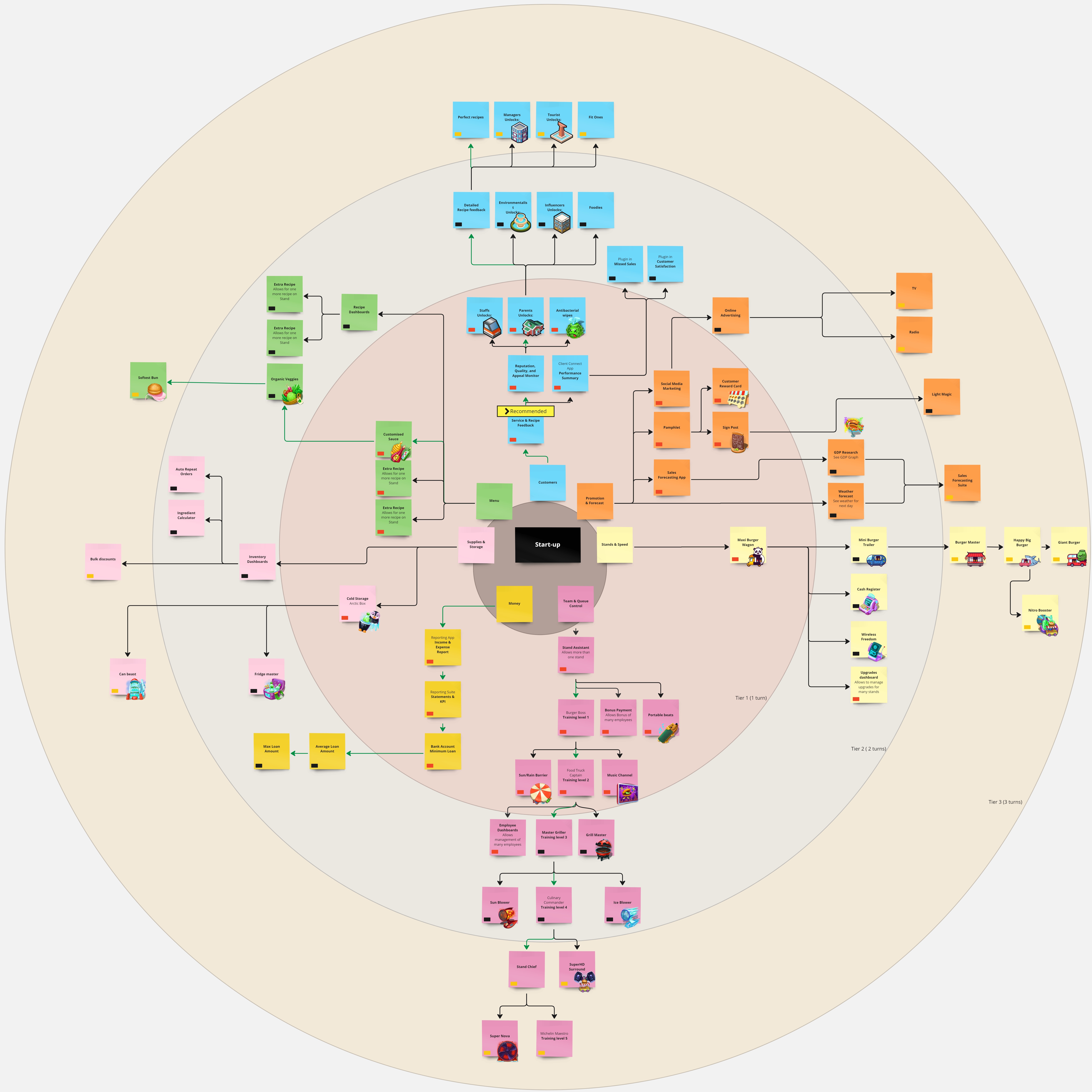
A larger version of the tree is available on Miro.
Information Layout 📄
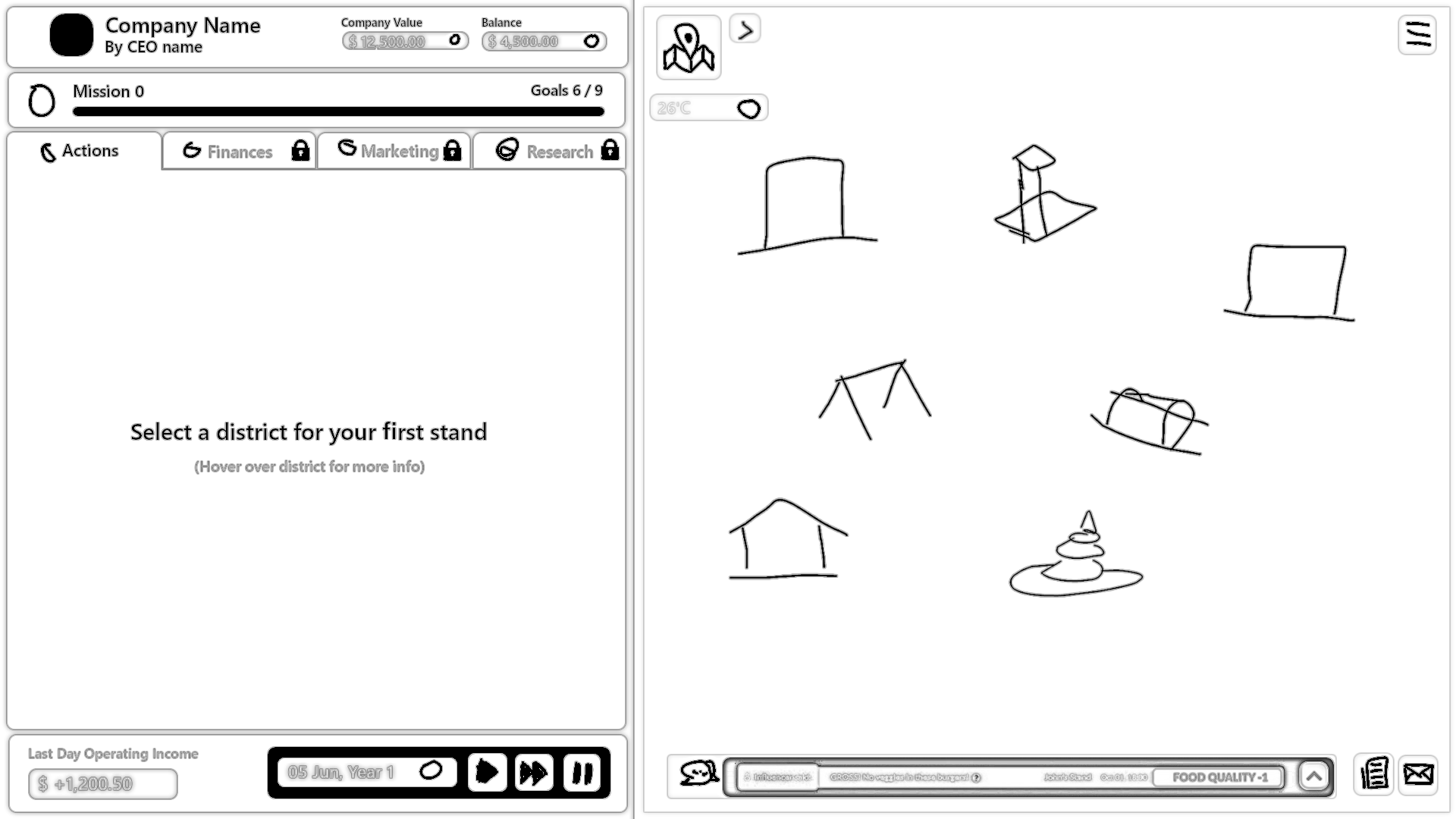
We then proceeded to brainstorm different information layouts to suit our redesign efforts. These were the two winning options.
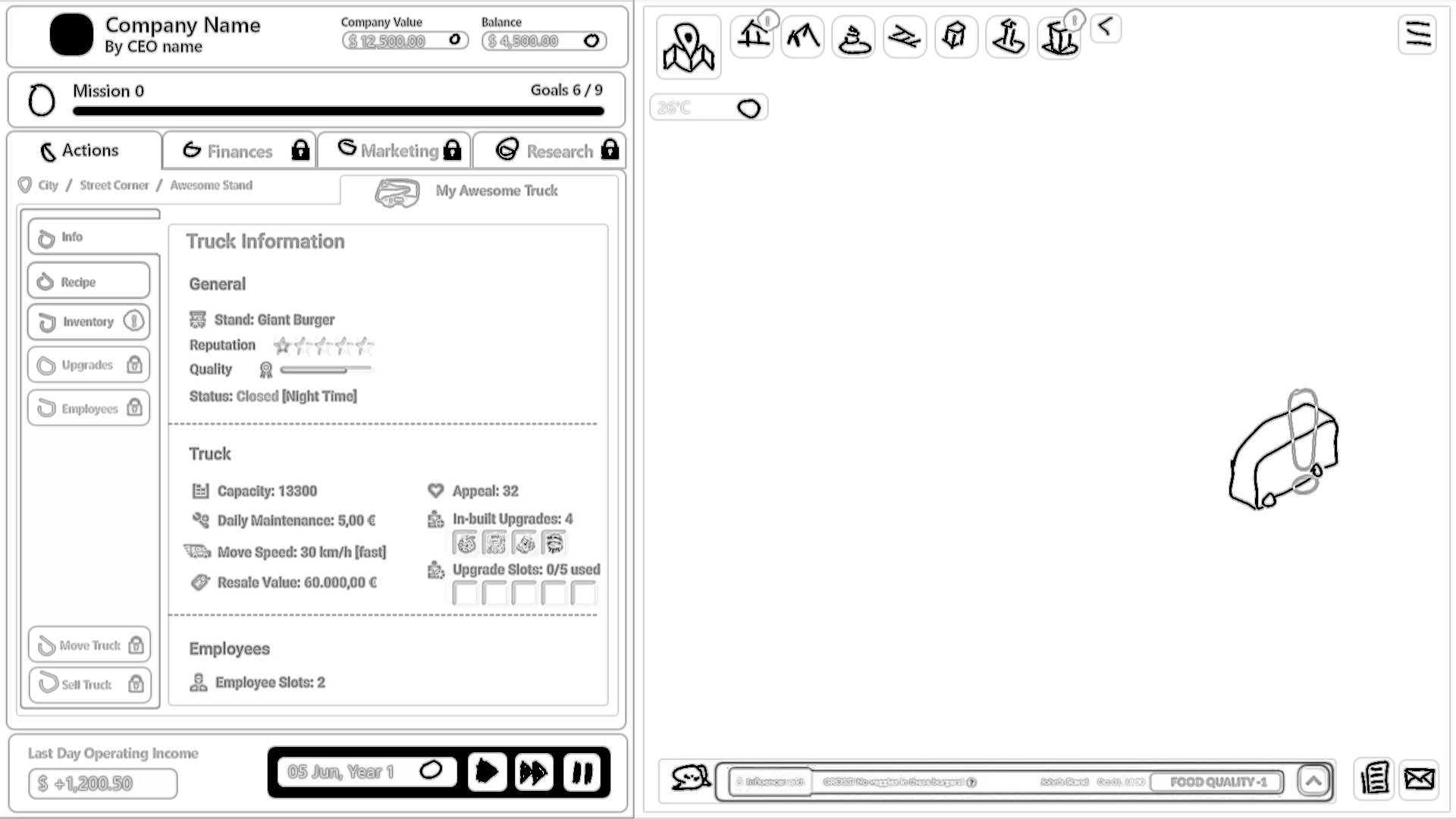
Option 1: Detailed User-Centric Design
- Detailed home 🏡 screen with primary action sections in fixed view.
- Tab-like functionality with a mix of new and existing features.
- Navigation: Left-side tabs for actions, research, finances, marketing; automatic adjustments for new functions.
- Bottom display of operating income 💰, date 📅, game controls. ▶️⏯️
- Stand management 🚚 in Action tab with improved readability 🥸.
- City view on right with Map 🗺️, weather data ⛈️, feedback 👍👎, and activity notifications.
- Easy navigation for localities with expandable arrow➡️; indicators ❗for stands requiring action.
- Notifications and news expand into the environment on click. 🖱️
- Player-centered approach with personalized navigation cues.
Option 2: Minimalist Approach
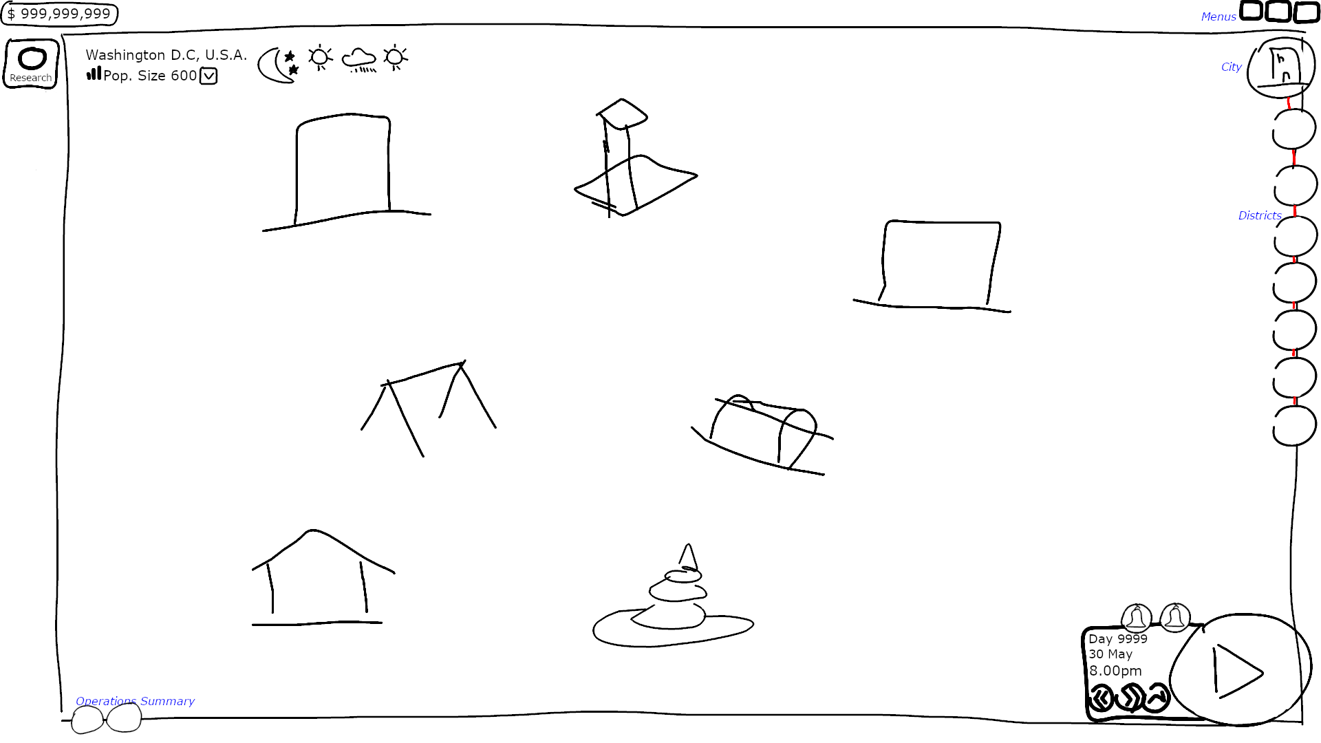
- Larger environment view 🗺️ with a focus on essential navigation elements.
- Navigation: Left corner for primary actions; dynamic expansion of buttons to reveal functions.
- Environment view minimizes on primary action click; maintains city/district navigation buttons. 🔲
- Stand shortcut buttons for easy jumping between stands. 🚚
- Bottom right hosts gameplay controls ▶️⏯️, integrated calendar 📅, feedback notifications 👍👎, and news 📰.
- Bottom left holds operating income 💰, expandable feedback summary.
- Essential information displayed without overwhelming players; replaces large matrix with numerical data. 🔢
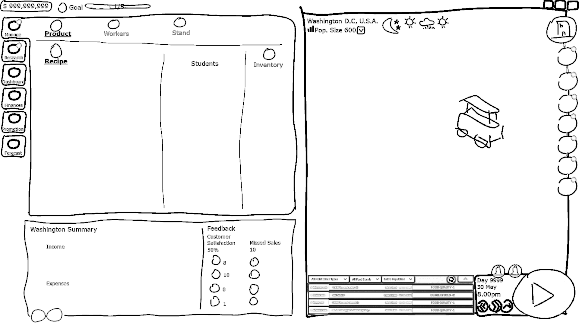
The main challenges we faced with the sketches were how to balance simplicity with detail and ensure accessibility for visually impaired players.
Wireframing 📐
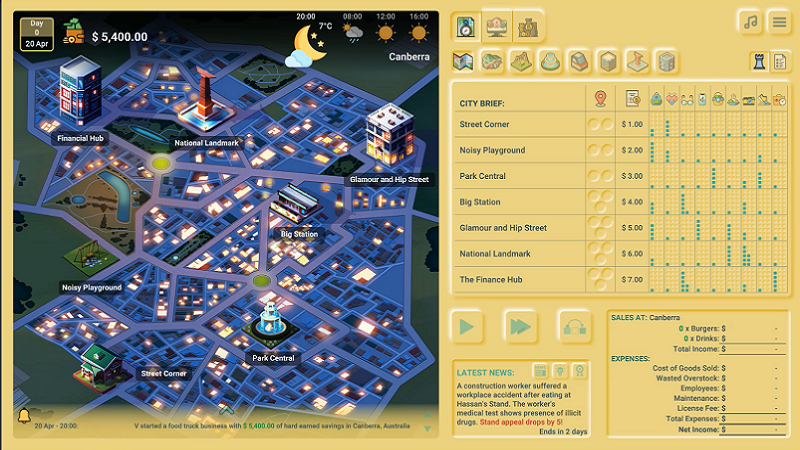
We eventually went with a blend of both sketches in developing the wireframes. We focused on improving gameplay by decluttering the interface and prioritizing interaction and decision-making.
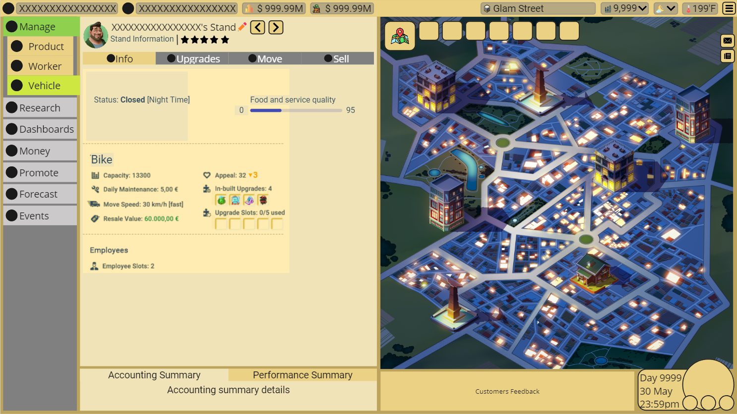
Some immediately apparent changes from the previous UI 🔄:
Environment: Shifted to the right to achieve more natural eye movement and smoother navigation.
Labeled Icons: Icons are great, but labels are better because they provide clarity.
Tabs: For improved data presentation and usability while ensuring everything's within a few clicks' reach.
Nested Data: Nesting data within dropdown buttons helped to declutter the User Interface.
Wireframing the Research View 🔬
The current design has 3 tiers and 7 research paths that cover various operations and business management functions:
- Customers: Provides customer segment access and insights.
- Menu: Contains everything needed for recipes.
- Money: Everything related to financial strategy.
- Promotion & Forecasting: For predicting and planning.
- Supplies & Storage: Stock management improvement.
- Stands & Speeds: For better vehicles and speed.
- Team & Queue Control: Workforce management path for maximum output.
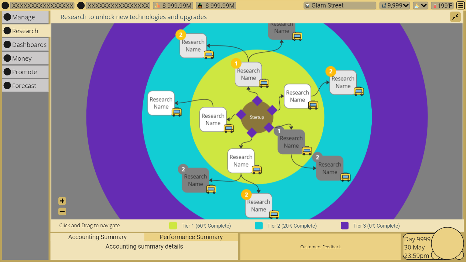
How does it work? 🤔 One item in each tier can be researched per turn. A turn is one night and day cycle. Items in Tier 1 unlock after one turn, Tier 2 after two, and Tier 3 after three.
That's it for this episode!
Don't forget to join our community to get these behind-the-scenes specials delivered directly to your inbox. Plus, we've got other exclusive perks waiting for you.
Live Long and Prosper 👋,
Team Visionaries