Hey everyone!
Following on from the last dev diary where we looked at the evolution of the logo for DNFC, we're going to have a look at the key art for Definitely Not Fried Chicken.
Key art is an important part of marketing that’s needed to sell the vibe of the game to our audience in a single image. Originally we wanted to show off the beautiful city building voxel art created by our artist with a tilt shift camera focal effect; our first mockups included the logo over the most aesthetically interesting part of the city being the art deco style beachfront.
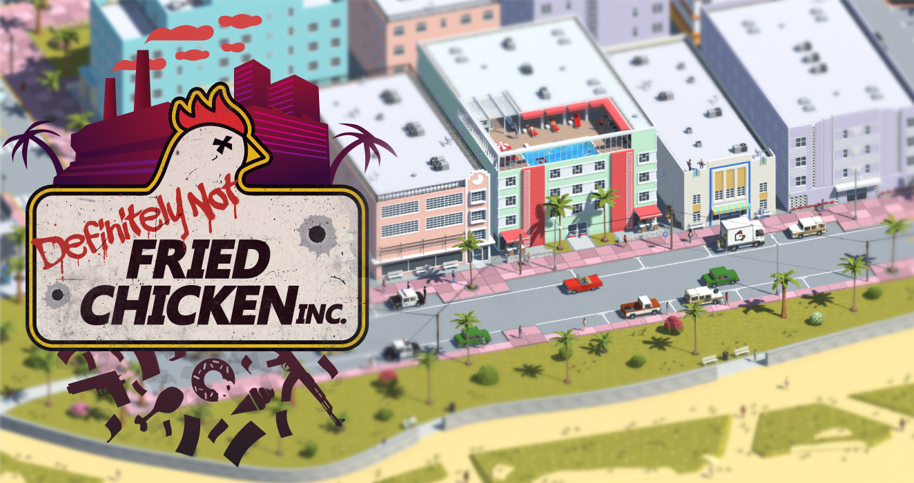
Whilst nice, this had very little to do with what players would be doing most of the time and didn’t really have any association with the logo. It was therefore decided that we should try a different approach aiming to connect the logo to the world.
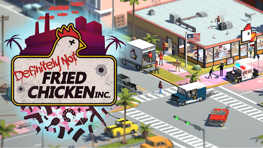
The next iteration included the corner of the iconic chicken shop, straight away connecting the chicken head on the logo to numerous voxel imagery like the truck, restaurant, flag, and employees.
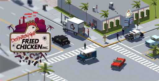
Further details like exhaust smoke, police lights, colour grading, logo details were added to complete the final art.
We hope you enjoyed taking a look at the key art with us, you are cordially invited to join us on Discord to let us know what you think or let us know what you'd like to hear about!
Add DNFC to your Steam wishlist
You can check out the latest trailer below!
https://youtu.be/OBVE1eMEuQ8